Graphesis by Johanna Drucker
Image, Interpretation, and Interface + Bauhaus
“The most complete graphic language systems appear in the twentieth century, as adjuncts to design curricula and professional training. Work at the Bauhaus, as well as in the technical academies and design schools founded in the 1920s and 1930s, such as Vkhutemas in Moscow, fostered a brief but generative dialogue between visual practices of design and those of fine art.”
- The Language of Graphics, pg 19
I chose to analyze the Bauhaus in the context of this text because I feel as if I always come across it referenced, but I wasn’t exactly sure what it encompassed. When I heard it mentioned in the chapter, I was curious about its connection to codifying graphics language, its role in graphic design history, and its merge between graphic design and fine art.
The Bauhaus was a German art school (1919–1933), famous for its approach to instruction and design thinking. It was a key player in the arts and crafts movement, which combines fine and applied art. It seems that most of this chapter was trying to identify the taxonomic foundation for graphics and information, without trying to be a history lesson on graphic design. With that said, it makes sense that the Bauhaus would be mentioned, and I wish it were mentioned in more detail. Through the research, it seems the school’s goal was to translate graphics and design in an intelligent manner, similar to what Gestalt theory does to visual perception and Walter Crane’s treet does to decorative motifs.
“The motivations behind the creation of the Bauhaus lay in the 19th century, in anxieties about the soullessness of manufacturing and its products, and in fears about art's loss of purpose in society.” – The Art Story
Instruction at the Bauhaus aimed to inject creativity back into manufactured goods and, in effect, daily life. The instruction separated itself from traditional fine art teaching, putting importance on the connection between intellectual and theoretical work and practical skills. In fact, the Bauhaus’ ethos was so influential to art education that many began to translate fine arts to visual arts, moving it from the sphere of humanities to research science. This style feels like it paved the way for data visualization and is significantly reminiscent of the field’s instruction today, which aims to channel the aesthetics of graphic design into visualizing data. In my eyes, there is a balance between understanding underlying theory, such as Jacques Bertin’s retinal and graphic variables, and understanding what makes data attractive to the layperson. The balance between these two goals shifts as the goal of the overall visualization shifts—i.e., if you’re working on an artistic visualization, aesthetics may take control.
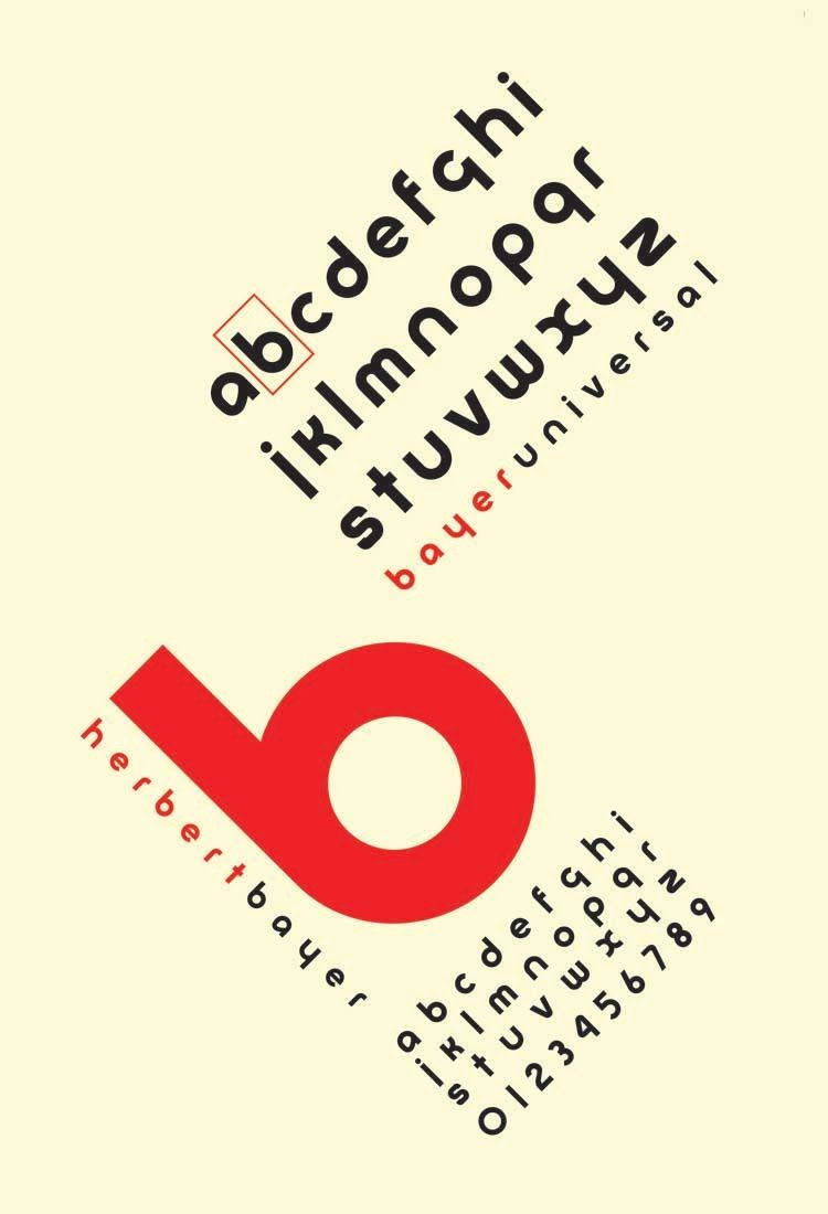
Bayer converted the medieval-influenced German script that was popular at the time to a cleaner design with sans-serif style. Another interesting feature of this work is the fact that Bayer moved away from two different typecases (upper and lower) and moved only to lowercase.
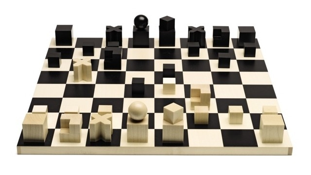
While the game of chess is far away from the language of graphics and data visualization, I feature this example because of the unique game pieces, which have designs that match their possibility for movement in the game. I think this encoding in an interesting concept in terms of visualizing data, where the goal is often encoding utility in the imagery we’re producing.
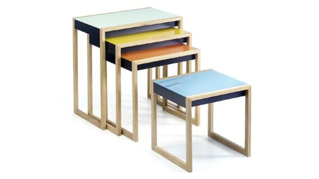
In line with the school’s interest to re-insert creativity into manufacturing, a lot of impactful furniture design came out of the Bauhaus, including these nesting tables. I feature these tables to connect to Jacques Bertin’s retinal variables, color-coding specifically, which match the size of each piece. In other words, the variable size is encoded in color.
Sources: The Art Story, Gizmodo