In Subtitles of color, Robert Simmon talks about how color was first efficiently used to denote numerical values by the cartographers. He extensively talks about the following aspect of usage of color in data visualization:
Basic color theory
- Ways the retina detects colors : the cells in our eyes respond to different wavelengths -> compared with the RGB color channels on the monitor
- If we describe color spaces based on HSB (it's a better representative of how we think about color & how our brains process color)
- Although, there’s an objective reality to color that it’s a representation of wavelength, the colors that we see are tricks of the imagination and there’s no perfectly objective view of color (James Gleick - on a radio lab podcast)
- psychology of color: what we see and what our brains are telling us is out there is a construct - processing is going on from the moment light hits the retina and continues through the optic nerve into the brain where we are processing vision which is a constructed reality - so that we can interpret it, move through it and react to it appropriately.
Using color in visualization
- cartography (100/200 yrs older concept): 1823: map : temperature zones across the globe : rainbow palette works in this case : cartographers have been encoding data for 190 yrs
- bathymetric map of crater lake : giving a sense of depth of the lake, the land cover classification and the topography at the same time
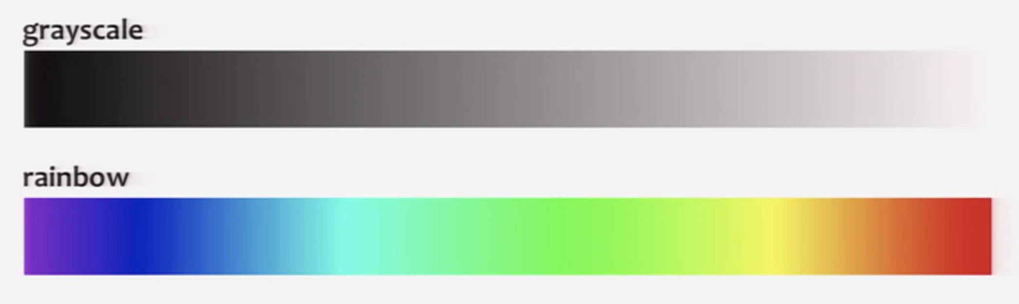
- grayscale palette (flaw: surrounding tones affect our perception of the lightness of the smaller area of color) and rainbow palette (flaw: it’s uneven- perceptual change of the same amount can appear to be larger for cyan- yellow whereas appears to be smaller near green areas comparatively, — it varies from dark to light, dark to light, dark to light thereby breaking the natural order of the colors & usage the entire spectrum )
- Colin Ware describes an alternative palette : spiral with changing hues and with increasing brightness -> to get the perceptual linearity of the grayscale palette and at changing color hues)
- Our visual system is driven by the lightness and color hue is more of a secondary component affecting it, (LCH lightness, saturation, hue vs HSB) LCH has smooth grad has smooth gradation (HSB is better than rainbow but has a quick transition from one hue to the other)
Then he talks about how all these palettes show a gradual increase of one or multiple values so they are basically best suited for sequential data type. This pops a question 'what are other types of data'? Simmone then goes on to describe Sequential, Divergent (dataset with a breakpoint in the middle of two opposing ideas) and Qualitative data types (data is broken into discrete categories).
Simmone describes color application to these different types of data.
- Divergent palette: two sequential palettes sliced together with the center being a light neutral color— when you want to emphasize your outliers. I feel, this method is quite limiting. What if we want to look at the entire data and not just outliers?
- What came up next in his talk, this question was answered to an extent: Magnetism on the Sun: he broke the rule of using a neutral gray color by using a light yellow as a neutral color so that the rest of the initial colors don’t blend in
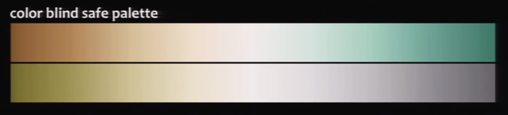
Color Blindness
Red-Green color blindness (8% of males and 5% of general population) Solution? Color blind safe palette
Should we not be using a color blind safe palette all the time? How does it limit our choices/established methods of color application to data?
Use of color in context
It is important to use color intuitively but in a right context. What one color may mean in one context can differ a lot when it's used in another.
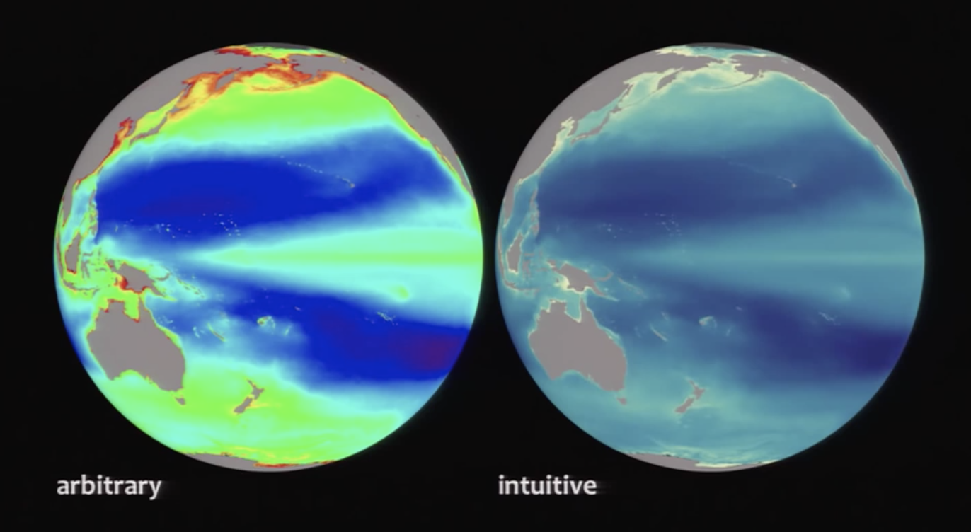
A lot also depends on the audience as well. Their culture and the associations colors have with it is important. Simmon explains the contextual use of color through the data visualization depicting 'the amount of vegetation inside the ocean and on land'. It's tricky as both represent the same entity but with a different context. Hence, color can be effective used to represent different contexts.
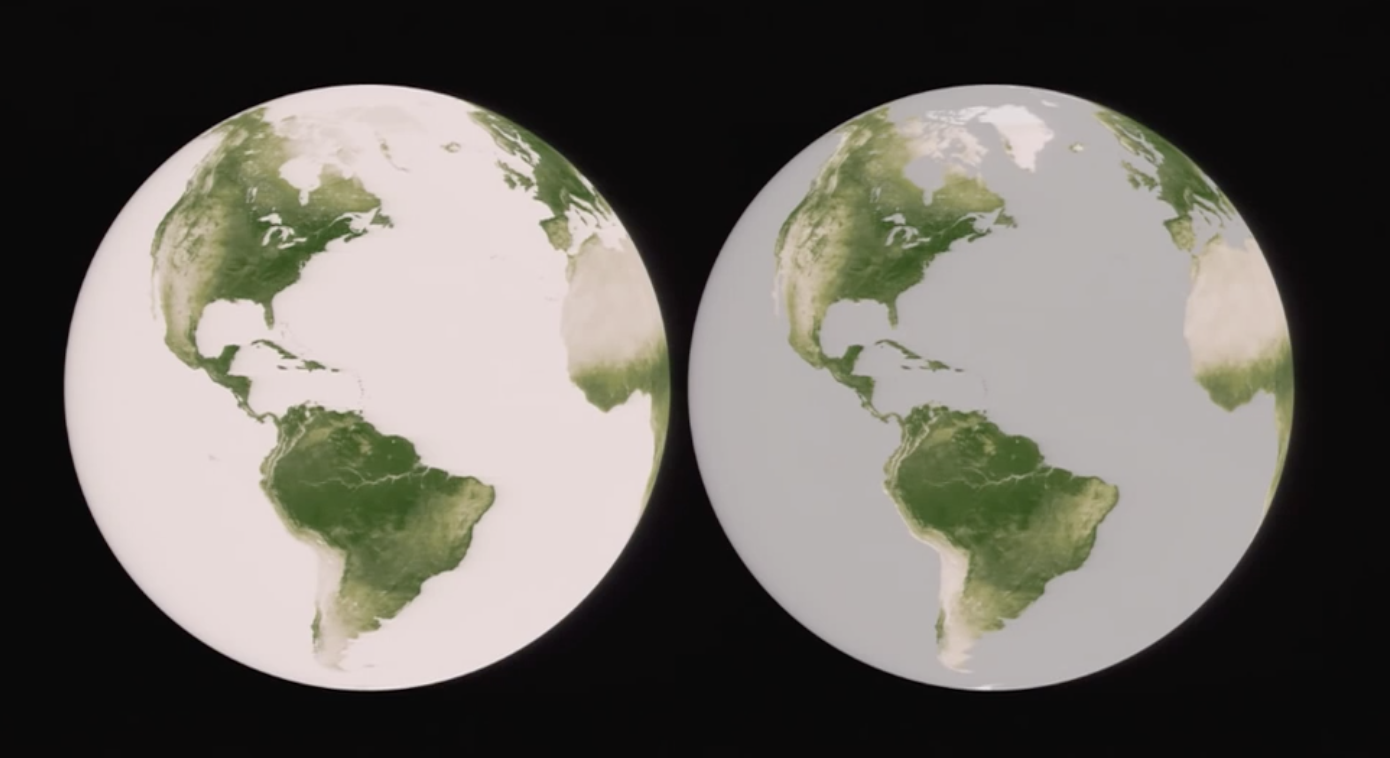
Color can also be used to indicate thresholds by using strong contrast or color and no-color areas. It is important to represent no-data as well as representing data. Since each complements what the other means. Human eyes non-attentively process areas distinguished by a strong color contrasts.
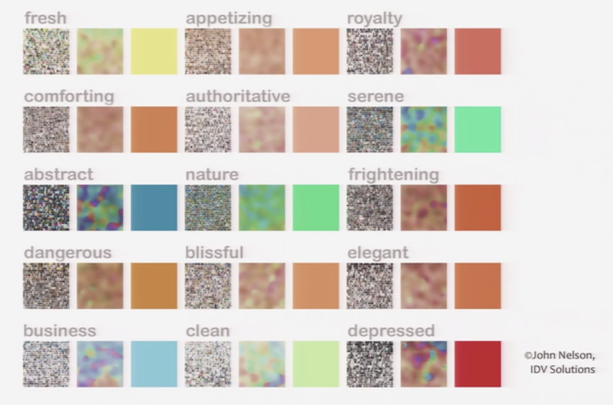
Evoke an emotional response
Although, with the help of collage a mood-board can be created to represent an emotional response to colors, we cannot expect the emotional responses to the colors to be universal.