It is important to give color its due worth of being able to intuitively tell the stories of data. Lightness (Black, white, Grayscales) , Hue (Color) and Saturation (sometimes known as Chroma, which is the saturation of color, using either color or grays to create these colors).
Connecting color to meaning in data can be reviewed as:
Sequential data - Data that varies continuously from a high to low value; such as temperature, elevation, or income is best displayed with a palette that varies uniformly in lightness and saturation, dark to light or light to dark with sometimes (preferably!) with a simultaneous shift in hue.
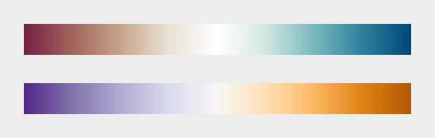
Divergent data - has a “break point” in the center, often signifying a difference. For example, departure from average temperature, population change, or electric charge. And suited to bifurcated or complementary triadic palettes with a neutral central color. (see color samples from middle range neutral color to complementary color choices)
Qualitative data - is broken up into discrete classes or categories, as in land cover or political affiliation and benefits from a set of easily distinguishable colors. The color is used to separate areas into distinct categories. Instead of a range of related colors, the palette should consist of colors as distinct from one another as possible. Due to the limits of perception, especially simultaneous contrast, the maximum number of categories that can be displayed is about 12 (practically speaking, probably fewer).
Robert Simmon says try always making an ‘intuitive’ palette meaning suited to the viewers perception and culture, ie: water and sky is blue, vegetation green, etc. There are universal ‘meanings’ to how we all read color, and beware of strong cultural meanings that are sometimes found with the color red and green.
Also, when layering datasets, try using different sets of muted colors to differentiate between the information.
Sometimes using analogous color (colors next to each other on the color wheel) needs to chosen carefully as in within the same saturation levels depict information without being in your face. Also, background (or no data) needs to be chosen as importantly as the data itself.
Choosing the right color to show datasets is a matter of aesthetics and judgement.
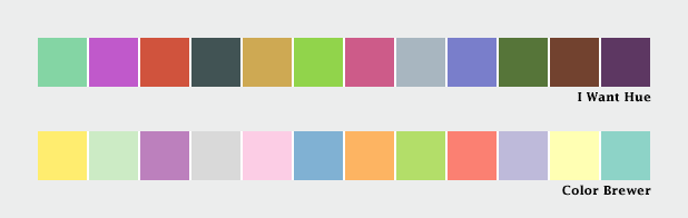
Mentions using Color Brewer. Cynthia Brewer’s tool for color palettes. Simmon gives instructions on how to utilize Photoshop and Color Brewer to create gradient palettes and tables. You’re able to keep the palette to refer to in the future.
He also reviews the NASA Ames Color Tool. When viewing this method reminds me of the Munsell Color System and various others.
These resources will be useful to keep a reference to.