In his blog series, The Subtleties of Color, Robert Simon asserts that the main purpose of data visualization is to make connections and highlight relationships that may be difficult to identify using large amounts of numbers. Throughout the series, Simon analyzes various types of data as well as their preferred color palettes to emphasize the important story telling role color plays in data visualization.
When connecting color to meaning, Simon explains that designers should choose color schemes based on “intuitive colors”, meaning colors that “match the audiences preconceptions and cultural associations”. I found this especially interesting because it requires the designer to make a judgement about the audience and create an assumption about what they believe to be “normal” color associations.
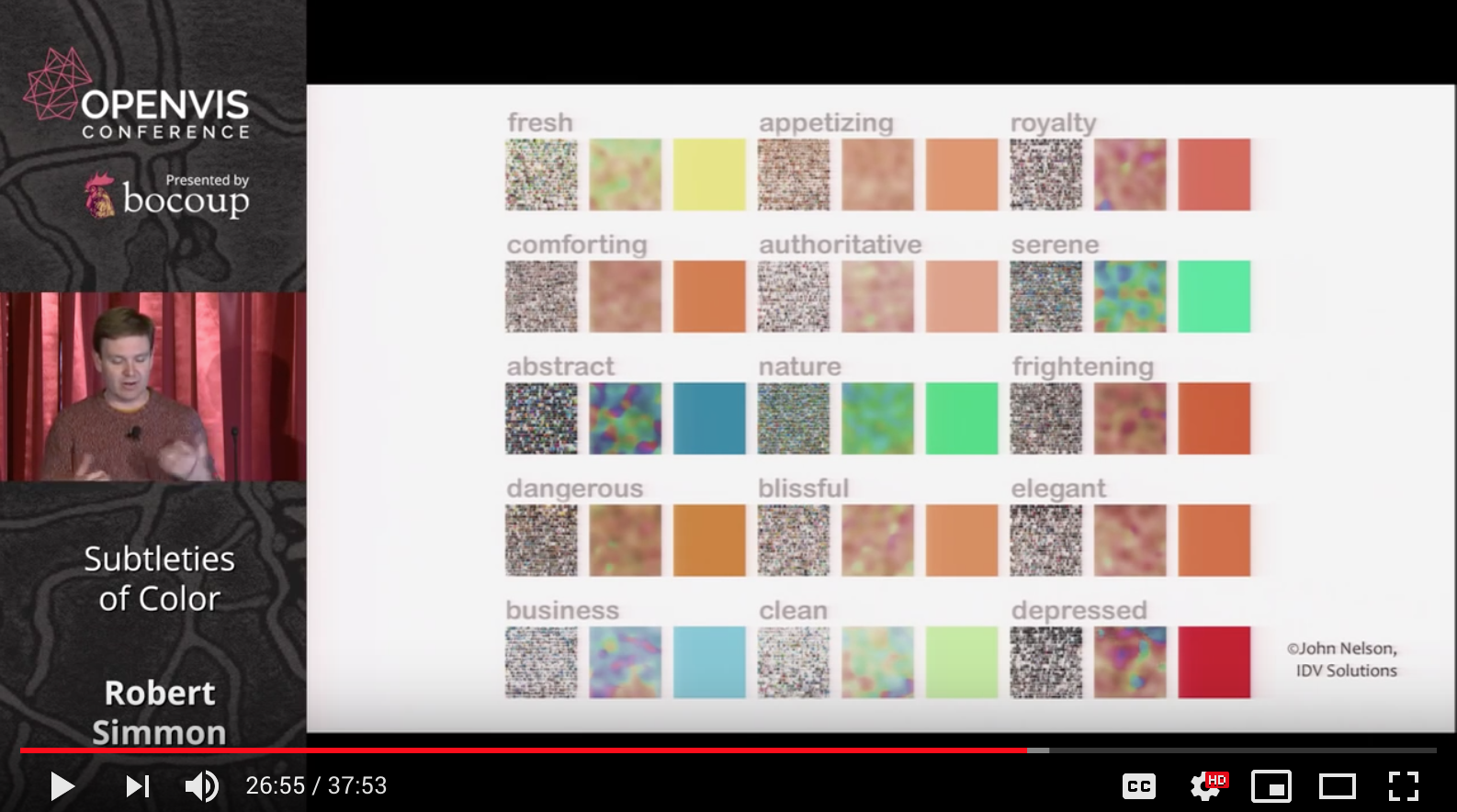
However, as pointed out in the video, it is almost impossible to assume that an entire audience will have the same associations with color because our perceptions are shaped by our cultural backgrounds. For example, while western culture may associate the color red with being angry or dangerous, eastern cultures often connote red with happiness or good luck. This part of the article made me question all of the bias I have personally encountered in design and wonder if it is even possible to design for an international audience? Are there any examples of good design that is not skewed towards one culture and accommodates a variety of associations with color?
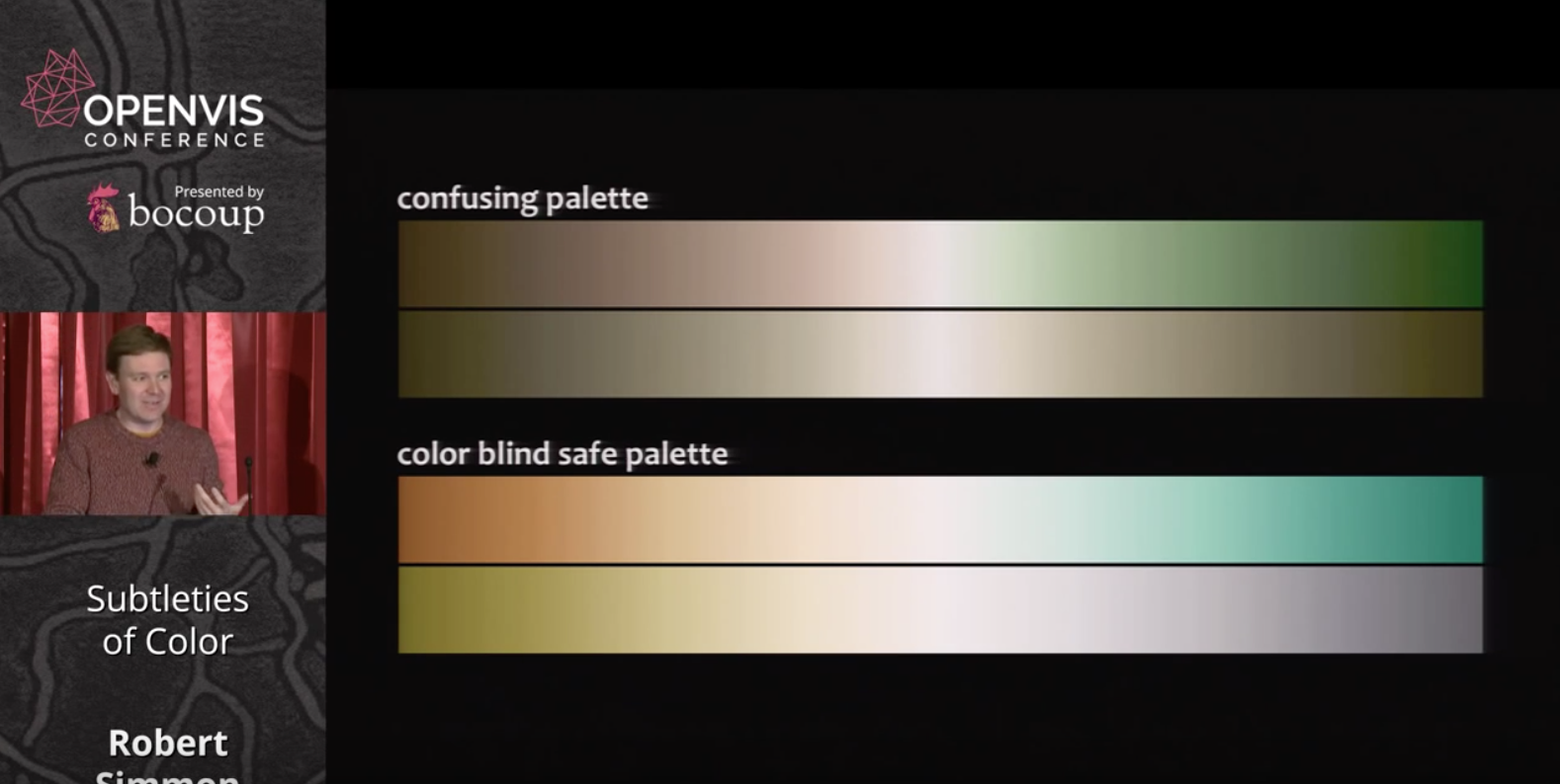
Additionally, throughout my undergraduate degree, I studied different aspects of design and found myself particularly interested in designing for accessibility. I appreciate Simon's emphasis on how certain colors become invisible to people with color blindness and ultimately suggests using a color blind safe palette. I truly believe that by designing with accessibility and inclusivity in mind, we ultimately create more thoughtful and well-designed artifacts that have the potential to reach a larger audience. However, in order to do so, we must acknowledge that our own perspective is different than our audiences and apply this information into our designs. This is easier said than done. What types of tools can we employ to take a step back from our work and limit our own personal bias within the data visualizations we create?