In his 6 part series, Robert Simmon's approaches colour use in visualizations with intuitive explanations and examples.
Colour is incredibly important to the visualization process, as Simmon's illustrates - the goal of data visualization is to illuminate data and essentially show patterns/relationships that may have otherwise been hidden. Careful use of colour enhances clarity, aids storytelling and draws a viewer into your dataset. Poor use of colour can obscure data or even mislead.
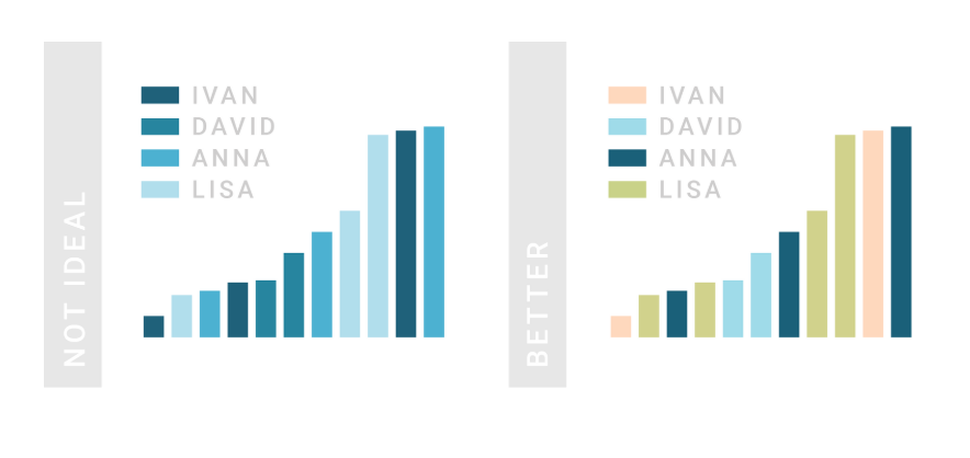
The author lays out a couple of guidelines when it comes to colour in visualizations:
- Think about colours in lightness, hue and saturation rather than in terms of green, red, blue. Computers process a different kind of RGB in comparison to how humans perceive those colours. Computers calculate light linearly, while humans perceive colours exponentially. Lightness speaks to black and white. Hue speaks to hues of colours: orange, purple etc. Saturation refers to dull to rich colours.
- Use divergent palettes with divergent data. Divergent data has a middle point or a "break point" in the centre often signifying a difference.
- Think about colours and accessibility. 5% of the world population is colour bling and cannot see the red/green scale. As well, different cultures process colours differently, red is a colour of anxiety in the West but signifies good luck in the East.
- Use intuitive colours when possible. For example: use shades of blue when representing data relating to the ocean.
- Think about your dataset categorization. Any dataset can be categorized as one of three types - sequential, divergent and qualitative - each suited to a different colour scheme. For example: don't use gradient palettes for categorical data.
- Use tools to help your colour journey. The author mentions a few tools such as: ColorBrewer, the NASA colour tool and chroma.js.
The author ends his piece with some hard cold truth. He says what separates an adequate viz from good and great isn't a matter of following rules it's a matter of aesthetics and judgement. Aesthetics and judgement are a key part of the colour process.
Questions for reflection and discussion:
- What's the best way to visualize revenue loss/growth when the default is to gravitate towards reds and greens?
- Something that has been on my mind for quite some time: how can we better illustrate gender data rather than using pink and blue hues?
Source: https://earthobservatory.nasa.gov/blogs/elegantfigures/2013/08/05/subtleties-of-color-part-1-of-6/