The use of color to display data is a solved problem, right? Just pick a palette from a drop-down menu (probably either a grayscale ramp or a rainbow), set start and end points, press “apply,” and you’re done. Although we all know it’s not that simple, that’s often how colors are chosen in the real world. As a result, many visualizations fail to represent the underlying data as well as they could.
The Series Subtleties of Color by Robert Simmon gives us an overview of how color and data are related along with providing examples of and history behind color usages in data visualization. The author went over concepts such as Basic Color Theory, Color Components, Color Palette, the connection between colors and data and some tools and techniques to apply colors in data visualization.
To begin the series, Robert mentioned that many visualizations picked random colors or pick colors in unscientific ways to present data. Then the author presented some issues related to choosing colors and explained the very basic of color theory. In part 2, Robert explained how to choose color palette by using proportionally varying color scales. "A color scale should vary consistently across the entire range of values, so that each step is equivalent, regardless of its position on the scale". The author explained how to create palettes by creating a scale of varying hue, brightness and saturation."The continuous, smooth increase in lightness preserves patterns, the shift in hue aids reading of exact quantities, and the change in saturation enhances contrast." with the change in lightness is the strongest. In part 3, Robert explained how to use different color palettes to present different Sequential data, Divergent data and Categories data. In part 4, the author explained how to choose colors according to the meaning of the data with. He gave examples of and explanation for concepts such as Intuitive Color, Layering, Choosing Color for Complementary Dataset and Non-diverging Breakpoints, Use Color to Separate Data from Non-Data, Figure-Ground and Aesthetic. To finish the series, Robert mentioned some useful tools to pick color as well as other resources and authors to for readers to expand their knowledge on choosing colors.
This article is particularly interesting to me because as a designer, I've been always conscious about using colors in my design. It is a common practice for every Graphic Designer including me to be able to explain why I choose a certain color and a certain palette. Every color can bring different emotions and feelings to people who see it. However, I usually choose color palettes because of reasons like they look good, they mean something or clients want it. I have never thought about choosing the exact colors in a color range as the author discussed in the article. Being new to data visualization, I did not know the different types of data before this article. It acts as a simple guide to choose color palettes for different types of data. I appreciate that this article has a variety of contents such as history, author's work to theories and specific techniques and tools. It is a very compact crash course for people trying learn about using colors in data visualization especially those who do not have design background.
My only critique is that I would love the article to give more real life examples of bad color choices through history.
In Subtleties of Color, Robert Simmon discusses the importance of color to show patterns and relationships that are otherwise hidden in a mass of numbers. He emphasizes how color is a tool to make visualizations more intuitive and successful. Throughout the series, Simmon discusses several types of data (sequential, divergent, and qualitative) and the colors suited to their different types of display. For instance, sequential data is best represented by color palettes that vary evenly from light to dark, divergent data is suited to a palette that uses two different hues that vary from a central neutral color, and qualitative color uses color to separate areas into distinct categories. I also look forward to incorporating Simmon's tips on layering multiple data sets in my future work. He describes the approach of using muted colors to limit the contrast and hues in one data set, and then overlaying the other data set. The color schemes for datasets displayed together should be designed together, and complement one another.
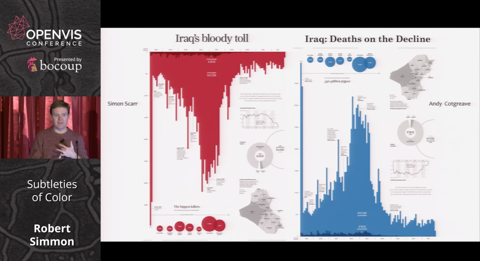
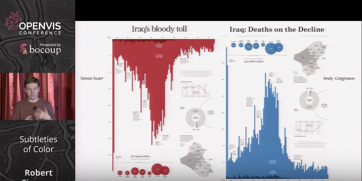
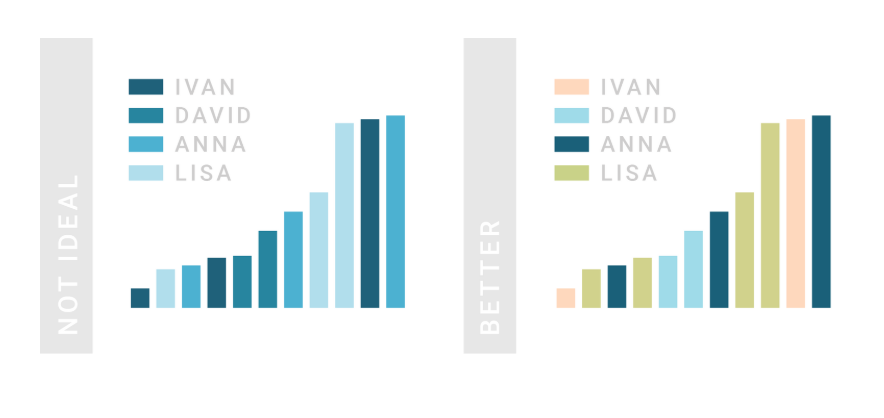
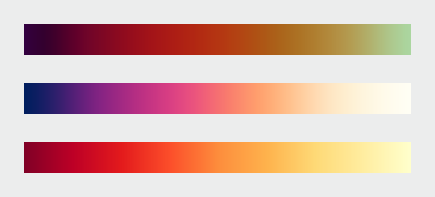
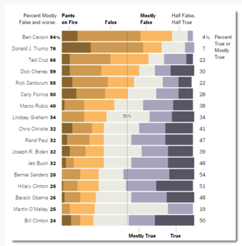
Another interesting topic was that of connecting color to meaning and how it evokes an emotional response in the audience. His example of Iraq’s Bloody Toll vs. Iraq: Deaths on the Decline charts show how by flipping the orientation and changing the color from red to blue, the graph is given an entirely different message.
Simmon discusses how colors have emotional and socially constructed meanings, some of which are unique to specific cultures. This point made me think of all the colors within my cultures that have different meanings and uses than they do here in the US.
In addition to how color enhances data sets, Simmon also discusses the issues that complicate color choices in visualization. One of the most interesting topics was with presentation and accessibility issues and how the use of red or green can make specific visualizations more difficult to differentiate. I agree that in order for a visualization to be most successful, it should be readable for the largest audience possible.
It is important to give color its due worth of being able to intuitively tell the stories of data. Lightness (Black, white, Grayscales) , Hue (Color) and Saturation (sometimes known as Chroma, which is the saturation of color, using either color or grays to create these colors).
Connecting color to meaning in data can be reviewed as:
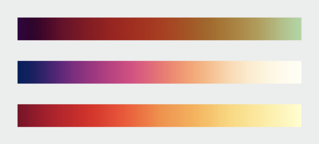
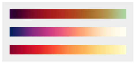
Sequential data - Data that varies continuously from a high to low value; such as temperature, elevation, or income is best displayed with a palette that varies uniformly in lightness and saturation, dark to light or light to dark with sometimes (preferably!) with a simultaneous shift in hue.
Sample of Sequential Color - darkness to lightness of the same hue. Can sometimes use monochromatic color palettes or analogous.
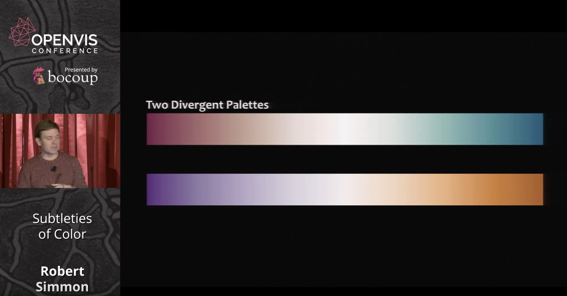
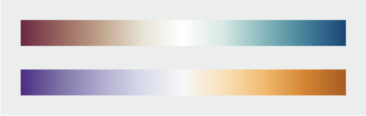
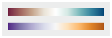
Divergent data - has a “break point” in the center, often signifying a difference. For example, departure from average temperature, population change, or electric charge. And suited to bifurcated or complementary triadic palettes with a neutral central color. (see color samples from middle range neutral color to complementary color choices)
Example of Divergent Color palette ( middle 'neutral' color either gray or beige to sometimes complementary or variations of chromatic triadic color choices.
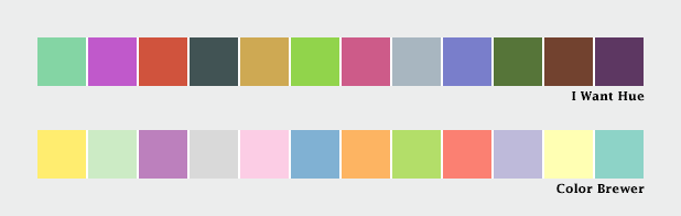
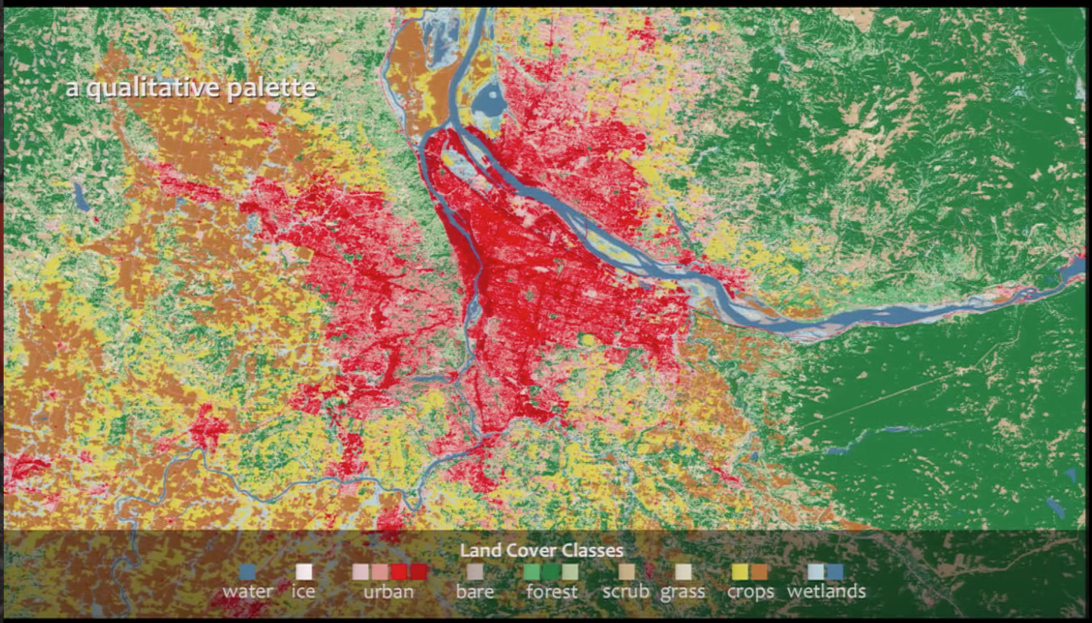
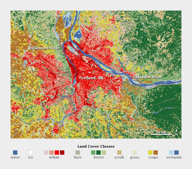
Qualitative data - is broken up into discrete classes or categories, as in land cover or political affiliation and benefits from a set of easily distinguishable colors. The color is used to separate areas into distinct categories. Instead of a range of related colors, the palette should consist of colors as distinct from one another as possible. Due to the limits of perception, especially simultaneous contrast, the maximum number of categories that can be displayed is about 12 (practically speaking, probably fewer).
Qualitative Data can be complementary colors (triadic) or sometimes on the opposite sides of the color wheel. You could use chromatic complements so the color wouldn't be as jarring!
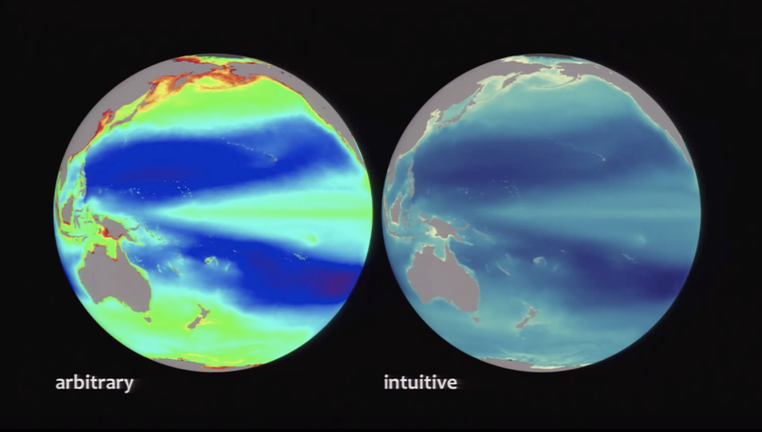
Robert Simmon says try always making an ‘intuitive’ palette meaning suited to the viewers perception and culture, ie: water and sky is blue, vegetation green, etc. There are universal ‘meanings’ to how we all read color, and beware of strong cultural meanings that are sometimes found with the color red and green.
Also, when layering datasets, try using different sets of muted colors to differentiate between the information.
Sometimes using analogous color (colors next to each other on the color wheel) needs to chosen carefully as in within the same saturation levels depict information without being in your face. Also, background (or no data) needs to be chosen as importantly as the data itself.
Choosing the right color to show datasets is a matter of aesthetics and judgement.
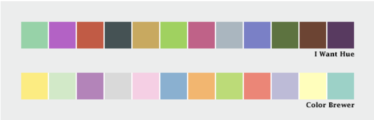
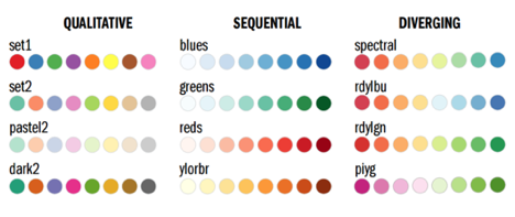
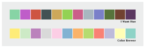
Mentions using Color Brewer. Cynthia Brewer’s tool for color palettes. Simmon gives instructions on how to utilize Photoshop and Color Brewer to create gradient palettes and tables. You’re able to keep the palette to refer to in the future.
He also reviews the NASA Ames Color Tool. When viewing this method reminds me of the Munsell Color System and various others.
These resources will be useful to keep a reference to.
blog/lecture by Robert Simmon (below summary) by Suzanna Schmeelk
The OpenViz lecture by Robert Simmon was very good. I was particularly fascinated by the different color pallets available to programmers: LCH versus RGB and others. LCH has a richer transition of color choices and can quite nicely be paired against two pallets to represent two items sharing the same hue scale. Simmons discussed the "perfect pallet" (below) based on the work of Collin Ware.
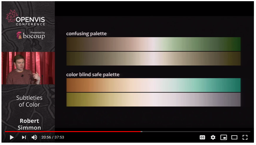
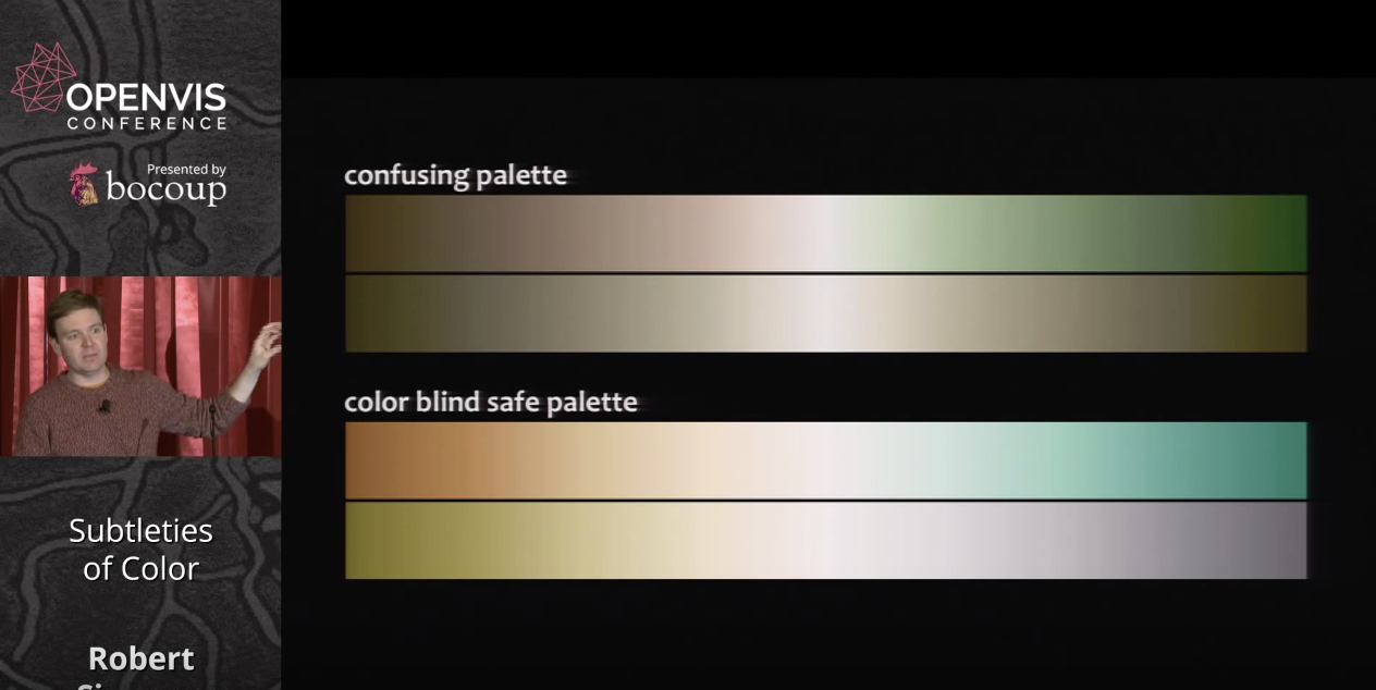
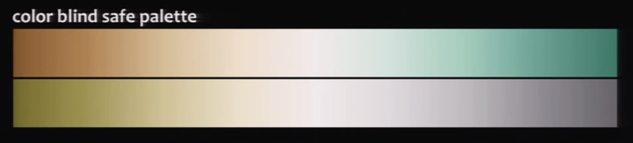
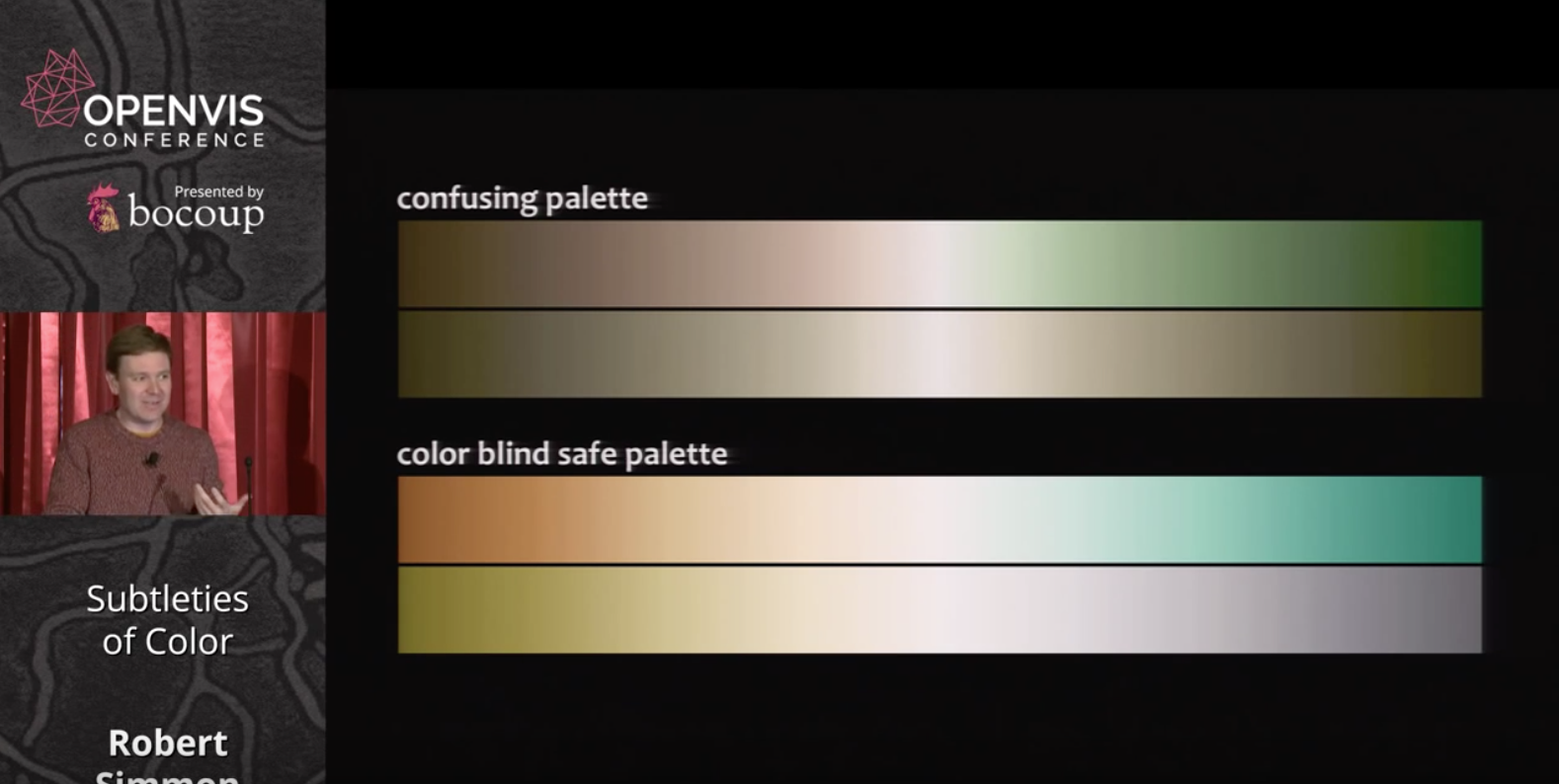
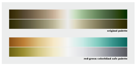
In addition to the above, Simmon mentioned Color Blindness and that visualizations should be constructed to be read by as many people as possible. He referenced color blindness and how NASA used a color blind pallet for many years, citing the example below:
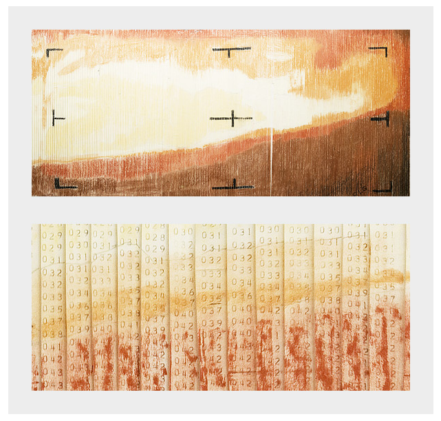
In addition to the OpenViz video, Simmons has written blogs. In both the video and the blog he mentioned the first Mars photo which turned out to be "paint by number" since it took so long to print they used pastels to map the colors (as seen below) before the actual image came off the printer:
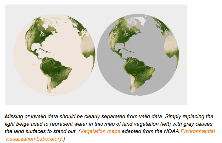
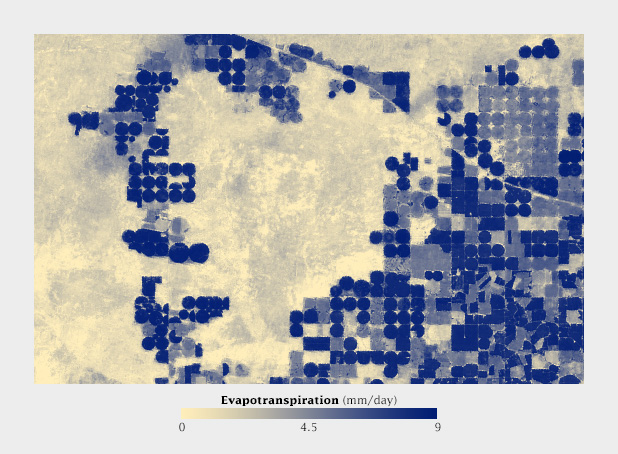
Simmons blog post carefully documents his OpenViz lecture. One interesting point is in his interpretation of "Use Color to Separate Data from Non-Data." As seen in the below image he quotes, the use of the grey scale is easier for our eye to detect the changes of vegetation on land.
Simmons over all discussion is geared at making data visualization more literate for more people. One final point he makes that is quite interesting is that color choices across cultures can be interpreted quite differently. He cites the below research on interpretation of emotions and references the fact that "red" can be perceived differently in different cultures.
In summery, I really thought deeply about color: lightness, hue, and saturation deeply from this discussion. Thank you for the enlightenment.
Questions raised:
(1) Is culture important for interpretation of color? Does anyone have a good example?
(2) In your opinion will using the LCH pallet increase visualization literacy? Why/why-not.
(3) Did anyone have any addition suggestions about color choices based on their own personal experiences and/or readings?
In his blog series and video talk on encoding data through color, Robert Simmon makes a strong case for strategic uses of color in visualizations based on how humans perceive color– both technically and culturally. As we learn, this often means throwing away the rainbow scale in favor of a continuous or monochromatic palette, using content context to determine hue selection, and how spacial elements/proximity can be used effectively on atomic and universal visualizations.
Theory and Sequential Data
We often think of color within the context of the visible light spectrum–and that's correct--however, all colors in the spectrum are not equally distributed. To me, this is the most critical point in all of Simmon's discussion of basic color theory to support his subsequent points and principles.
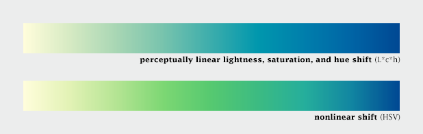
Computer colors are linear and symmetrical, human color perception is non-linear and uneven
Because of the point above, we need to manipulate the liner shift in colors so we can perceive a consistent gradual change across the palette, even if it's not technically consistent. This is where the design side of visualizations come into play. (This is not much different than the concept of centered vs. optically centered). Our eyes work with our brains to play tricks on us, and we as designers need to adjust for that so as to not accidentally create optical illusions in visualizations which need to be universally understood.
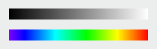
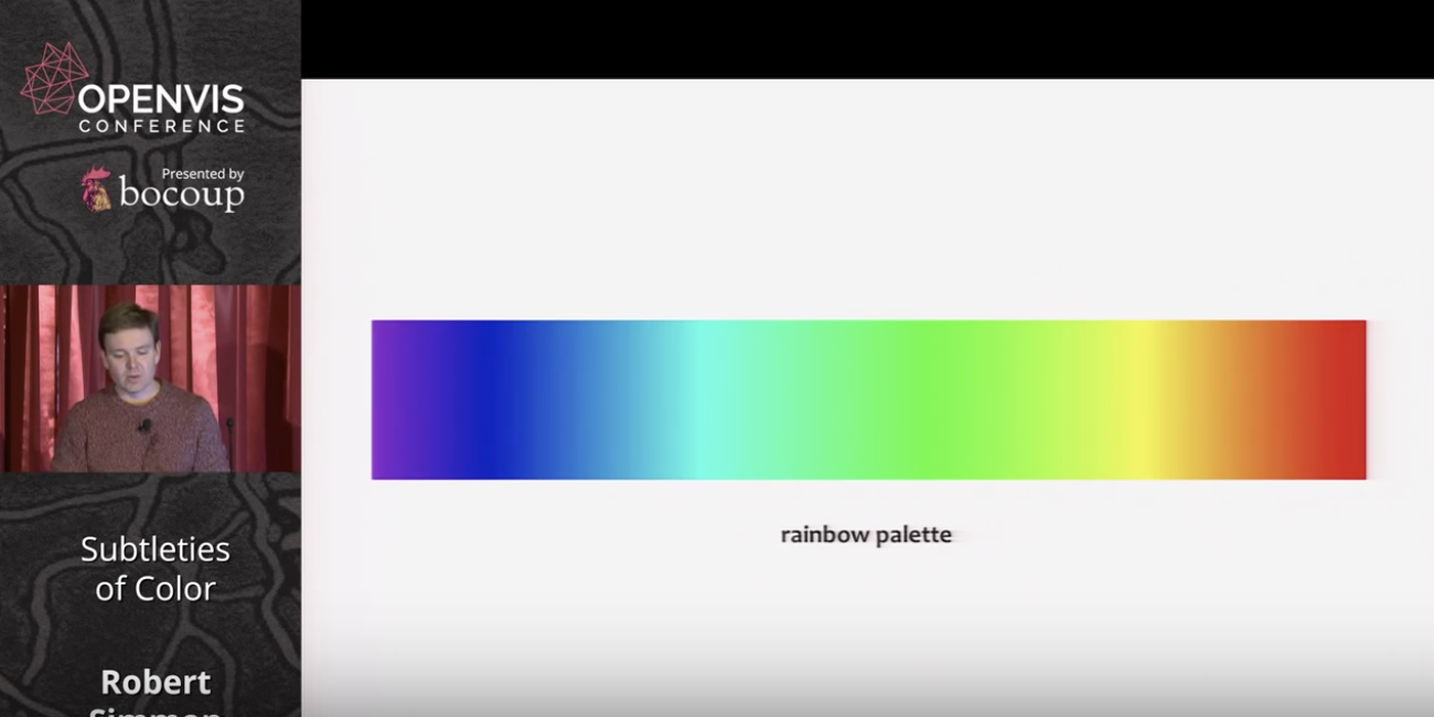
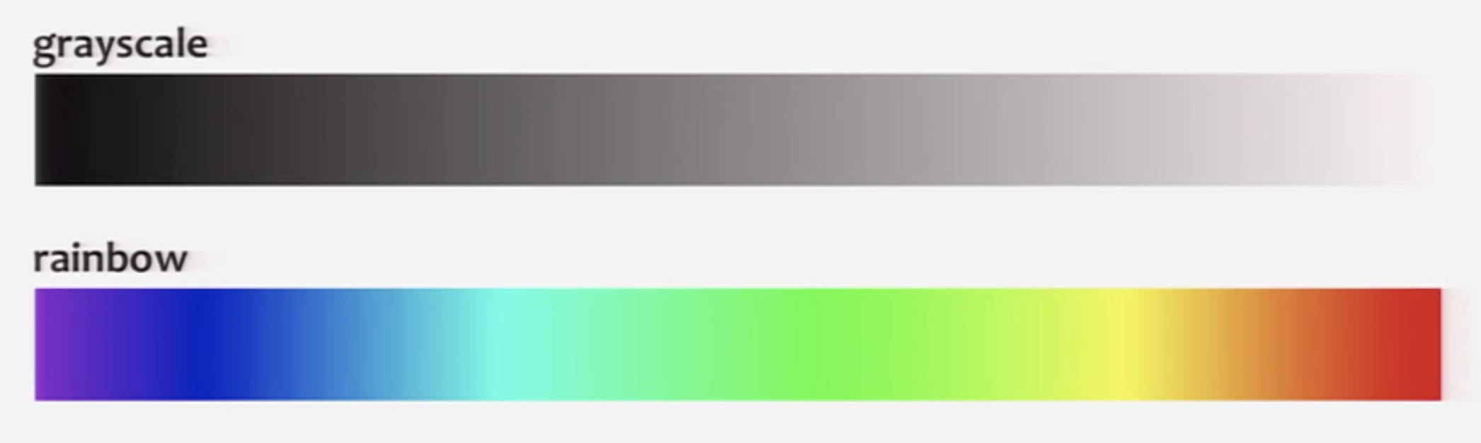
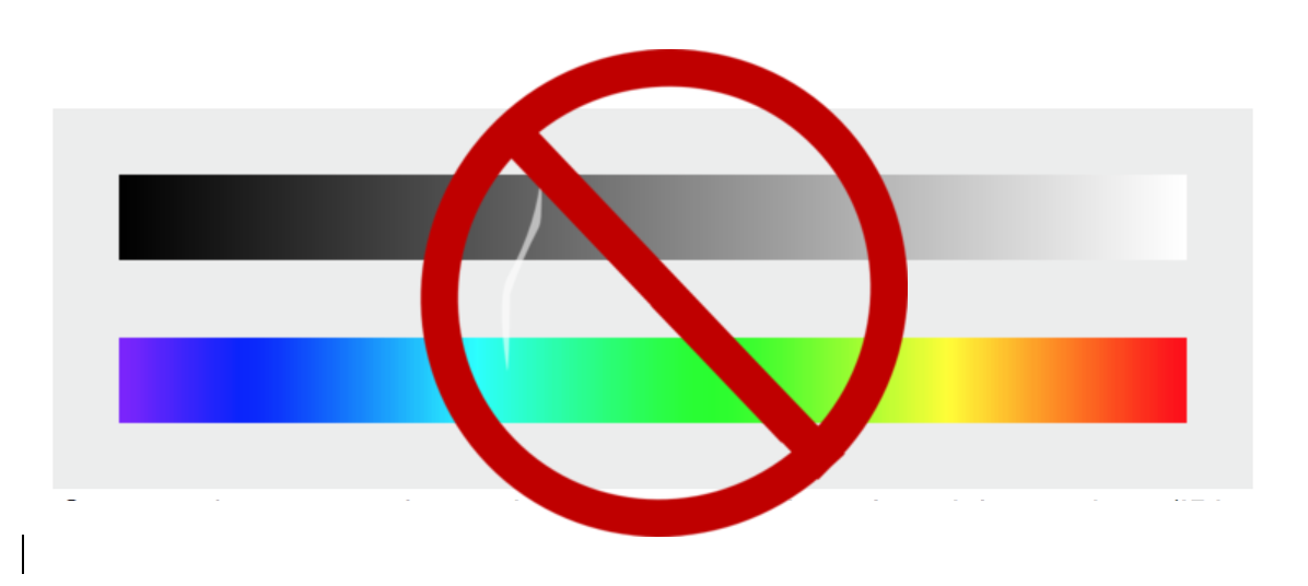
Rule: basically, just don't use rainbow palettes visualizations with sequential data. Even if they are more pleasing to the eyes and provide contrast (which is often seen as a good thing in design)–our brains mess up the scale because we don't perceive the shift in colors correctly. The difference in 1–2 must be perceived the same as the difference in 9–10. Adjusting the lightness of a color will accomplish that both technically and to our eyes; however, adjusting the hue across the rainbow will not. Simmon's calls out the fact that the range of green is way larger than yellow, amongst other issues.
Greyscale monochromatic vs. rainbow palette
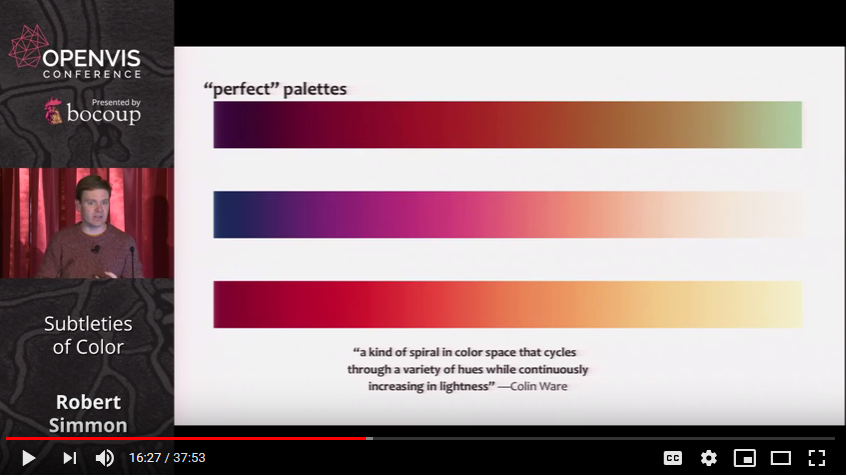
So what's the perfect palette?
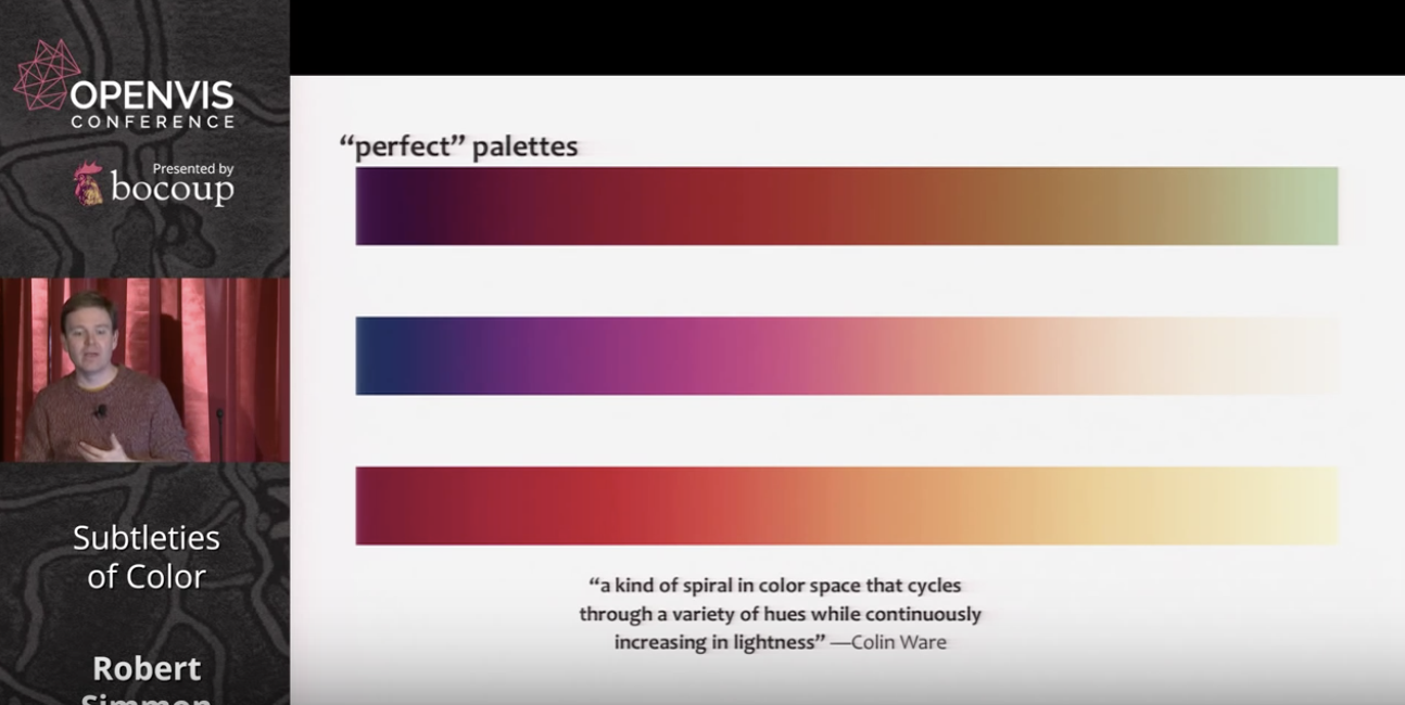
Combine a linear, proportional change in lightness with a simultaneous change in hue and saturation
The continuous, smooth increase in lightness preserves patterns, the shift in hue aids reading of exact quantities, and the change in saturation enhances contrast.
These palettes above are perfect for continuous/sequential data. Divergent or qualitative data (i.e., categorical) can benefit from contrasting sharp hue changes, which he gets into next.
Divergent Data
If you need to visualize divergent data (data on either side of a breakpoint) like profit vs. loss or any positive vs. negative change, you want the positive change to have a sequential palette, and the negative change to have a different/contrasting sequential palette.
If this is done correctly, we can very quickly and simultaneously evaluate the magnitude of the positive change, the magnitude of the negative change, and the difference between the negative and positive changes together.
See the graphic below to illustrate this point.
Perfect example of divergent data using two distinct sequential palettes
Categorical Data
If we are visualizing categorical data, color is used to distinguish between values. Here, contrast is critical and therefore, changes in hue work very well.
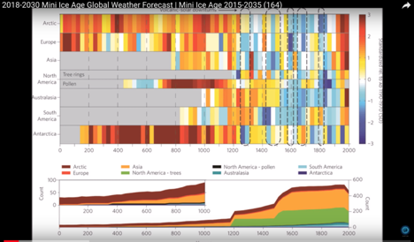
But what about when the categorical data is also continuous within categories? This is where it get complicated. We are basically combining everything we've covered so far into a single graphic. Although, it's a little chaotic, I think the graphic below beautifully makes sense of this.
By clustering the similar categories together (if possible), we can perceive the difference and similarities in the contrast and the magnitude of the values within the categories.
I was happy Simmon's addressed color blindness in his talk at this point, as I was waiting for him to address it. Basically, the takeaway here is that there are "safe" and not safe palettes to use for the population that does not have the ability to perceive the full color spectrum. When using color to convey meaning (i.e., coding data to color), this is extremely important.
Intuitive Colors
Now that we understand how to use color lightness and saturation with sequential, divergent, and categorical data, it's worth addressing what colors to pick. Time to meaningfully select your hue(s).
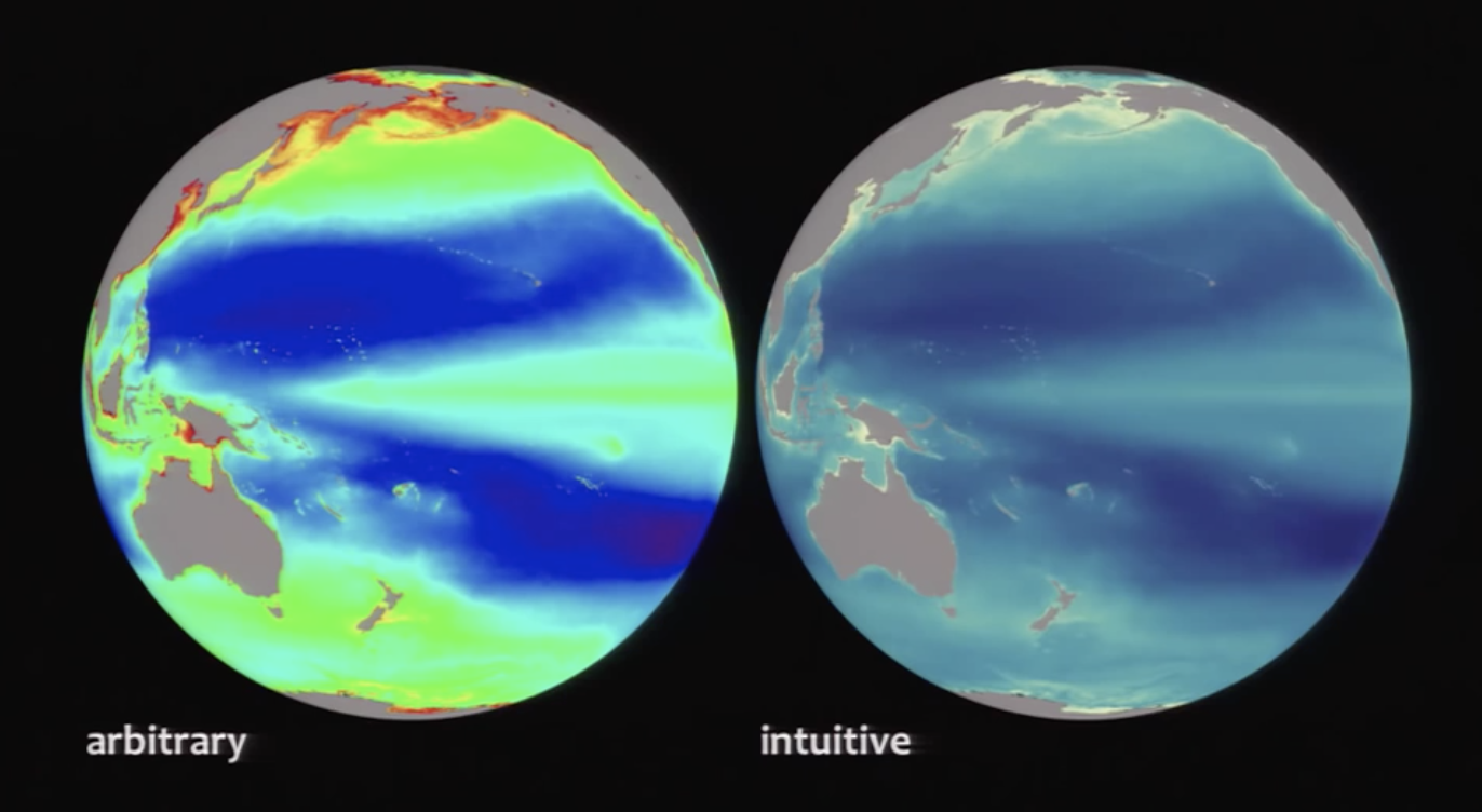
Red vs. blue vs. green? When should I choose what? This answer depends on the content and the culture. The visualization comparison below helps communicate this.
Crude interpretation: water is blue, land is green. That makes sense to everyone and should be used as such. Communicate the most meaning with the least amount of stuff (one of the 10 commandments of design i'm paraphrasing, obviously). By applying that principle here, we can pack more meaning into the usage of color. You know you're looking at water on a planet if there's a lot of blue on a sphere on a black background. Intuitive hue selection reduces cognitive load.
Additionally, we should think about color in different cultures. In western culture, red is passionate and fiery and maybe even evil, but in eastern cultures can be associated with happiness. All we can do about these cultural differences is be aware of them and your audience when producing visualizations.
Aesthetics and Conclusion
One of the more interesting points towards the end of Simmon's piece, is the role of aesthetics and judgement calls, especially within the meaning of color choice (hue). His example of the red palette to communicate heat makes sense on a global scale, but when zoomed into a specific area, the palette doesn't hold up. Interestingly, it's not that the palette doesn't hold up from a technical perspective (it absolutely does), but for a reason that's hard to explain, it seems to communicate the wrong information. It looks like the white is the hottest now, instead of the red– opposite of how we perceived the graphic on a global scale. And the funny thing is, I totally see it too even though I know it's not what the visualization is communicating. So he changes the color at the zoomed in perspective to adjust. That's the point. We need to use our judgement as designers to adjust and tweak, even when something is already technically correct.
It's a little frustrating that at the end of this rules based semi-technical guide for using color in visualization, it still ends like any designer would conclude–with ambiguity. Basically, all the previous rules generally hold up, but sometimes they don't. And were not really sure why these rules don't always hold up (which makes them principles and not laws) but it's up to you as a designer to use your judgement, even if that means breaking the principles.
A NASA data visualization expert, Simmon explores best practices for color, grounding his presentation in the science of visual perception and visual culture.
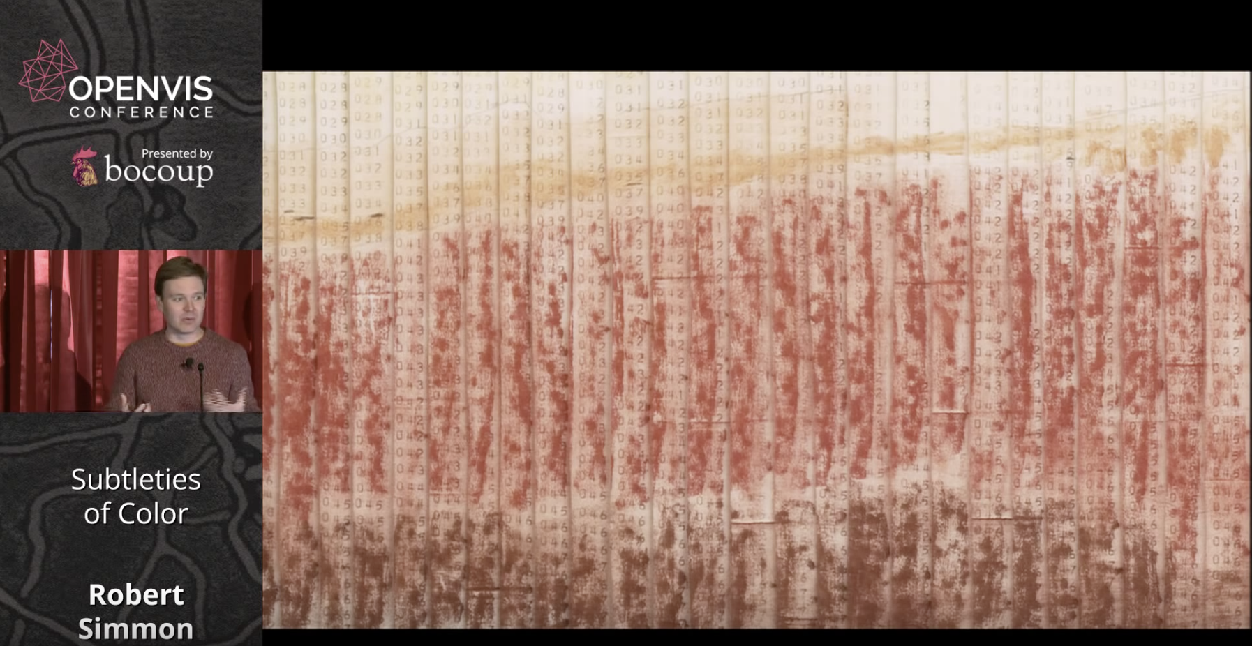
Simmon begins by stating that the purpose of data visualization is to illuminate patterns and relationships hidden in numbers. He illustrates this with an early map of Mars' surface that was hand colored in to reflect numbers transmitted by a space probe.
He then goes on to discuss the divergence between the objective reality of colors and the colors that we see as a 'construct of brain processing.' Simmon points out that our vision evolved to 'see the lion hiding in the brush.'
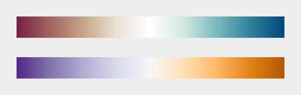
Since color ramps on computer monitors are linear but our response is not, we need a better approximation of visual perception than the RGB scale. While the HSL scale is closer to human perception, this need resulted in the creation of the LCH color scale as per below.
Following his presentation of basic color theory, Simmons next turns to best practices for using colors in data visualization. He refers to the long history of cartography and outlines three types of data that require differing approaches: sequential, divergent, and qualitative.
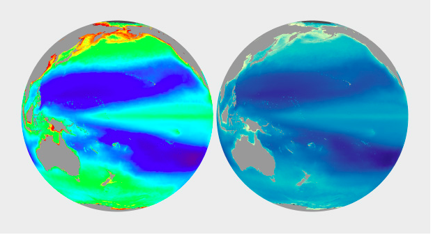
He prefaces his discussion of best practices by referring to the problems inherent with rainbow and grayscale palettes. Simmons says rainbow colors are suitable for divergences, but less so for other types of data. Grayscale is problematic due to surrounding color tones effecting perception of lightness. For an example of the problems inherent to the rainbow palette, the below example shows little difference in green hues, despite the number values being an even progression.
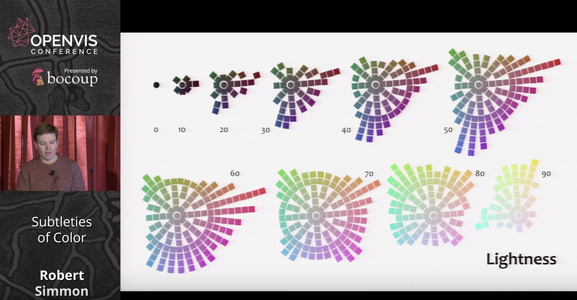
Colin Ware, however, has proposed palettes that cycle through hues and saturation while increasing in lightness. These are useful for sequential data with a progression from low to high values.
Divergent palettes on the other hand are suitable for cases when emphasizing outliers, as in anomaly data, or profit/loss visualizations.
For qualitative data, such as for example different political parties in a multiparty system, he proposes a rule of thumb called 'magic 7' in which 7 colors are used. This can be extended by plus or minus 2 for 5-9 categories altogether.
Simmons next discusses issues involving color blindness, presenting safe palettes available online for common green-blue issues.
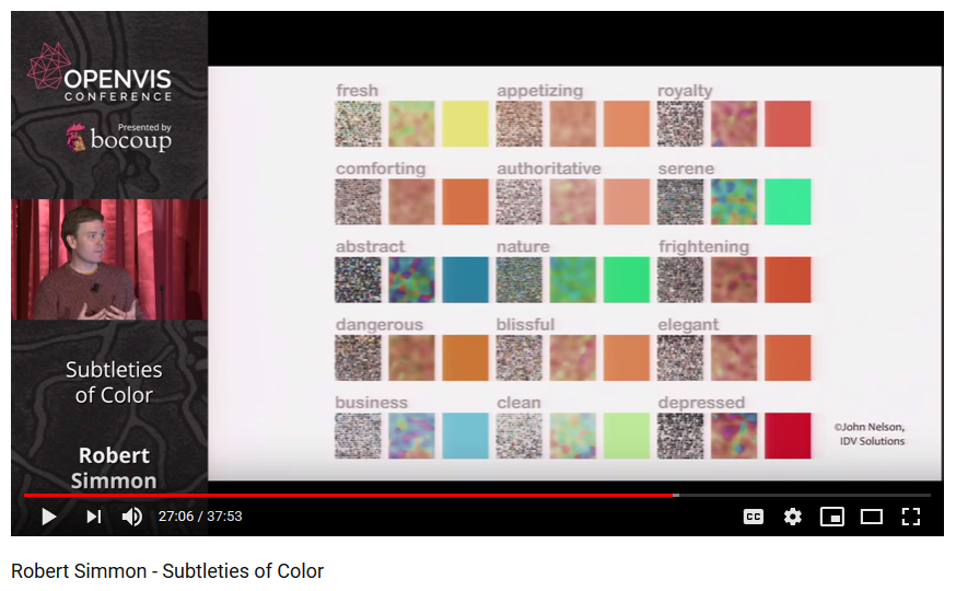
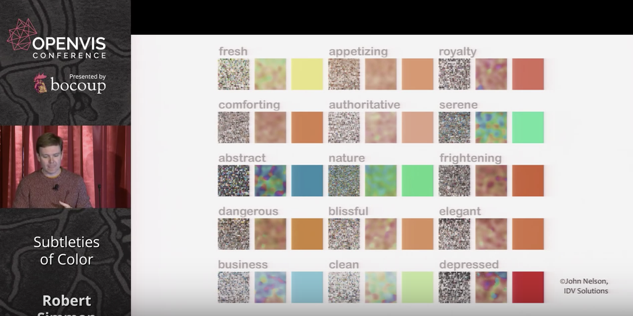
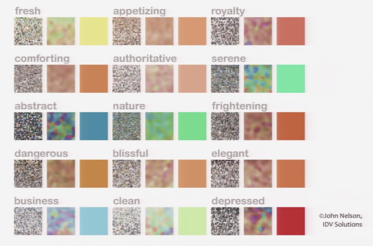
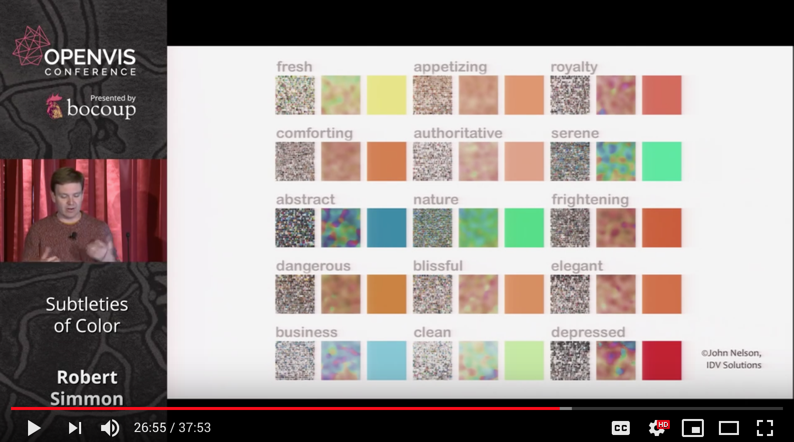
Symantic, emotional and cultural associations of color also need to be considered in visualizing data. He presents as one example the fact that in the west the color red is associated with anxiety and danger whereas in China it's linked with good luck. He also displays a fascinating chart of qualities people associate with different colors.
He makes the point about our intuitions regarding color dramatically with two examples of deaths in the Iraq war, one in red and one in blue, conveying rather different messages with the same data.
Simmons stresses the usefulness of color in indicating thresholds, or to indicate no data at all, as in a hurricane map of the oceans where gray indicates land.
He ends his presentation by listing available tools, such as the online Color Brewer palettes, and stressing that aesthetics matter to data visualization, because 'creating something attractive is a tool to make our data visualizations more effective.'
Aside from its wealth of useful, evidence-based tips for selecting color, what stood out to me from Simmons' presentation is the divergence between objective color values, and the way they are perceived. This presents challenges that, while cartographers have been solving them intuitively for centuries, have only been understood scientifically quite recently.
In Subtitles of color, Robert Simmon talks about how color was first efficiently used to denote numerical values by the cartographers. He extensively talks about the following aspect of usage of color in data visualization:
Basic color theory
- Ways the retina detects colors : the cells in our eyes respond to different wavelengths -> compared with the RGB color channels on the monitor - If we describe color spaces based on HSB (it's a better representative of how we think about color & how our brains process color) - Although, there’s an objective reality to color that it’s a representation of wavelength, the colors that we see are tricks of the imagination and there’s no perfectly objective view of color (James Gleick - on a radio lab podcast) - psychology of color: what we see and what our brains are telling us is out there is a construct - processing is going on from the moment light hits the retina and continues through the optic nerve into the brain where we are processing vision which is a constructed reality - so that we can interpret it, move through it and react to it appropriately.
Using color in visualization
- cartography (100/200 yrs older concept): 1823: map : temperature zones across the globe : rainbow palette works in this case : cartographers have been encoding data for 190 yrs - bathymetric map of crater lake : giving a sense of depth of the lake, the land cover classification and the topography at the same time
- grayscale palette (flaw: surrounding tones affect our perception of the lightness of the smaller area of color) and rainbow palette (flaw: it’s uneven- perceptual change of the same amount can appear to be larger for cyan- yellow whereas appears to be smaller near green areas comparatively, — it varies from dark to light, dark to light, dark to light thereby breaking the natural order of the colors & usage the entire spectrum ) - Colin Ware describes an alternative palette : spiral with changing hues and with increasing brightness -> to get the perceptual linearity of the grayscale palette and at changing color hues) - Our visual system is driven by the lightness and color hue is more of a secondary component affecting it, (LCH lightness, saturation, hue vs HSB) LCH has smooth grad has smooth gradation (HSB is better than rainbow but has a quick transition from one hue to the other)
Then he talks about how all these palettes show a gradual increase of one or multiple values so they are basically best suited for sequential data type. This pops a question 'what are other types of data'? Simmone then goes on to describe Sequential, Divergent (dataset with a breakpoint in the middle of two opposing ideas) and Qualitative data types (data is broken into discrete categories).
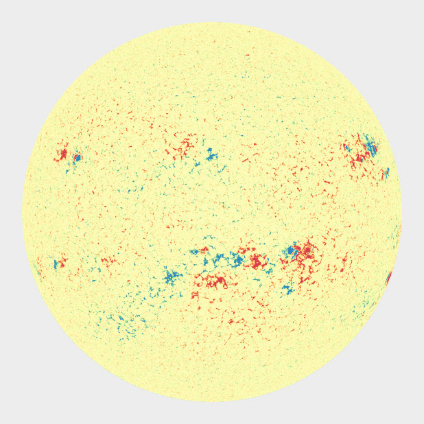
Simmone describes color application to these different types of data. - Divergent palette: two sequential palettes sliced together with the center being a light neutral color— when you want to emphasize your outliers. I feel, this method is quite limiting. What if we want to look at the entire data and not just outliers? - What came up next in his talk, this question was answered to an extent: Magnetism on the Sun: he broke the rule of using a neutral gray color by using a light yellow as a neutral color so that the rest of the initial colors don’t blend in
Color Blindness Red-Green color blindness (8% of males and 5% of general population) Solution? Color blind safe palette Should we not be using a color blind safe palette all the time? How does it limit our choices/established methods of color application to data?
Use of color in context
It is important to use color intuitively but in a right context. What one color may mean in one context can differ a lot when it's used in another.
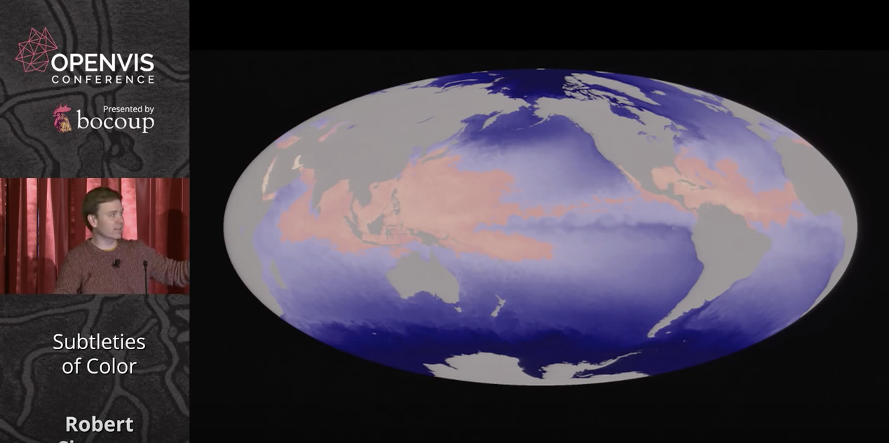
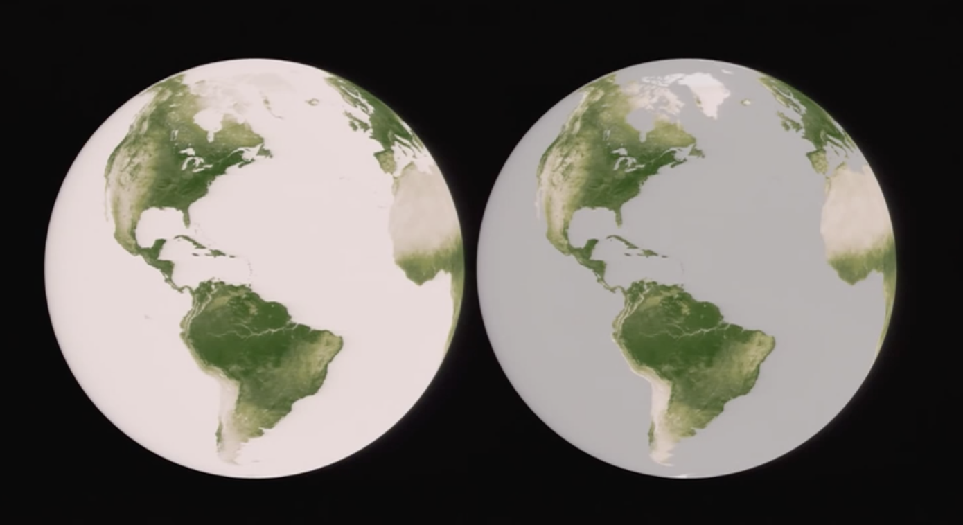
A lot also depends on the audience as well. Their culture and the associations colors have with it is important. Simmon explains the contextual use of color through the data visualization depicting 'the amount of vegetation inside the ocean and on land'. It's tricky as both represent the same entity but with a different context. Hence, color can be effective used to represent different contexts.
Color can also be used to indicate thresholds by using strong contrast or color and no-color areas. It is important to represent no-data as well as representing data. Since each complements what the other means. Human eyes non-attentively process areas distinguished by a strong color contrasts.
Evoke an emotional response
Although, with the help of collage a mood-board can be created to represent an emotional response to colors, we cannot expect the emotional responses to the colors to be universal.
In his 6 part series, Robert Simmon's approaches colour use in visualizations with intuitive explanations and examples.
Colour is incredibly important to the visualization process, as Simmon's illustrates - the goal of data visualization is to illuminate data and essentially show patterns/relationships that may have otherwise been hidden. Careful use of colour enhances clarity, aids storytelling and draws a viewer into your dataset. Poor use of colour can obscure data or even mislead.
The author lays out a couple of guidelines when it comes to colour in visualizations:
Think about colours in lightness, hue and saturation rather than in terms of green, red, blue. Computers process a different kind of RGB in comparison to how humans perceive those colours. Computers calculate light linearly, while humans perceive colours exponentially. Lightness speaks to black and white. Hue speaks to hues of colours: orange, purple etc. Saturation refers to dull to rich colours.
Use divergent palettes with divergent data. Divergent data has a middle point or a "break point" in the centre often signifying a difference.
Think about colours and accessibility. 5% of the world population is colour bling and cannot see the red/green scale. As well, different cultures process colours differently, red is a colour of anxiety in the West but signifies good luck in the East.
Use intuitive colours when possible. For example: use shades of blue when representing data relating to the ocean.
Think about your dataset categorization. Any dataset can be categorized as one of three types - sequential, divergent and qualitative - each suited to a different colour scheme. For example: don't use gradient palettes for categorical data.
Use tools to help your colour journey. The author mentions a few tools such as: ColorBrewer, the NASA colour tool and chroma.js.
The author ends his piece with some hard cold truth. He says what separates an adequate viz from good and great isn't a matter of following rules it's a matter of aesthetics and judgement. Aesthetics and judgement are a key part of the colour process.
Questions for reflection and discussion:
What's the best way to visualize revenue loss/growth when the default is to gravitate towards reds and greens?
Something that has been on my mind for quite some time: how can we better illustrate gender data rather than using pink and blue hues?
I watched Robert Simmon’s “Subtleties of Color” presentation at OpenVis Conference. Even though Simmon focused on color in his talk, I think he made some nice overarching comments on data visualization in general. I particularly liked when he said the purpose of data visualization is to illuminate data, showing patterns and relationships that are otherwise hidden. It felt like a graceful and succinct explanation of an abstract concept. Simmon also says an aim of data visualization is to show underlying data as accurately as possible. I think that’s an interesting statement when said next to the purpose of illuminating data. It articulates responsibility when practicing data visualization while also instigating a long list of questions in return. What is underlying data? How do we know a visualization is accurate? How do we know a visualization is accurate as possible?
Simmon does a great job at relaying color’s important role in data illumination. I liked his discussion of how there is no perfectly objective view of color and how it’s a constructed reality. This idea lends itself well to data visualization as a whole, in that there is really no objective choice of visualization for any one type of data. Some choices are better than others, but there is no prescribed way to measure if a visualization is perfectly satisfactory in a certain form.
A small anecdote, I thought it was interesting that he mentioned the trouble with dark yellow because it doesn’t exist in our perception. Just a half hour ago for another project, I tried to darken yellow on a graph, so it would show up better on a white background. As you’d probably expect, I didn’t get far. I tell this because I think it translates how important understanding color is, even its most basic theory, for data visualization as a whole. You can be a fantastic coder and wonderful designer, but if you don’t understand color, your visualizations can fail every time.
Additionally, every time I try to understand color in terms of data visualization, topics often don’t stick super well after the fact. It always felt convoluted and unrelatable—a black box of sorts. However, I think learning color and data visualization in the context of cartography was one of the most successful explanations I’ve encountered. There is an aspect of maps that works well with these concepts. The colors themselves are grounded in tangible translations.
I had a lot of fun reading Robert Simmon's Subtleties of Color, especially through the perspective of a scientist. I used to work in a retina neuroscience lab, and although our specialty was not in phototransduction or visual components of the circuit, I appreciated seeing the field of visual neuroscience having an impact on other areas of life. It was eye-opening to observe just how much visual perception has a role in our interpretation of color, and how much color theory is rooted in it.
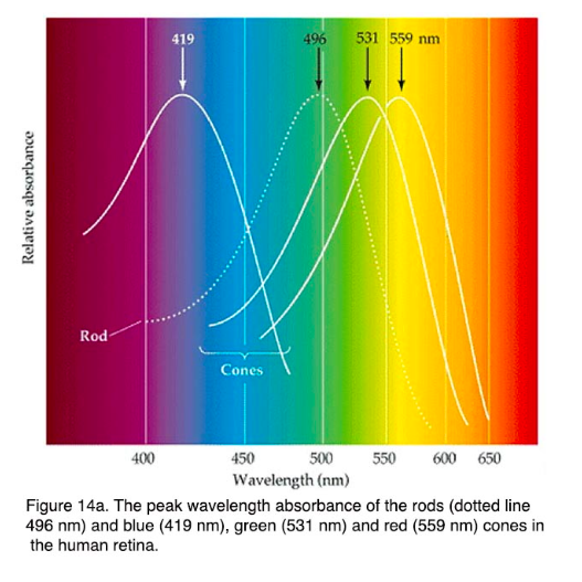
First, the concept that computers do not process colors in the same way that humans do: our retina uses three types of cone photoreceptors (L, M, and S types), which process broad wavelengths of light, corresponding to long, medium and short wavelengths (peak absorbance - 560nm, 530nm, and 420nm respectively). We perceive light exponentially rather than linearly, as a computer does, and our ability to perceive different colors is not equal. This gives rise to the necessity for translation of colors on a screen, because it is one of our main methods of looking at visual information.
It was entertaining to read his remark on how scientific visualizations are often difficult to understand:
Some conventional color schemes, especially those used in scientific visualization, are difficult for non-experts to understand. In fact, one study found “satellite visualizations used by many scientists are not intelligible to novice users” (emphasis mine). Visualizations should be as easy as possible to interpret, so try to find a color scheme that matches the audience’s preconceptions and cultural associations.
This statement was significant to me because more often than not, when presenting scientific data, we (as scientists and researchers) get so caught up in the accuracy of the data that we do not take into consideration how readily it can be interpreted by people who are not specialized in that particular field. It is even a problem within a single company (i.e. my workplace), where people in differing programs (more pharmacology based vs neuroscience based) have trouble interpreting data of other teams, simply because the presentation is not intuitive (even though it is the standard for that particular field). If it is a problem for people who are specialized in science, it is obvious it will be a problem for non-experts. If we cannot communicate scientific data effectively to the public, we cannot use our findings to induce change and advancements in society--and ultimately, that is the goal of the scientific pursuit.
Rainbow palette vs naturalistic palette
Generally speaking, I thought the series gave very practical tips on how to go about picking the right colors for our visualizations, and what questions to consider when doing so. It will be a good resource to comb through again when creating our own visualizations.
Robert Simmon discussed the importance of using color schemes in data visualizations and what makes the color scheme "perfect". Before choosing the color scheme, it's important to know the type of dataset that we want to translate. According to Simmon there are many types of data, each type can be visualized differently, the most common one is the "sequential data", the two other types of data Simmon mentioned are: divergent, and qualitative.
Sequential Data "is best represented by color palettes that vary evenly from light to dark, or dark to light, often with a simultaneous shift in hue and/or saturation."
example of color scheme:
(100 - 0)
Divergent Datawhen data is unstable and changeable, it decreases or increases like stocks. The translated color scheme would look like the dataset, the color increases and it stops, then it decreases.
example of color scheme:
(100-0-100)
Qualitative (Categorical) Data Unlike sequential and divergent data, qualitative data does not show relationships, instead it's used to show the distinction between certain areas/elements that are not necessarily related to each other.
example of color scheme:
Thoughts I work with colors on daily basis, and because I am graphic designer, my ultimate goal is to create attractive pieces (most of the time). Yes, designers solve problems by using the perfect layout, grids, typefaces, visuals, colors...etc, but how many of us have ever thought about the "perfect color palette" as Simmon defined it?
In the graph (Iraq's bloody toll), he talked about the impact of the red color, and how the message changed when the designer played with the orientation, color and title. I think this is a good example of misleading data visualizations.
Psychology of colors, rainbow is happiness, red is danger, green is mint and green tea. Do you believe that colors really stimulate our brains?
I enjoyed this weeks reading a lot, because of it’s amazing overview over the different aspects of how to treat color in data visualizations. I liked how Robert Simmons manages to contextualize his experience with color but always makes his main points about design practice.
The most important learning for me in this reading is to be aware of consistent variance over a color palette or gradient and to try and implement it as best as possible.
There are two aspects of consistency in regards to color schemes or gradients:
They should preserve the form of the data: Regardless of the position on the scale steps of equal quantity should be conceived as the same relationship (1 to 2 should express the same relationship as 101 to 102). This is what greyscale gradients do best
They should avoid the perceptual errors induced when nearby areas of different color or lightness shift the way we perceive a color. (This is the so called simultaneous contrast). This is what gradients over color hue do best.
As Simmons lays it out it made perfect sense, that a good color gradient for data visualization would then combine both and the image of the spiral really stuck with me, because my expectation had been, that a “perfect” perceptual gradient was more a straight line through the color space.
“Combine a linear, proportional change in lightness with a simultaneous change in hue and saturation. Colin Ware describes this type of palette as “a kind of spiral in color space that cycles through a variety of hues while continuously increasing in lightness” (Information Visualization: Perception for Design, Second Edition).”
Comparison of a “perceptual linear” spiral and a nonlinear (arithmetically computed) gradient.
Another point where I agree with Simmons is his advocacy for subtle and muted colors. He showed very well and cautiously designed examples and my absolute favorite was this one:
This very modest use of color allows to even add other layers of information if needed on top of it. The Switzerland mobility mapsare also amazing in this respect.
My questions are:
Robert Simmons writes that the perfect color tool doesn’t yet exist. That was in 2013. He announced he would be developing one. Did you find out if he did or if there is a new, more complete color tool?
In the text there is a warning that figure ground relations can change the way a visualization is read. When designing a color scheme you might sometimes loose sensibility of such subtleties, because you have your work much longer in front of than your audience will. What are your strategies to look at your own work “like it was the first time”?
Good visualization choices also profit form good contextual design choices. Which of these contextual design choices are specific to data visualization and can/should be applied as a rule of thumb? Or to put it another way: Should a data visualization establish its own context or should it subordinate to its context?
There are so many references in this reading, that I decided to make a small collection of those, that I might want come back to:
I'm starting writing having completed the video and before reading through the blog posts. I loved the video. Robert Simmon manages to disrupt so much of what I though I knew about color. Like him, I'm not a color expert but his approach to the use of color - the specificity of color - is at a whole other level. I'm not yet sure how I'll use the information from this series but I'm curious enough to begin my own line of research. The emphasis on even, gradation of color is fascinating. Like everything else in the world of Data Visualization it seems nothing is left to chance and every detail is considered.
I'd never realized the gaps or uneven color of the RGB or the rainbow palette. Nor have I given much consideration to the way we perceive natural vs computer color. While much of the video is about the practical function of color and how it might be used to best represent data I appreciated that he also spoke about using colors that 'make sense' based on the data being represented. Ex. using green to represent grass or trees.
He doesn't address this directly but this approach to color could easily be applied to the UX/UI development. Many of the issues he discusses, establishing hierarchy, clear boundaries, planning for color blindness, etc aren't specific to the world of data visualization.
The insight that lightness is the strongest of the three components of color (hue, saturation, and lightness) reinforces a practice that I've often applied when working on digital painting and illustrations - which is to view a piece in grayscale to better understand the clarity of form. It's tempting to use saturation and hue to compensate for indefinite shape and previewing work in grayscale exposes where and how color is being manipulated in a compensatory fashion.
Rather than rephrase the takeaway below I chose to copy and paste because the whole paragraph is useful:
"How to take advantage of the strengths of both the grayscale palette (preservation of form) and rainbow palette (preservation of quantity), while minimizing their weaknesses? Combine a linear, proportional change in lightness with a simultaneous change in hue and saturation. Colin Ware describes this type of palette as “a kind of spiral in color space that cycles through a variety of hues while continuously increasing in lightness” (Information Visualization: Perception for Design, Second Edition). The continuous, smooth increase in lightness preserves patterns, the shift in hue aids reading of exact quantities, and the change in saturation enhances contrast."
Types of Data
There are several types of data, each suited to different types of display. Continuously varying data, called , is the most familiar. In addition to sequential, Cynthia Brewer defines two additional types of data: divergent and qualitative. Divergent data has a “break point” in the center, often signifying a difference. For example, departure from average temperature, population change, or electric charge. Qualitative data is broken up into discrete classes or categories, as in land cover or political affiliation.
Sequential Data Vary evenly from light to dark, or dark to light, often with a simultaneous shift in hue and/or saturation.
Divergent Data Has a breakpoint in the middle. The merging of two sequential palettes with equal variation in lightness and saturation.
Qualitative Data Broken into classes or categories.
Questions
How does one use the CIE L*c*h (lightness, chroma/saturation), hue) color space in Photoshop (or other industry standard design tools)?
'Subtleties of Color' by Robert Simmon is a very decent and interesting research and lecture on digital color and its application to Data Visualization. Interestingly, unlike the art and design lectures I took before, 'Subtleties of Color' is telling the story of using color from a data visualization scientist objective view. What I find most intriguing is that he points out the weakness of the wide use digital color mode RGB system, which is not the way how human process color. Computer process color in RGB and the intensities are from 0-255, but human eyes see green as lighter than red and blue is the darkest. “The range of colors perceived by humans is uneven.” (Equiluminant colors from the NASA Ames Color Tool) This creates the problem when we are trying to pick and use the color from the RGB index. It is hard to match a set of colors with the same lightness only by adjusting the RGB value. Then the author introduced the CIE color spaces, which is a series of color spaces that classify color in a much more human user-friendly way. This is a very new knowledge to me, which I have never thought about before. What I used to do is manually matching the different colors by myself and I didn't question about the tool. Then, I quickly checked the lab color mode in Photoshop, and it is surprising to see how color responds tools differently compare to RGB mode. Another point that caught my attention is the section about the color blind problem. As a designer, it is significant to consider and take care our audience need. In order to convey our idea precisely through visualizing data or design, we should always concern that all the color languages we are using are passing to the audience correctly. Last but not least, those color tools introduced by the author are very handy. Those fragmentary color palette opens a new way of looking at digital color.
Random Notes:
Three Type of DV:
Sequential data | Divergent data | Qualitative data
Color has an objective reality, but the colors we see are tricks of the imagination, and there is no perfectly objective view of color -James Gleick
In his blog series, The Subtleties of Color, Robert Simon asserts that the main purpose of data visualization is to make connections and highlight relationships that may be difficult to identify using large amounts of numbers. Throughout the series, Simon analyzes various types of data as well as their preferred color palettes to emphasize the important story telling role color plays in data visualization.
When connecting color to meaning, Simon explains that designers should choose color schemes based on “intuitive colors”, meaning colors that “match the audiences preconceptions and cultural associations”. I found this especially interesting because it requires the designer to make a judgement about the audience and create an assumption about what they believe to be “normal” color associations.
However, as pointed out in the video, it is almost impossible to assume that an entire audience will have the same associations with color because our perceptions are shaped by our cultural backgrounds. For example, while western culture may associate the color red with being angry or dangerous, eastern cultures often connote red with happiness or good luck. This part of the article made me question all of the bias I have personally encountered in design and wonder if it is even possible to design for an international audience? Are there any examples of good design that is not skewed towards one culture and accommodates a variety of associations with color?
Additionally, throughout my undergraduate degree, I studied different aspects of design and found myself particularly interested in designing for accessibility. I appreciate Simon's emphasis on how certain colors become invisible to people with color blindness and ultimately suggests using a color blind safe palette. I truly believe that by designing with accessibility and inclusivity in mind, we ultimately create more thoughtful and well-designed artifacts that have the potential to reach a larger audience. However, in order to do so, we must acknowledge that our own perspective is different than our audiences and apply this information into our designs. This is easier said than done. What types of tools can we employ to take a step back from our work and limit our own personal bias within the data visualizations we create?
Robert Simmon is a data visualizer for NASA, so his primary output of work is within the Earth and natural sciences. In this series of essays, he writes about color theory and the various considerations one must make before beginning to visualize data. The first thing he did was introduce us to the origin of the use of color to visualize data which gives us an interesting link to his work and the early cartographers who pioneered the effective use of color in data representation. This makes sense. Cartographers have the privilege of having a large canvass to display a wide variety of data that could also include a naturally occurring diversity in color(s) that could simultaneously be universally understood: hot is red like fire, water is blue and refreshing, land is green if there is vegetation or various shades of brown if it’s arid land mass, and white and light blues for snowy tundras, etc.
In thinking about this author’s perspective, it takes me back to a moment in Kieran Healy’s article “What Makes bad Figures Bad” where he says this about the one of the common problems that plague the field of data visualization; “Some [problems] are strictly aesthetic. The graph we are looking at is in some way tacky, tasteless, or a hodgepodge of ugly or inconsistent design choices”. At first I balked at that assertion. As someone who tends to root for the underdog, I am naturally inclined to defend those who may not care about aesthetics. And hey, as long as the data is real and true, why should it matter what it looks like? I found myself trying to avoid getting caught up in conforming to beauty standards, but this is not up for debate. In data, aesthetics matter and should not be considered disposable.
There are many things that one must consider prior to picking the palette that will represent the data that you want to visualize. You have to consider the data itself, the audience that you are targeting or representing, the viewers genetics (e.g. color blindness), the cultural and subcultural references, personal taste, as well as the story that emerges from the data. There are three primary types of data and he goes on to provide reasoning for why color matters. First we must cover the three primary data types that he describes in this article: sequential,divergent, and qualitative.
Sequential Data- This is data that continuously varies from a high or low value over time, like income, temperature, and music etc. For this type of data, he recommends a palette that varies evenly from light to dark, or dark to light, and requires a simultaneous change in hue and saturation.
Example:
Finding a good real life example through a casual search was surprisingly hard. In the example below, they attempt to look back in time to predict the future of Australia's and our planet’s climate for the next 40 years. In fact it’s unclear to me if this can even count as sequential data. Thoughts?
Divergent Data- This is data that has what he calls a “break point” in the center which signifies a (what I assume to be) a sharp difference, like population change, a departure from the average temperature, or even an electric charge! (I’m not entirely sure how one would visualize this or what kind of data this would show, but now I’m curious). In other words, it shows a departure from the norm. In this case, a palette that has two different hues that vary from a central neutral color.
Example:
It was initially difficult for me to imagine how this type of coloration would play out in a visualization, so I looked for examples, and this stacked bar chart is a great tool to use in this manner.
Qualitative Data - This data type requires that the information be broken down into discrete classes or categories, which can then have color applied to them. In this case, the use of “intuitive colors” are probably best suited for this data, as qualitative data includes the personal accounts of people so applying colors to various categories and sub-categories should without question, be inclusive of the people/population being observed. It is advisable not to use more that 12 colors but in the case where there are more than 12 categories, it makes sense to group related data with related colors - like one big happy family!
Example:
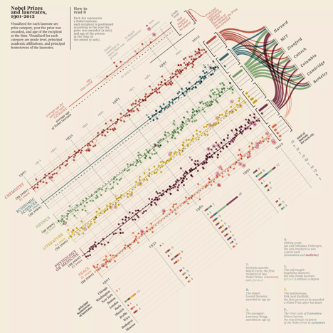
Fantastic example of how to use color to visualize qualitative data in this multivariate graphic that details the history of Nobel prize winners between 1901 - 2012.
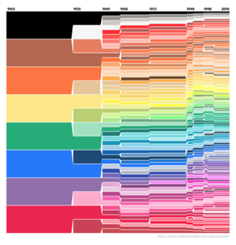
And check out this visualization of Crayola’s crayon colors from 1903 through 2010!
Binary data?
Oddly left untouched in his essay. Perhaps it's unimportant in the grand scheme of things?
Important Considerations:
The relationship between the light humans beings see and the colors we perceive is complex. To this end, it is always important to consider color blindness in your designs.
And last but certainly not least, Just Say No to these tired old palettes!
The grayscale & rainbow palettes we all grew up with have limited color ranges because computers process color in RGB, so when they are used to represent data, it becomes very easy to obscure data or even mislead people. It is our job to “illuminate data”, not hide it.
The author emphases the importance of using intuitive colors when creating visualization projects, which I have found more difficult when representing qualitative or categorical data using different colors. It seems like our human eyes start to perceive different colors when the number reaches a certain ceiling. I once saw a project work using 48 colors for 48 countries and it caused so much confusion, as I constantly need refer to the legend and remind myself which color corresponds to which country. Besides, as the main accents of colors human can easily recognize and distinguish are the main seven colors (while the nearby colors remain a little difficult to distinct sometimes.), the 48 colors have many that are the same in hue and only different in saturation and/or value, resulting in a great difficulty to distinguish them.
I think colors are really helpful when used to display density or distribution. However, when it turns to represent the categories, it means different value for each of the color, and requires the audience to differ each color from the rest pairwisely. In this case, unless the number of categories is small, I think it is better to avoid the color representation of the categories.