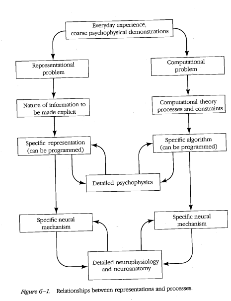
Read the frontmatter and first chapter: Image, Interpretation, and Interface. Also consult the relevant 'plates' in the Windows section.
Pick one of the works cited in the chapter to investigate and collect some imagery and/or context to be included in your write-up. Take your pick of any books/essays/artworks mentioned in the text itself, or highlighted in the red sidebar text in the margins.
In this chapter, Drucker provides us with some historical context on the evolution of data visualization from its beginnings. Though Drucker's writing can be quite dense, she is able to apply scientific concepts to historical concepts.
Key topics discussed within this chapter:
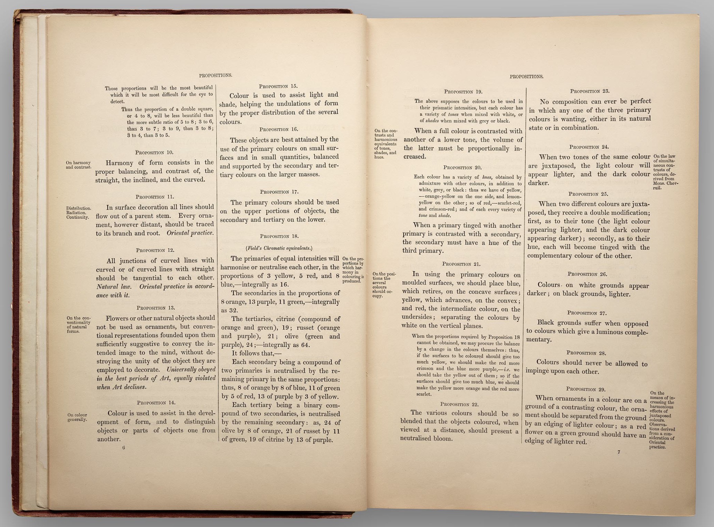
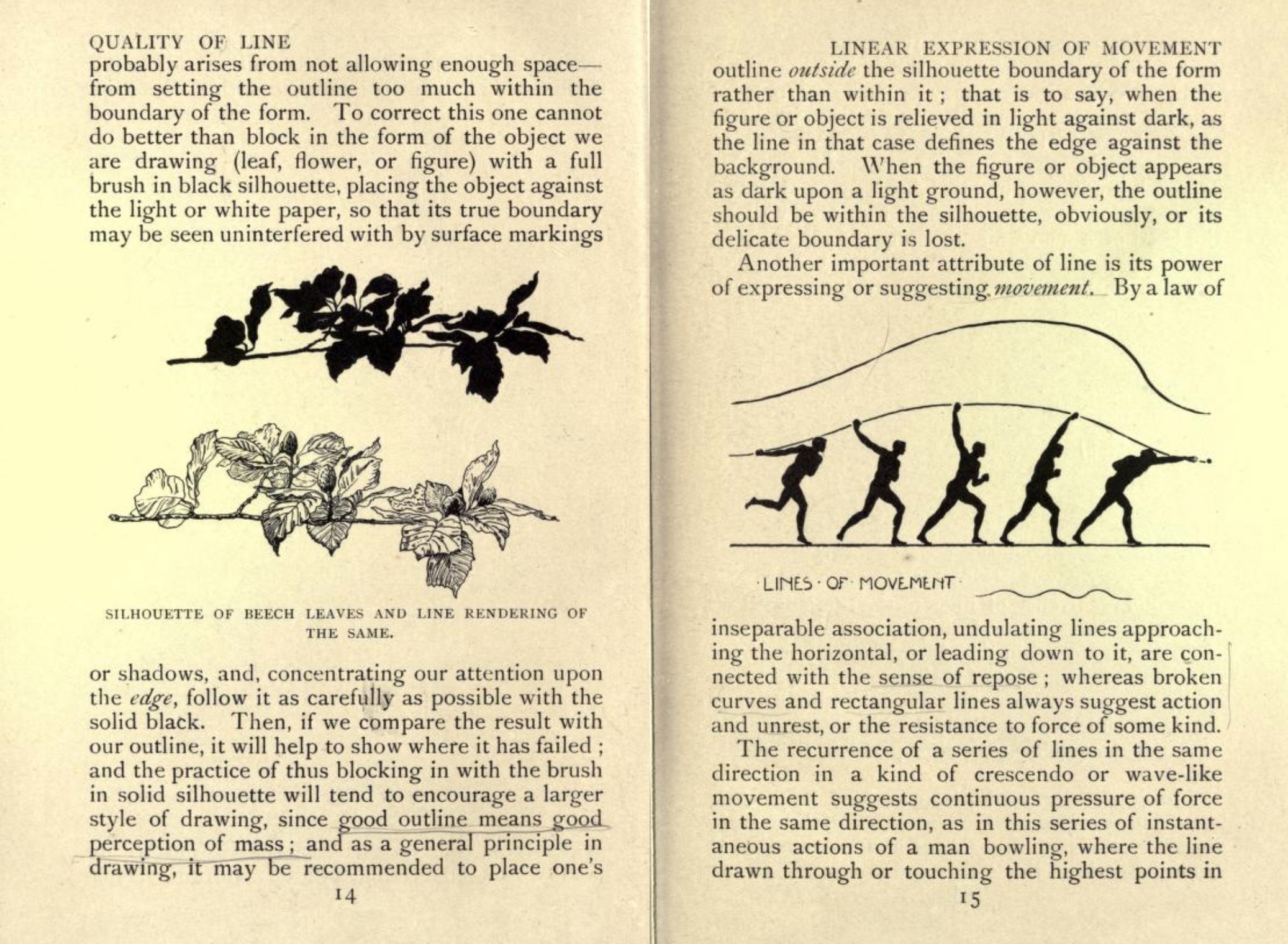
The theoretical study of graphical elements and principles developed differently in art history than design.
The late nineteenth century is when we began to see the idea that design was a skilled profession whose principles were graphic, not pictorial and whose language was built on an analogy with verbal language.
The Gestalt principles emerged in studies of psychology in the 1930s.
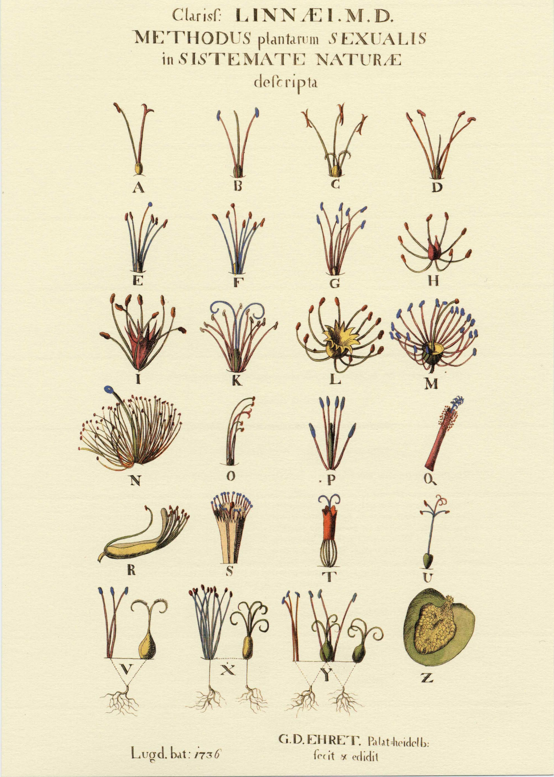
Georg Dyonysius Ehret's illustration of Liannaeu's sexual system of plant classification (1736)
Source: Google Images/ Drucker: Page 45
I chose Georg Dyonisius Ehret's illustration from Graphesis to discuss. I have truly been fascinated with botanical prints ever since growing up in a household that had several antique botany prints. I have also been fond of the aged paper, the beautiful flora illustration as well as the information provided about that respective plant.
Botanical illustrations can be traced back to sometime between 50 and 70 CE when a book was created by a Greek botanist to help readers identify plant species for medicinal purposes. Prior to the invention of photography, botanical illustration was the only way to visually record the many flora species.
I love Ehret's print because it's minimal, has a perfect visual grid and all of the elements being referred to are numbered while at the same time, looking like they have movement.
Lets look at a few more illustrators for comparison:
Maria Sibylla Merian
Merian (1647-1717) was also known for her botany illustrations. Her illustrations helped contribute to the advance of entomology in the late 17th and early 18th centuries.
Cacao (1705)
In Merian's illustrations, we see a more exotic variety of plants that weren't native to the European continent. However, unlike Ehret's illustration, we are missing some additional text to provide more context to the illustration.
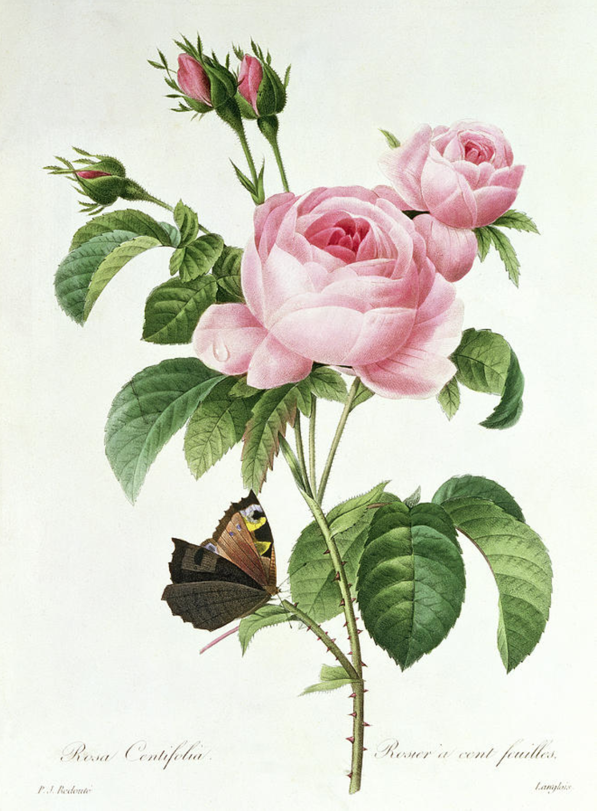
Pierre-Joseph Redouté
Rosa Centifolia
Redouté (1759-1840) was also a European botanist. His rose illustrations are some of the most stunning botany illustrations. In the Rosa Centifolia image - at the bottom, we see that he is providing both the scientific name of the plant as well as the more common name (Rosier à cent feuilles). This provides the reader with both a visual element and information about the type of plant with text.
Sources: Drucker, Johanna: Graphesis, Visual Forms of Knowledge Production
The author approaches to explaining the system of understanding of visual epistemology through the following pillars of the historical and critical foundation for understanding graphic languages in infoviz and GUI:
What's termed as software painting is a set of forms in motion (or as Reas puts it- 'drawing, erasing, reshaping') generated from code. Another terminology could be 'constantly changing artwork'
AMERICANS!
Reas seem to have explored connections between the earlier and newer forms of generative art. In his work, code (a software written in processing) provides the instructions that decide how different elements such as lines, geometric shapes would interact with each-other. What fascinates Reas about this method of expression, is that one could figure a pattern in one part of the work and within a blink of an eye, entire geometry has changed.
What I adore about Reas work is the the visually rich imagery put to motion, representation of abstraction and the uncertainty. It's probably the same aspect that seems to not make his work super functional but it definitely does invoke a certain emotional response in the viewers. At times the observer can be thrown into confrontation with the work’s illegibility or comprehension but then it's an either or situation when there's certain amount of abstraction.
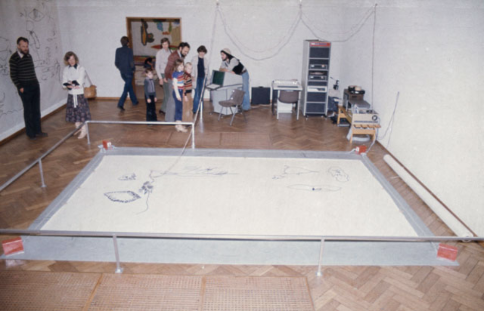
Still LifePath is a series of prints that document the movement of synthetic neural systems. Each line in the image reveals the history of one system's movement as it navigates its environment. Like the Tissue series of work, Path is built around the ideas of neuroanatomist Valentino Braitenberg.
Something that does not work for me considering Reas' work is the extra effort demanded from the viewer's side to contextualize these quickly shifting patterns and making sense of overall expression, what could be facilely considered 'modern art' in my opinion, is also what I love about his explorations. It is free flowing, experimental, close to what I imagine a humanized format would be and has it's implementational origins in computational processing (the 7th point mentioned in the notes below).
Linear Perspective
Casey Reas's work appeals to me as a representation of human subjectivity. He seems to have captured a moment wherein humans and technology started to exist in a beautiful conglomeration.
We probably need to question if we still plan to follow the rule-based/structured approach to express or are we moving towards more natural forms of expression that are free-flowing, comparatively subjective and made possible by the newer technology based tools & platforms?
#R3 notes::
1. Knowledge and/as vision - augmentation of human vision intensified the belief that careful observation was the key to unlocking the workings of the universe - tech and media play their part in knowledge production surely as well as optical instruments and observational techniques, all images are encoded by their tech of production and hence embody the qualities of the media in which they exist - some abstract ideas such as power, force, ideology, speed, scale, complexity do not have a specific visual form - author discusses the statements of the mathematician René Thom, according to whom, graphical means of representation were unstable, imprecise and hence unreliable, the images have marks& signs that are changeable, they aren't like alphabets and numbers (forms) that stably translate to binary codes. -according to the author Thom overlooked the history of the communication through graphics wherein the systematic usage of images have created standards and consensus across a wide variety of disciplines e.g. architecture, physiognomy
Can visual system be structured like a language? The rules that govern language structures, use and combination have been there for thousands of years making the comparatively recent principles of graphics astounding
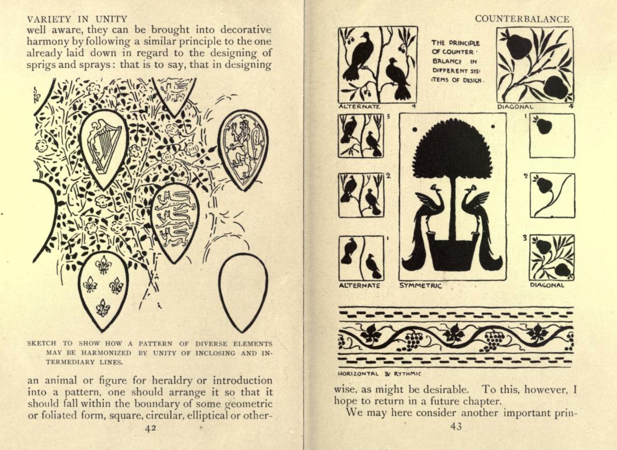
2. Language of form - author discusses Owen Jones' work with patterns describing its rational and systematic approach to presentation of ornament in both semantic and syntactic modes. New training demands arose as the industrial and applied art were put to production creating a need for systematic education in creation of pattern and form This systematization of knowledge was required to pass it on facilely. - Humbert De Superville's attempt at systematicity provided a crucial early contribution to methods of graphics. Guillaume understood that it was necessary to cut ties to fine arts in order to produce a practical system based in geometry contributing to the machine- readable graphic language long before digital tech. - Walter Crane's works are a demonstrations of methodical approach to graphics, the structure in which he chose to present his knowledge echo morphologies from nature: weight, tone, value pattern, rhythm etc. elements of graphics - his work was meant to train the eye & mind at the same time.
3. Dynamics of form/ universal principles of design - newly emerged practices from product and pattern design needed an articulation of principles that could be taught in the technical trainings. - late 19th century observed a shift from highly technical manuals to graphics induced manuals whereas typographical manuals contained technical info about typecasting, composition, imposition of pages etc. - attention to composition as an art and not merely a tech became fully evident during this time, artists were keen to articulate what they believed were universal principles of the visual forms.
4. Gestalt principles & tendencies - the intersection of intersection of cultural anthropology, psychology of perception, abstract form formulated the graphical principles. - Worringer: hard-edged geometric forms emerge in cultures whose relation to natural world is fraught and difficult whereas curvatures were found in more harmonious cultures - the experimental studies in perception established the existence of certain tendencies in human visual perception: proximity, similarity, closure, continuation, common fate, good form etc. - Gestalt principles were a results of studies in psychology emerged in 1930s.
5. Basic variables & semiotic approaches - semioticians and structuralists struggled to find the basic codes of visual form and their efforts were brought to fruition by 1960s -graphical signs trouble the distinction between inherent and conventional meaning production e.g a color may carry a symbolic value but a diagonal line does not say anything about the angle at which it's drawn - the cartographers, for whom knowledge and manipulation of basic graphic forms is of major relevance, enthusiastically received the semiotics of visual forms- Jaques Bertin - isolated 7 vars of static graphics : shape, size, orientation, color, tone, texture, position - elaborated their considerable use in cartographic and geographic representations.
6. Visual editing/framing & reading - the study of graphics takes a different turn when it's introduced by the additional parameters such as time and motion. Graphic novels, comic books are a graphic exercise in storytelling which is usually not the case with GUI. - editing approaches could be linear or non-linear (those establishing illusions of realism and those that rapture them) - film editing relies on narrative theory and not just on visual perception- principles of motion, animation, temporal change etc. are applicable to them, the task of abstracting principles differs when a machine has to be trained
7. Computational processing for analysis and production - most of the graphical systems for production are based on wither pixel values or vector graphics- lending themselves to computational processing. These programs had to choose between analysis of graphic formal primitives like line, texture, fill and production behaviors like stroke, rub, stipple etc. - recents programs have numerically based approaches - David Marr, who incorporated an approach directly related to models of vision, cognition in neurology and psychology, showed that different features of a single image could be isolated. They could be described independently holds a special place as a computational theory of visual perception.
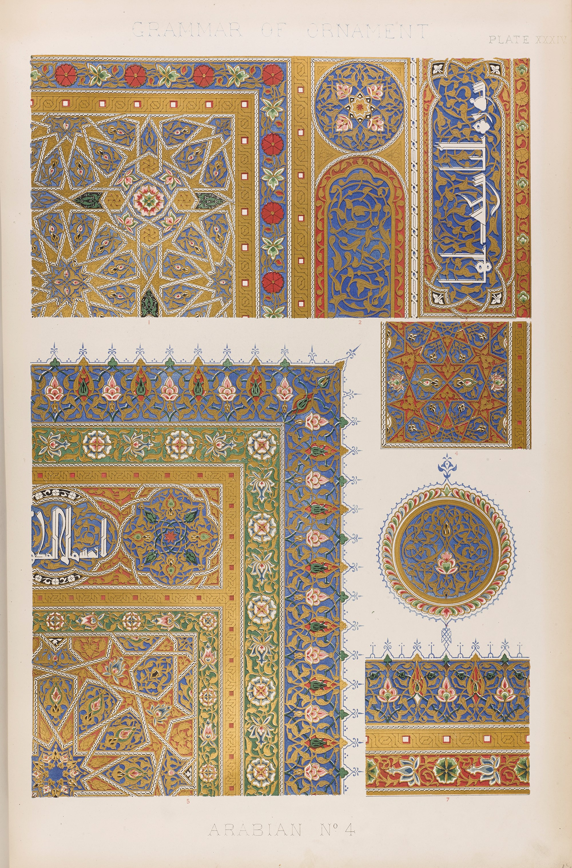
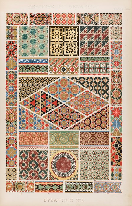
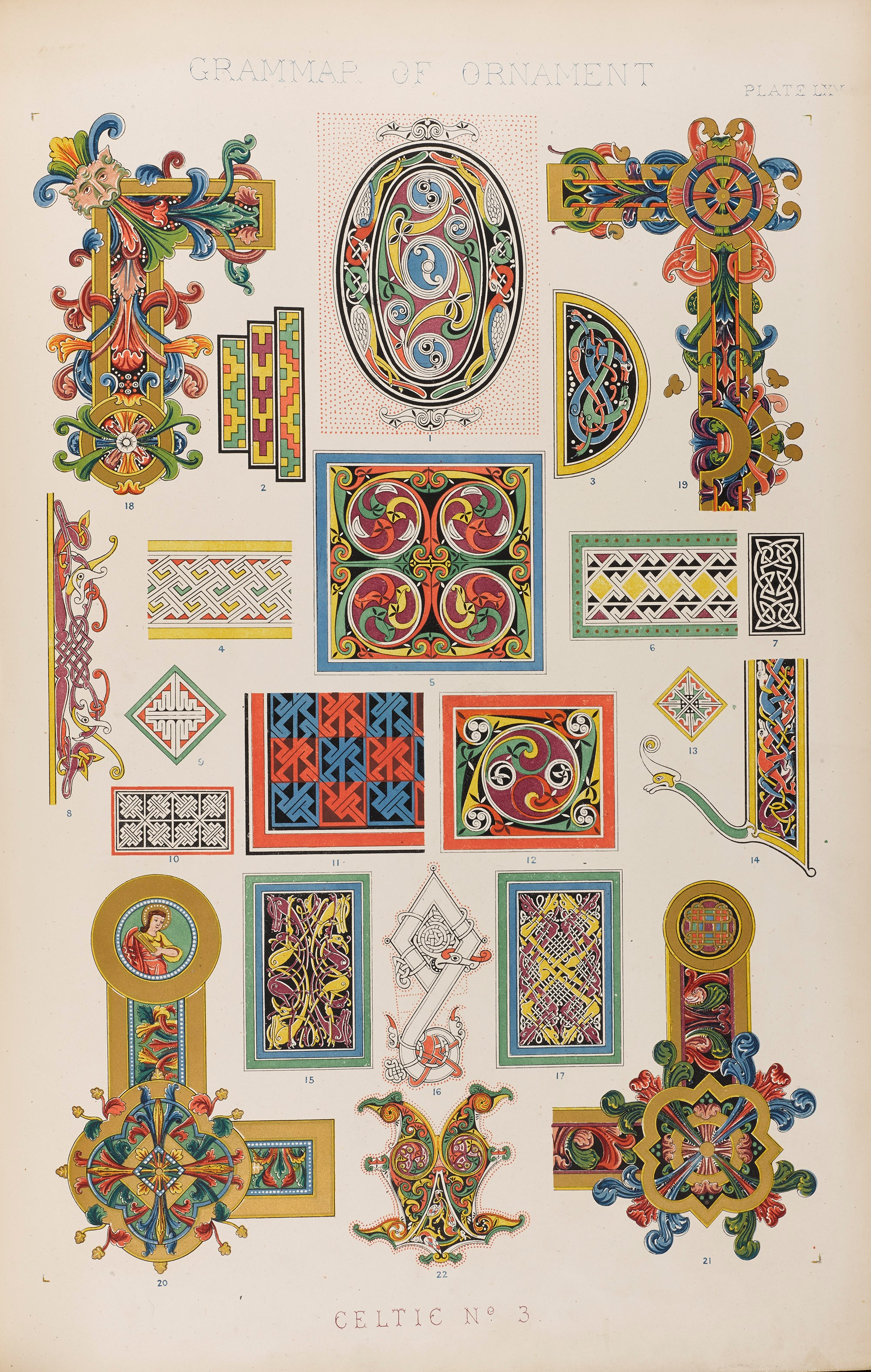
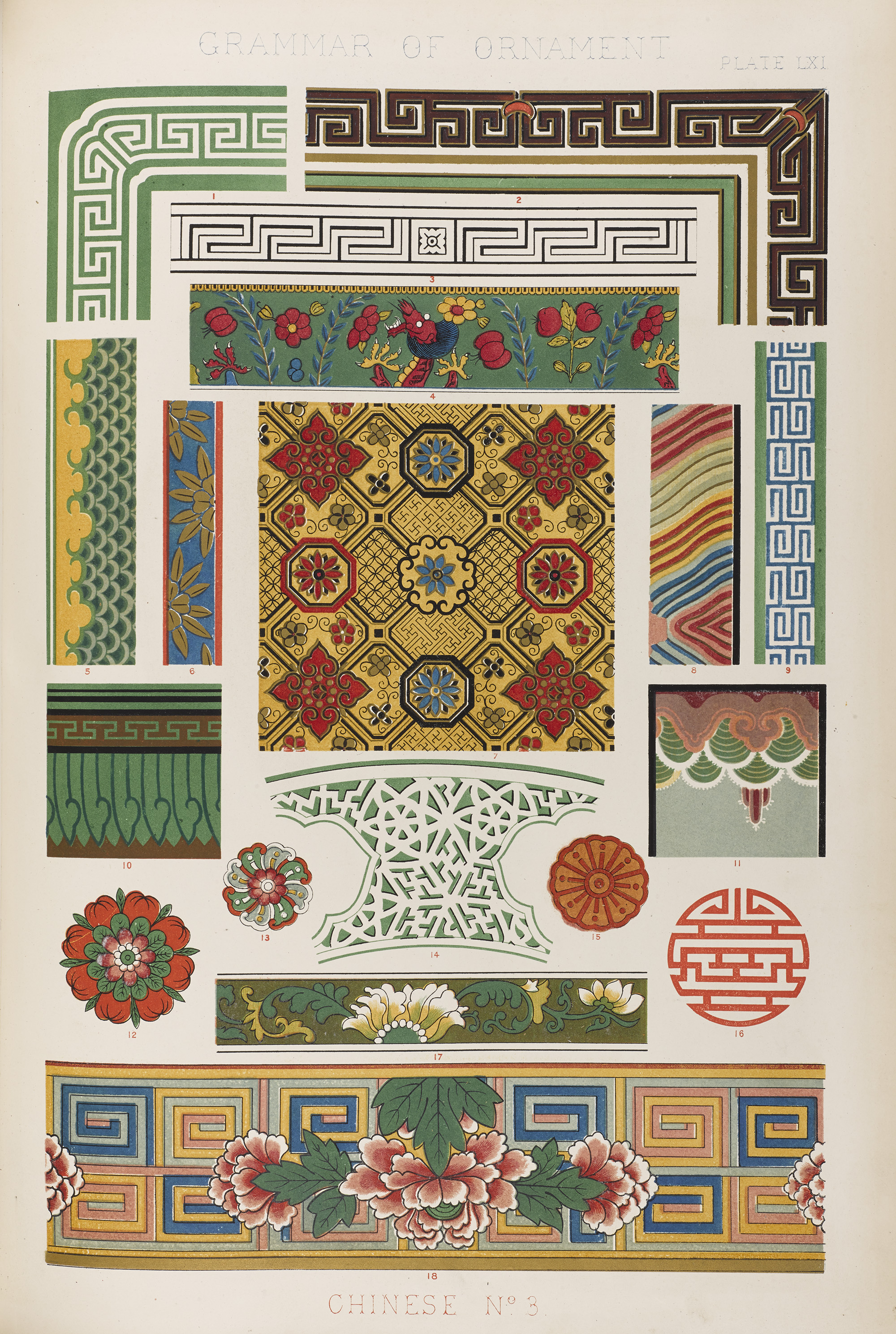
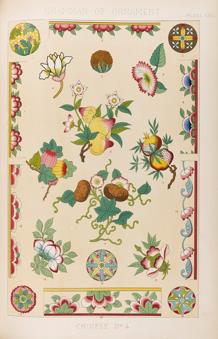
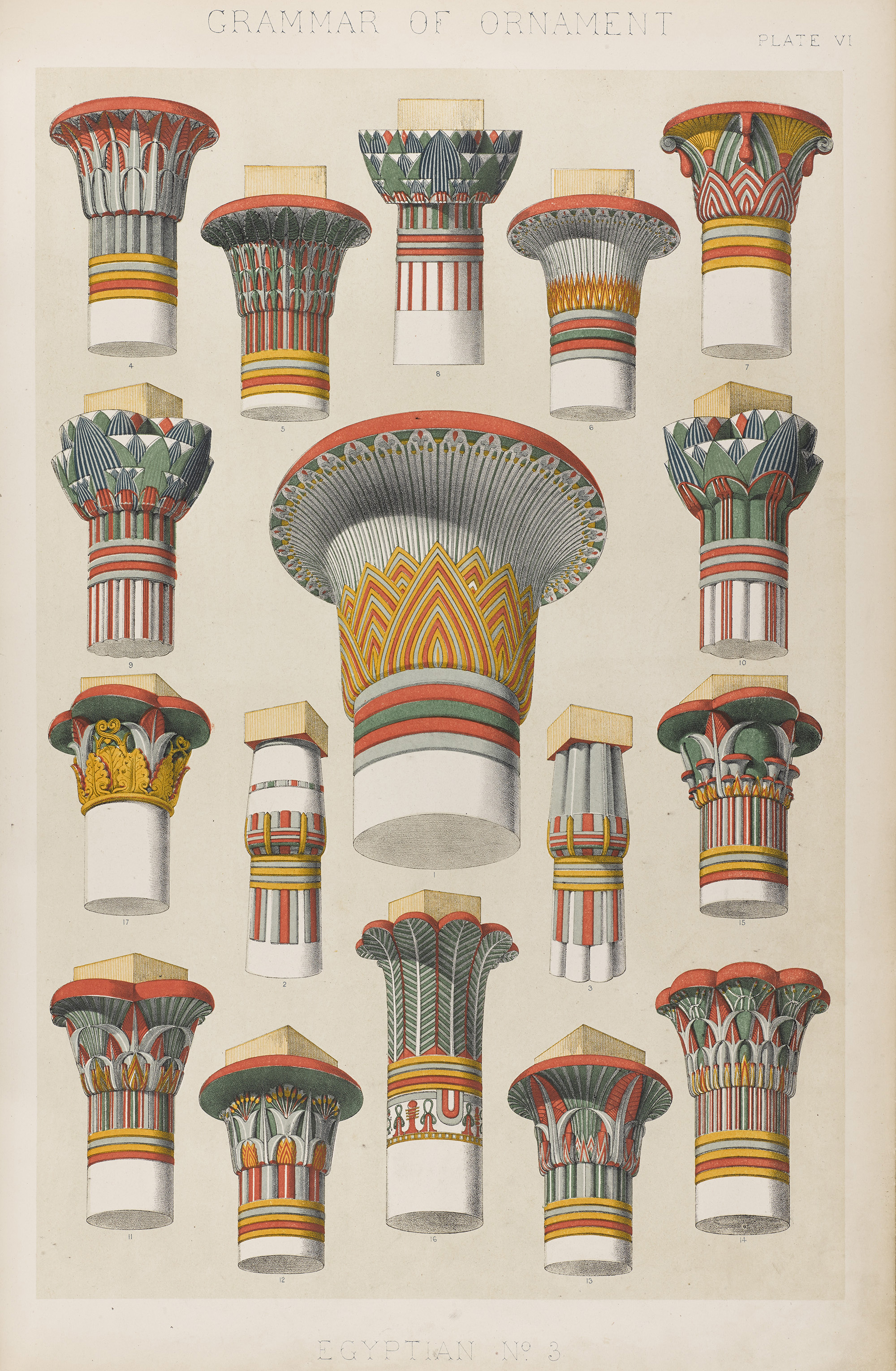
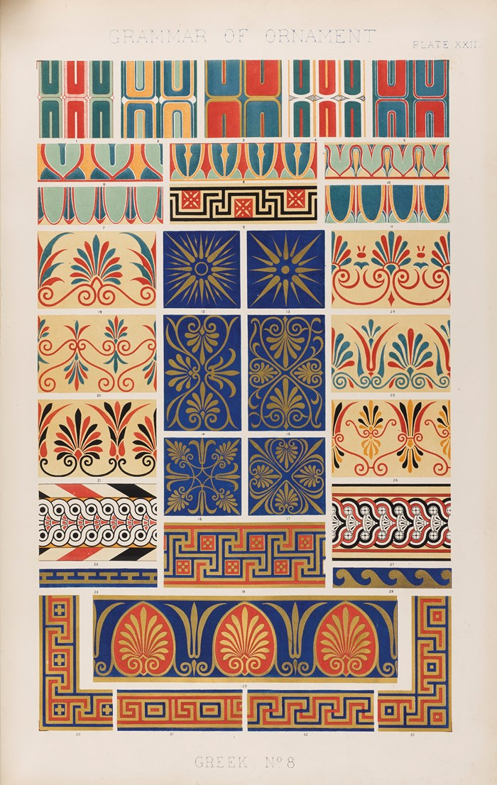
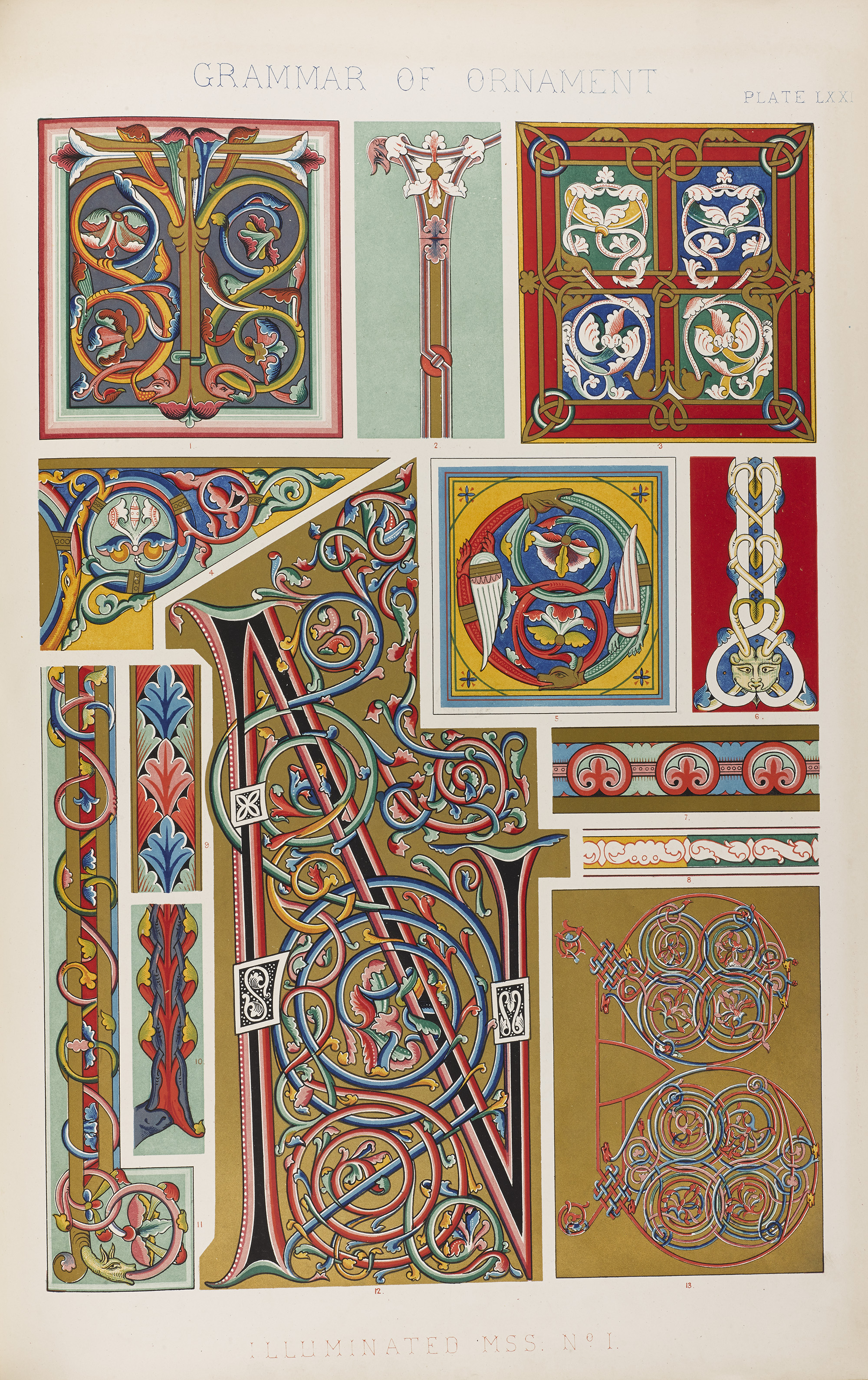
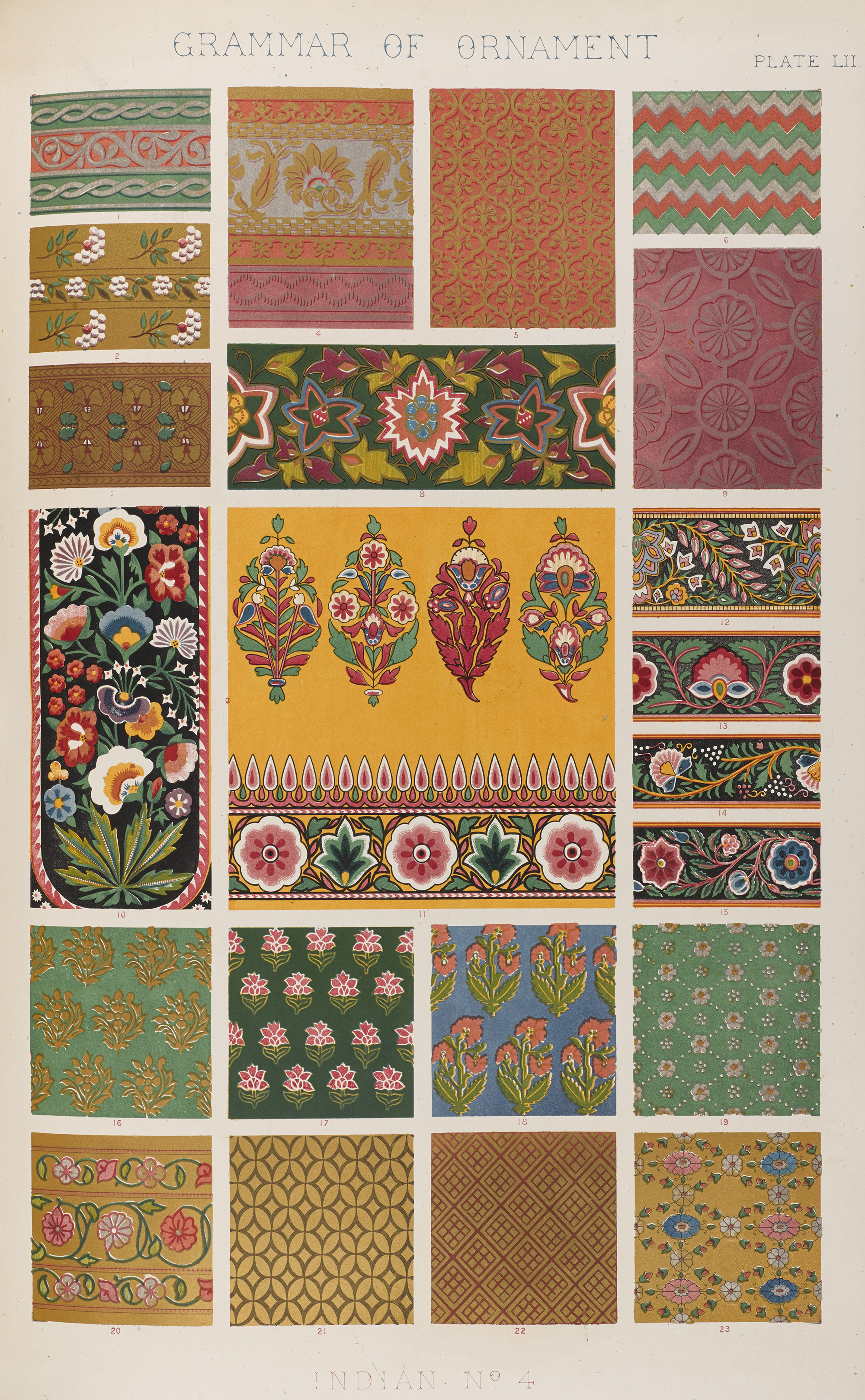
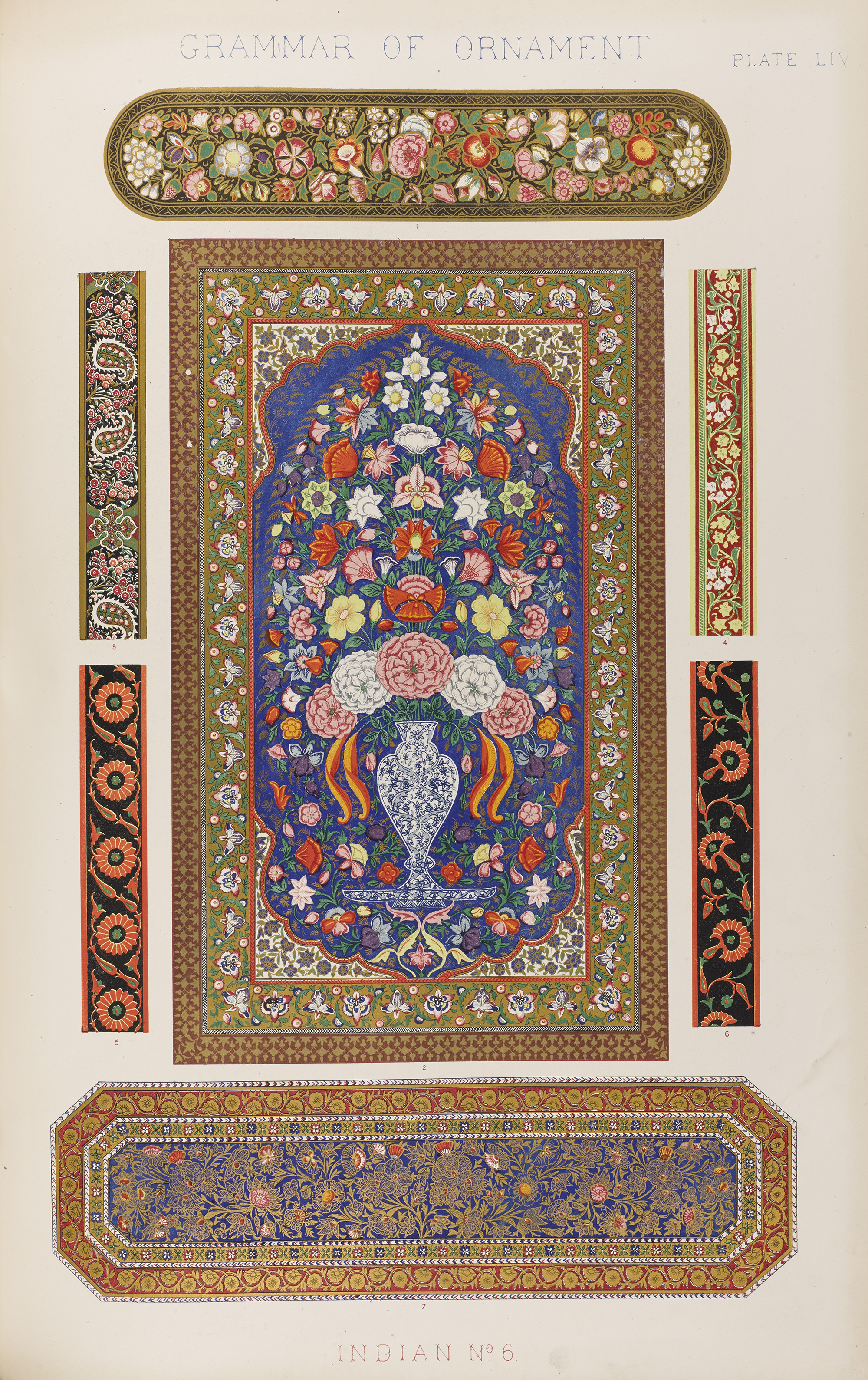
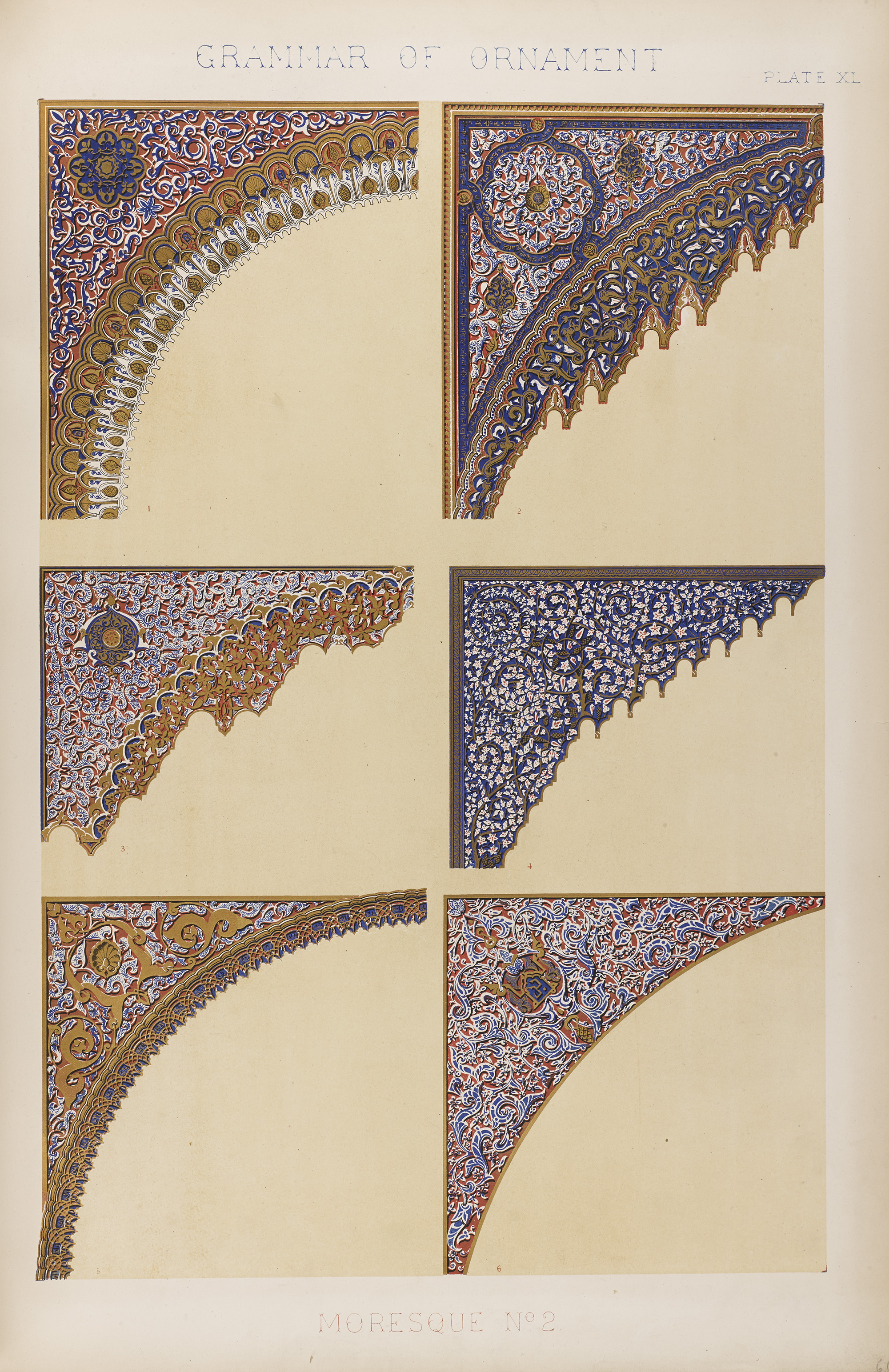
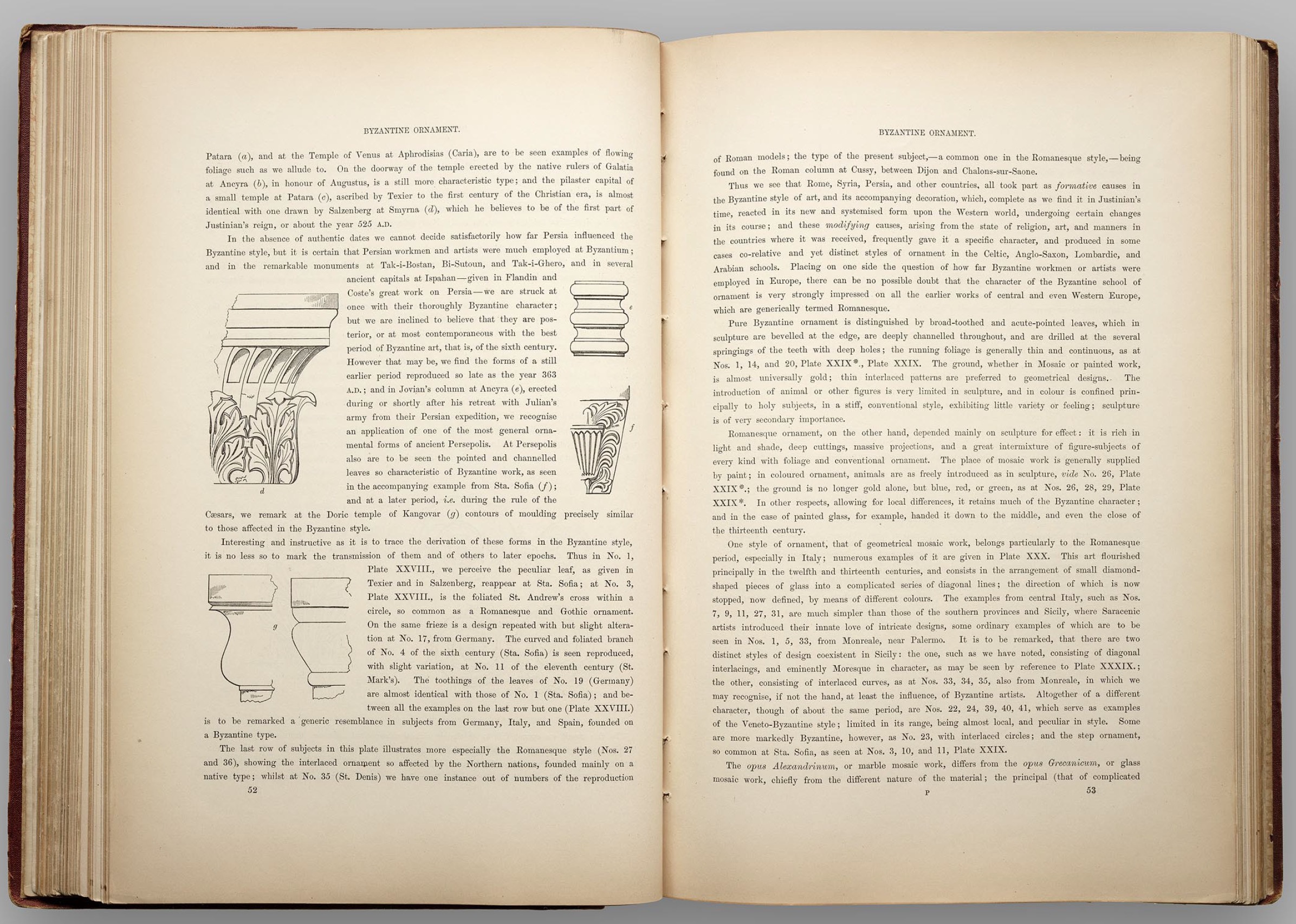
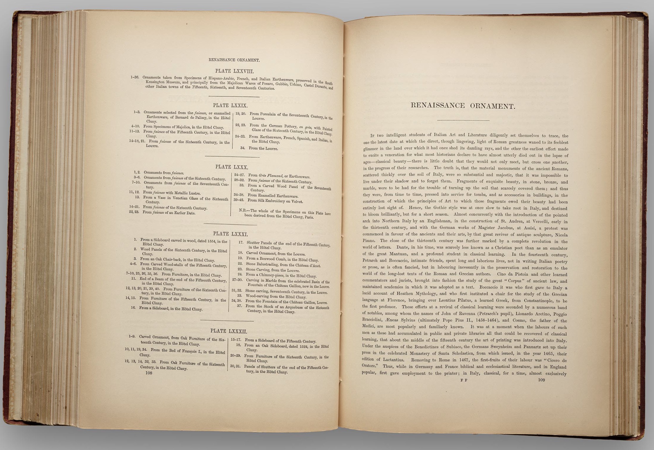
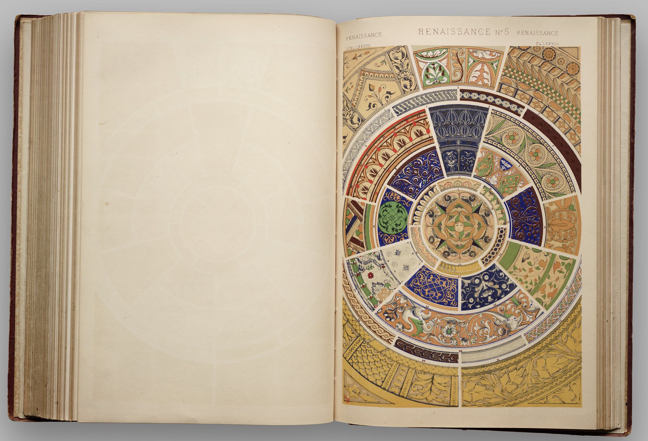
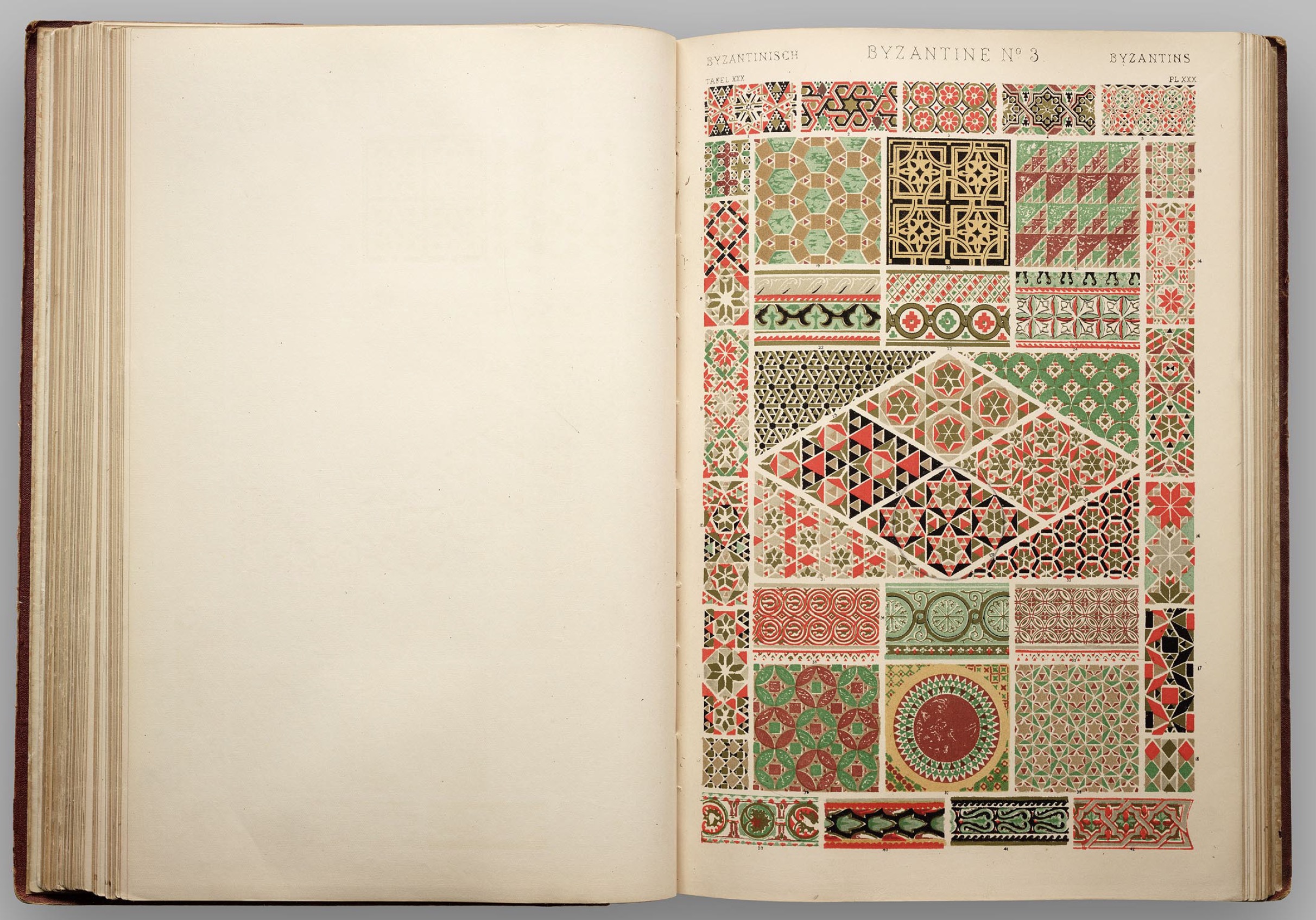
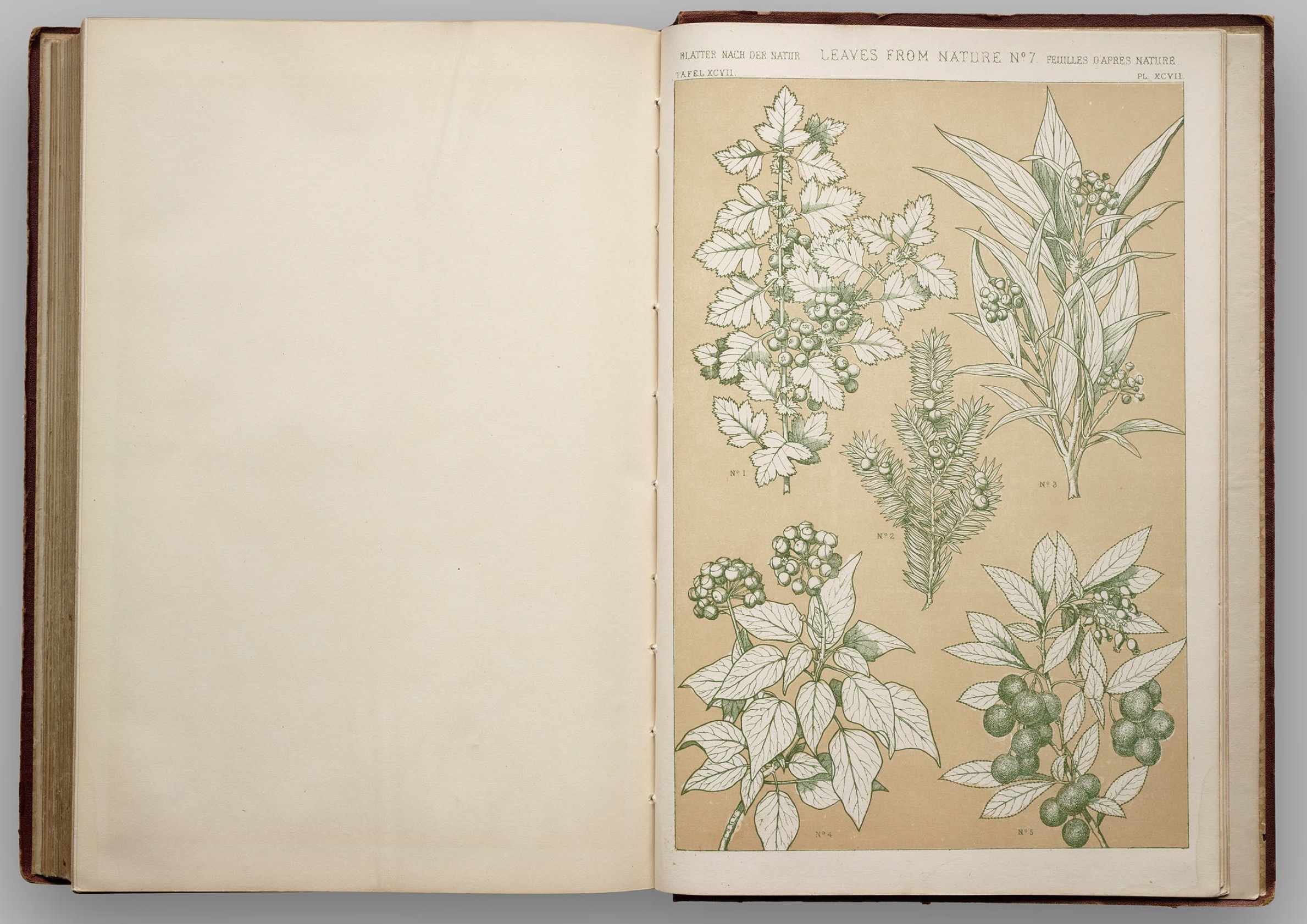
While reading the first chapter of Graphesis by Johanna Drucker, a specific work caught my eyes. It is The Grammar of Ornament by Owen Jones. First published in 1856, The Grammar of Ornament is a folio consists of systematic presentation of ornaments, motifs and patterns of different cultures all over the world. After over 150 years, the book is still being printed today and contributes to one of the most "ambitious pattern book in the history of Western art" (Drucker, 2014, 29).
Before going details what includes in the book, let's talk about who Owen Jones is. Owen Jones (1809 - 1874) was an architect, designer and designer theorist. His studies concentrated on color theory, geometry and forms. Owen created The Grammar of Ornament not for young designers to copy but to encourage them to learn from the underlying principles of design from the history.
According to the National Museum of Scotland, "Jones funded the Grammar’s print run from his own pocket, at great expense. Working with lithographers Day & Son, he turned to the new and expensive technique of chromolithography. This elaborate method of printing required up to 20 separate lithographic stones and drawings, one for each color. These were then printed one over the other, layer over layer, to form the finished plate. For Grammar of Ornament, Jones’ assistants spent a year meticulously copying the original drawings on to lithography stones."
The book is structured is by being divided into different culture categories such as Arabian, Celtic, China, etc. and the last part is natural ornaments. The reason for this structure is that Jones wanted readers to recognized the similarity and trend of each culture of different time period to see how the designs evolved overtime throughout history. Below are some of the designs from the book.
Arabian No. 4, Plate XXXIV
Byzantine No. 3, Plate XXX
Celtic No. 3, Plate LXV
Chinese No. 3, Plate LXI
Chinese No. 4, Plate LXIL
Egyptian
Greek No 8, Plate XXII
Illuminated No. 1, Plate LXX
Indian No. 4, Plate LII and Indian No. 6, Plate LIV
Moresque No. 2, Plate XL
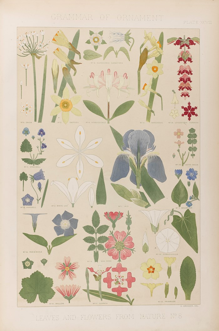
Leaves and Flowers from Nature No. 8, Plate XCVIII
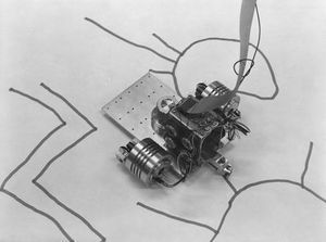
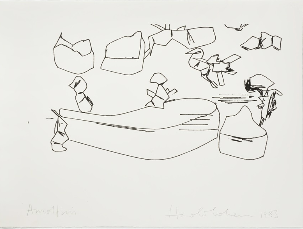
One of the points that arose in the first chapter of Drucker’s “Graphesis” that I found interesting was the idea of using computers to draw or present information in graphical form. Specifically, Harold Cohen's work with AARON, in which he worked out a systematic approach to visual composition, is an example of an attempt to build with primitives about the visual experience of the world.
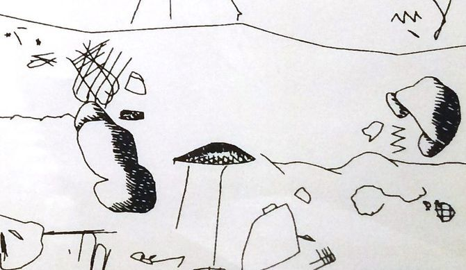
Harold Cohen was a British artist who helped create AARON, a computer program designed to produce distinct images in its own style. The term “digital art” was first coined in the early 1980s with the creation of AARON. Initial versions of AARON created abstract drawings that could not learn new styles on its own- each new style had to be hard coded by Cohen. Therefore, AARON’s output followed a similar formula and pattern. The image below is an example of Cohen's earlier work:
Untitled Computer Drawing, 1982
In the 1980s, more representational imagery was added and in the 1990s colour along with scenery was added including rocks, plants, people, and faces. It was possible to download video onto computers, allowing artists to manipulate the images they had filmed with a video camera, which gave artists more creative freedom, allowing them to create visual collages by cutting and pasting within moving images. Most recently, some digital art has become interactive, allowing the audience control over the final image.
The work Cohen created at the time, at the intersection of science, art, and artificial intelligence garnered a lot of attention, leading to many exhibitions at the Tate Gallery in London and many other notable museums.
Intro -> Image, Interpretation, and Interface -> Windows
Through the first section of her book, Drucker provides us with a crash course in the evolution of visual imagery as a legitimate form of communication design. She highlights how, from the beginning, design has been fighting to be taken seriously as a technical craft. An early example being mathematician René Thom not acknowledging visual or graphical information as a form of communicating knowledge.
Visual imagery has always been seen as artistic, subjective, emotional content because visual images "have no single identifiable code" and therefore cannot be counted as a standard form. Drucker concedes this as a legitimate critique, especially at a time when the "grammar" and "syntax" of visual language wasn't precise (it still isn't), defined, or well-understood; however, to me it's not much different than the origins of a written language (which does count as a form of communication, obviously).
If the audience doesn't understand the language something is written in, it doesn't do them any good unless they translate it. It's no different than looking at a visualization and having to learn the language of the objects encoded with data. Where this doesn't necessarily hold up is once you learn a language, you can then use that language across any type of content delivered in that language (if I learn English, I can expect to generally understand English in any context); whereas, with visual language, it's up to the individual designer to determine the language for their piece or collection and this may not be relevant outside their single visualization. Ultimately, this contributes to the critique that visual language should be discarded as not legitimate because is not standardized. But does this matter?
As we approach the 1950's "visual communication" and "graphical language" are commonplace. It seems like the pendulum has completely swung in the other direction as we get Swiss design comprised of rigid rules, step by step procedures and grid-adhering design to formalize and legitimize visual communication.
The idea that visual art might have a method that produced reliable and repeatable results gave it an air of authority.
Gestalt principles bind psychology to design, bringing logic to natural human perception, which also helps legitimize visual design. This is a big step forward in understanding the human factor. As Drucker states earlier in this section, "Design was uncoupled from the task of life drawing, but interestingly, not from the communication of affective experience."
Psychology is what separates visual language from art and brings with it enough logic to become a reliable and therefore legitimate form of communication. The best example of this are the principles of Proximity, Similarity, Continuity, Closure, and Connectedness. Once we understand how humans want to see patterns (subconsciously or consciously), we can design to take advantage of that natural visual language that we all share.
A melody's structure, not its specific notes, gave it a distinct formal identity, hence our ability to recognize it across different keys
Humans gravitate towards patterns so strongly, that we even do it with melody. We're one of the only species that can recognize sounds as patterns even when they are transposed to different keys.
Fast-forwarding to the digital revolution, we are introduced to computational processing to produce visual information, beginning with Cohen's AARON (see additional research below). Here we can discuss the codification of primitives used to generate these visualizations. While Cohen's primitives were based in the visual experiences of the natural world (like trees, faces, and landscapes), Marr's primitives were much different – they consisted of models of "vision and cognition in neurobiology and psychology." (opposite his peers in the graphic arts).
Marr was able to "define visual primitives in terms of the operations through which each property can be processed." This is important because it's was a major step forward in how our current computer processing tools and coding libraries approach data visualization. Different attributes could be isolated and defined independently. For example, setting color separate from orientation, size, or texture.
Towards the end of the section, we reflect on how visual knowledge is complex because it isn't defined globally and it relies on cultural training to interpret – this is especially difficult when we have different cultural experiences across the world. These conventions translate to semantic value in order to communicate effectively.
Now in the 21st century we have widely recognized and established design patterns. These patterns now begin to reduce cognitive load since we've seen them used over and over again – in visualizations, in UI for product design, in digital workflows, applications information hierarchy, etc. Visual design is closer to a traditional language now than ever before – but it's still not standardized (and never will be). To communicate effectively through visuals, we must understand and respect the cognitive burden we expect our audience to reasonable take on when consuming our visualizations.
Instead of syntax and grammar, we have principles of design. Therefore, bad design is like a misspelled word. It can be interpreted, but it requires a higher cognitive load.
Research - Harold Cohen's AARON
As mentioned above, Cohen's primitives were based on real world primitives - not just basic abstract shapes. To me, AARON provided a bridge between the old human-centric life drawing and the computer generated rigid visual language that contains strict syntax and grammar.
Cohen was a painter turned generative/computer/algorithmic artist. The combination of art and engineering is what many of us are drawn to in this field, both as designers and consumers. AARON dealt with the "internal aspects of human cognition" (Cohen)
AARON painting machine
The number of primitives was limited, but very effective. It was able to distinguish between concepts like inside vs. outside, landscapes vs. human forms, etc. And because of that, it is able to produce an unlimited number of paintings based on this limited primitive knowledge.
Early AARON drawing – the primitives are extremely organic
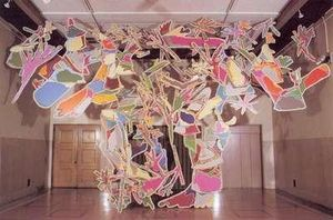
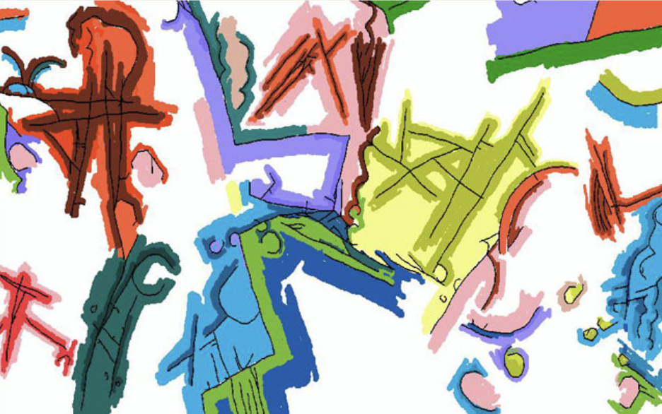
Overtime, AARON was taught new forms and basic symbol structures. It paints within the confines of its knowledge, making it "creative" in a sense. It matured over the years, eventually creating the Socrates' Garden piece below.
AARON's masterpiece: Socrates’ Garden
By the 1990s, AARON was able to use color.
A computer-generated piece of art that evokes real human emotion is a thing of beauty, and is probably why we still argue about the difference (and importance) between art and design. I'm sure the mathematician Thom would point to this as the exact reason visual imagery cannot communicate effectively because it's too subjective. And while that's correct in this instance (because this is generating art, not visualizing data sets), AARON is an extremely important step in generative visual imagery that paved the way for modern visualizations while also retaining the emotional qualities of art as we crossed over to the digital frontier.
In the first chapter of Graphesis, Johanna Drucker explores the evolution of people's perception and use of graphics throughout history. She states early in the passage that "images have a history, but so do concepts of vision and these are embedded in the attitudes of their times and cultures as assumptions guiding the production and use of images for scientific or humanistic knowledge." This resonated deeply in that in each stage of the pursuit of knowledge by humanity, there were different beliefs and approaches to visual graphics that compounded on themselves to advance us to our current embracement of visual forms of knowledge.
It was interesting (and also unsurprising) to read that graphical representations were first thought of as somewhat unreliable, and inconsistent in their meaning and value. Yet, graphics have encoded knowledge for centuries and have enabled communication in ways pure numbers or words could never do. Architecture, physiognomy, evolutionary biology, medicinal fields all incorporate graphics as an indispensable form of knowledge representation. As graphics became widely accepted as such, it transformed into a discipline that developed formal rules and methods through diverse efforts--from the systematization of design for industry, to semiotic approaches to graphical systems, to the integration of computational processing for the breaking down of components to primitives, and also automated production of graphics.
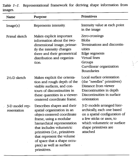
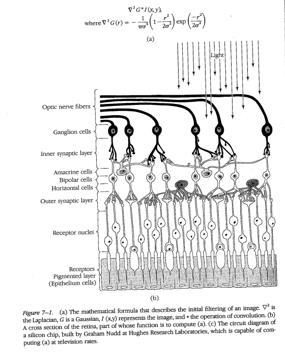
One figure that stuck out to me during the reading was David Marr, who created one of the first models for computer vision by investigating the human representation and processing of visual information. He treated vision as an information processing system, and described it as such. He put forth the Tri-Level Hypothesis, which stated that in order for any informational processing system to be understood completely, it must be described in three levels of analysis: The computational level, which describes what the system does/what problem the system solves; the algorithmic/representational level, which describes what steps the system goes through to solve the problem (what representations and processes it uses); and the implementational/physical level, which describes the physical characteristics of the system (how is this system physically realized). He also put forth a model of vision that begins with visual primitives that end with a sophisticated 3D output. His model states that visual processing starts as a primal sketch, or a 2D mapping on the retina that captures edges, blobs, bars, ends, virtual zero crossings, curves, boundaries. Then it moves to a 2.5D sketch which additionally detects texture an depth, and finally moves to a 3D model organized in terms of surface and volumetric primitives. In his book, he goes through how each visual primitive can be computationally detected, using the human visual system as his model.
In visual neuroscience, we learn about how the visual system and specifically the retina computes directional selectivity, edge boundaries, orientation. And in computer vision, we have built machine learning algorithms inspired by how the visual system works. David Marr's work integrates both, leading the way with thinking about visual processing computationally, and opening up the field for computational scientists to explore computer vision.
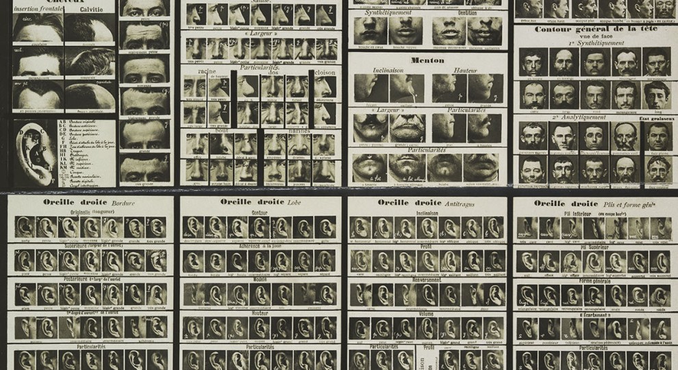
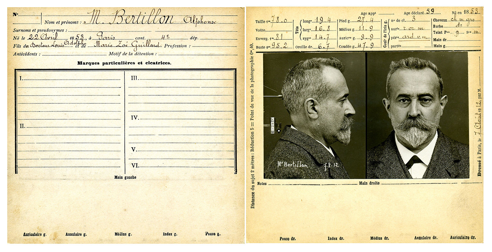
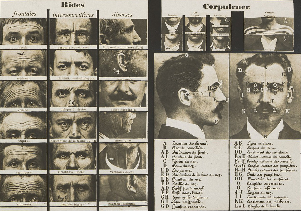
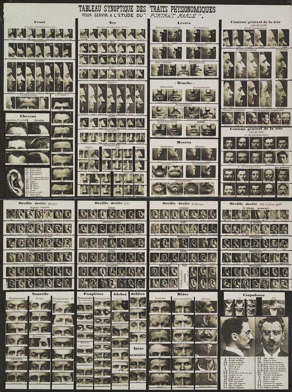
Charts showing eyes, ears, noses and other body parts helped officers identify suspects using Bertillon's system.
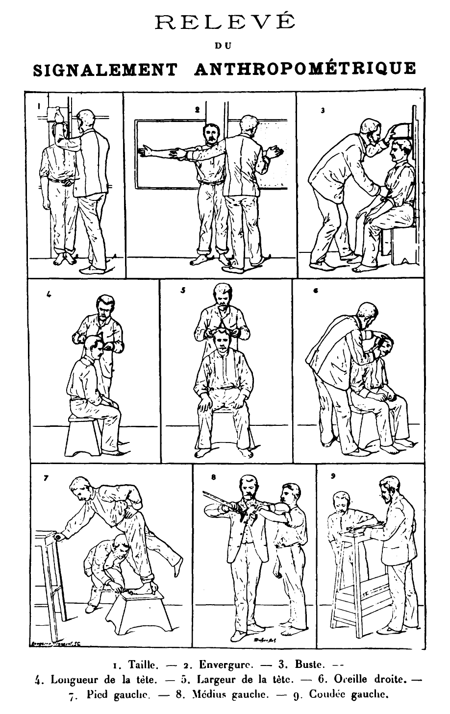
Forensic investigator, French police officer and biometrics researcher Alphonse Bertillon (1853-1914) leaves behind a record that is simultaneously one of achievement and one that serves as a warning in our new era of digital biometrics.
The son of a statistician, Bertillon's great achievement was the invention of the modern mug shot. The Bertillon system standardized the technique for taking mug shots, with one side-view photo, and one front-view. An example is seen below in this mug shot of Bertillon himself.
Bertillon's mug shots revolutionized police work and reportedly helped Parisian police identify 241 repeat offenders. Even today, mug shots are taken according to Bertillon's system. He was lionized in his time and recently featured in an exhibition at the Metropolitan Museum of Art, Crime Stories: Photography and Foul Play.
Bertillon outlined his system in his book Identification Anthropométrique (1893) under which body measurements were rendered into a formula that referred to a single unique individual, and recorded onto cards with mug shots. The cards were carefully filed and cross-indexed, so they could be easily retrieved by police detectives. By standardizing a biometric identification system, Bertillon made detective work easier and more effective.
Yet Bertillon also left a troubling legacy. First, he believed his mug shots and eleven different anthropometric measurements offered data from which could be surmised 'degenerate character' types. Second, confident in his abilities to draw scientific insights from biometric 'data', he was a prosecution witness in France's scandalous Dreyfus affair. Bertillon served as a handwriting expert and claimed that Alfred Dreyfus had written an incriminating document. His flawed testimony was apparently a significant contributing factor in the innocent Dreyfus's sentencing to life imprisonment on Devil’s Island.
In the context of our current era of increasingly pervasive biometric identification and the "quantified self," Bertillon's career serves as a reminder both of the high efficacy of such methods, and the disastrous results that can occur when too much confidence is placed in biometric data. Whether it be mistaken corroboration based on faulty DNA evidence, China's biometric-based 'social credit' system, or even the mistaken outing of an extramarital affair thanks to Facebook's facial recognition, the potential for Orwellian catastrophes ruining individual lives is high even with biometric systems created with the best intent. When it comes to knowledge created from forms of a biometric nature, the greatest caution appears to be warranted.
Graphesis is the study of the visual production of knowledge. The front matter first defines some key vocabulary to help readers with the book interpretations: (1) “Information graphics are visualizations based on abstractions of statistical data. All information visualizations are metrics expressed as graphics. Visualizations are always interpretations—data does not have an inherent visual form that merely gives rise to a graphic expression.” (2) “Visual epistemology refers to ways of knowing that are presented and processed visually, though in this book I only pay attention to representations, not to cognition. Visual expressions of knowledge are integral to many disciplines in the natural sciences, but language-oriented humanities traditions have only barely engaged with visual forms of knowledge.” (3) “The phrase “language of form” suggests a systematic approach to graphic expression as a means as well as an object of study. The long history of codifying knowledge in visual forms contains a rich inventory of examples on which to construct a fundamental understanding of graphics as systematic expressions of knowledge.”
The author’s approach in the book are as follows:
• Knowledge and/as vision: the ways visual ordering and classification serve intellectual work, particularly with respect to issues of interpretation;
• Languages of form: the formal systems in which visual forms have been classified and characterized;
• Dynamics of form/universal principles of design: the extension of the “languages” metaphor to universal and dynamic systems;
• Gestalt principles and tendencies: the principles of perception that locate visual knowledge in psychology and human experience;
• Basic variables: the contributions of the semiotics of graphics;
• Understanding graphics and editing: techniques of framing and reading;
• Processing images: basic issues in computational vision; and finally,
• Typology of graphic forms presents ways of classifying graphic images in current use for humanistic projects.
The author references visual historical pieces. Drucker emphasizes that visualization is an extremely powerful and important data representation that has historically been marginalized. For example, Drucker referenced, “The mathematician René Thom once stated unequivocally that knowledge could only be communicated using one of two modes of expression: mathematical notation and written language.12 He deliberately excluded graphical means as unreliable. Visual codes are notoriously unstable, too imprecise to communicate knowledge with certainty. .. But Thom overlooked the ways graphical representation has encoded and communicated knowledge for centuries. Systematic uses of visual images have created standards and consensus across a wide variety of disciplines that depend on visual observation and analysis.13 Architecture provides a particularly useful example of this since analogies with language as a formal system were central to description and analysis of building styles from late antiquity.”
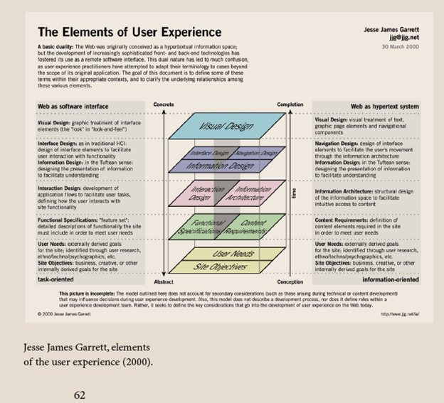
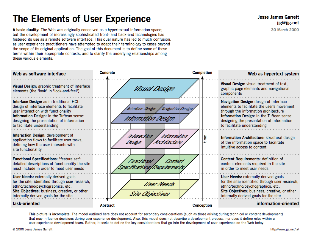
Jesse James Garrett, Elements of the User Experience (2000)
The above diagram (Graphesis, p. 62) was the result of a new job Jesse James Garrett begun. As he was working internally (i.e. within himself) to define some of the functionalities of his new job, he developed the above diagram which led to the book, “Garrett, Jesse James. The Elements of User Experience: User-Centered Design for the Web and Beyond (2nd Edition).” which is an eight-chapter. In his book he states, “Eventually I started hearing from people all over the world about how they had used the diagram to educate their co-workers and to give their organizations a common vocabulary for discussing these issues. … In the year after it was first released, “The Elements of User Experience” was downloaded from my site more than 20,000 times. I began to hear about how it was being used in large organizations and tiny Web development groups to help them work and communicate more effectively.” The book is loosely organized around the details for describing the graphic above.
Johanna Drucker begins with discussing 2 visuals. One by Kircher in 1669 – a system of the mystic Ramon Llull’s ‘Great art of knowing’ – as PRODUCING the knowledge it draws (which looks like and idea of how humans make connections(?) and Kircher’s computer generated image, although looking quite similar, which Drucker says only DISPLAYS information. This similarly reminds me of my report on STAMEN design, which I felt only replicated what the FACEBOOK, ‘virality’ of George Takei’s post of Marvin the Martian might be visualized as.
With this short frontmatter text, I thought of what really constitutes art? And conversely, data visualizations? How is it different? I also questioned the idea of photography as art. Is it interpretation, point of view? My burning question was – what makes information (if its all representation), different than art?
ARTHUR “WEEGEE” FELLIG Street Photos (1920's)
Chapter 1 – Image, Interpretation, and Interface
Is Data Visualization is the epistemology and creation of a new language? There’s always a play between wanting to abstract form (as in Graphics) and math (the cross between calculus and geometry). She breaks down visual epistemology into a systematic 8 points.
Knowledge and/as vision OR Order/Classification
Johanna Drucker discusses the ideas of both KNOWLEDGE and/as VISION, or what we know and see, vs. HOW we interpret what we see. This is one of the issues that have inspired artists of all time. When we see a catalog of screws at a hardware store – do we see this as ‘information’ or direction? Or likewise, when we see Marcel Duchamps ‘Nude descending a staircase’ – is this merely vision, point of view, or because it IS part of our thought process – reality?
Catalog of self-tapping screws
2. Formal systems.
We want to simplify our visual information into a system of geometry. Basically trying to create a universal language in which to put order to our lives - Mapping, the ‘language of form’. We are ‘told’ information by cultural and decorative motifs (see ‘oriental’ or ‘muslim’ typeface types for reading menu’s or store signs). Or is looking at Munsell's color tree also and form of visual language that ‘informs’?
'Oriental' typefaceMunsell Color Tree - or a guide for the theory of color
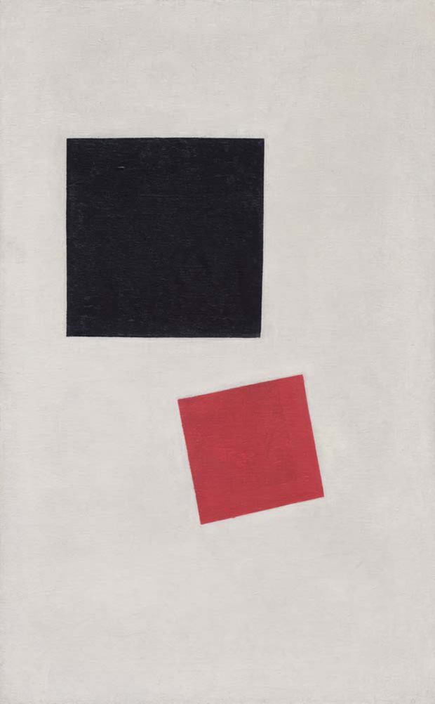
3. Dynamics of Form/Universal principles
Formal systems, or the universal principals of design. Examples of Jan Tschicholds Bauhaus typography book, and various layouts to Kazimir Malevich and El Lizzitsky Suprematist paintings, which became a type of religious doctrine for him. When we try to formalize design, don’t we get into cultural deviations? Sometimes bordering on with almost zealous religiosity? Aren’t these formal systems meant to be broken so new formal systems can be created?
Tschichold Bauhaus teachings
Malevich Suprematist Painting
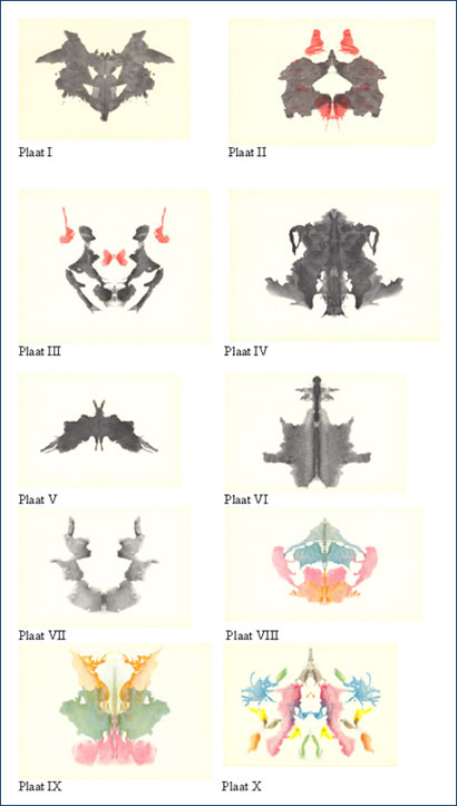
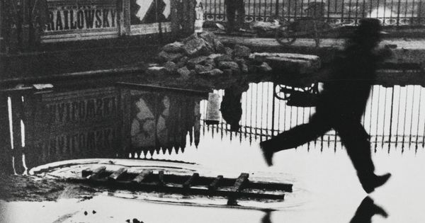
4. Gestalt – (my personal favorite) or the human experience
Our brains finishes up visual representations, a zillion times a day.
M & Co 10 1 4 WatchRorschach Test inkblotsHenri Cartier-Bresson Man jumping over puddle
5. Semiotics – (my second personal favorite) or basic understanding of what you are seeing. We try to understand what we are seeing by a series of systems and visual clues. ( I'll discuss that at the end with my brief review of the 'Semiotics of Visual Language' by Fernande Saint-Martin
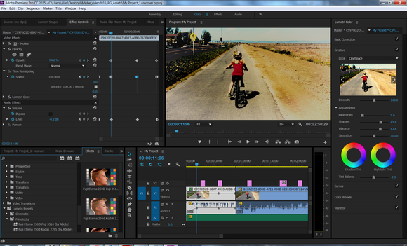
6. Graphics and editing: framing and reading
Visual editing and framing or how gestalt is applied, we create our OWN stories.
Adobe Premier - video editing GUIKids drawing - (already edited)
7. Processing images. Computational processes. We are constantly trying to organize our visuals.
Adobe Illustrator toolbox
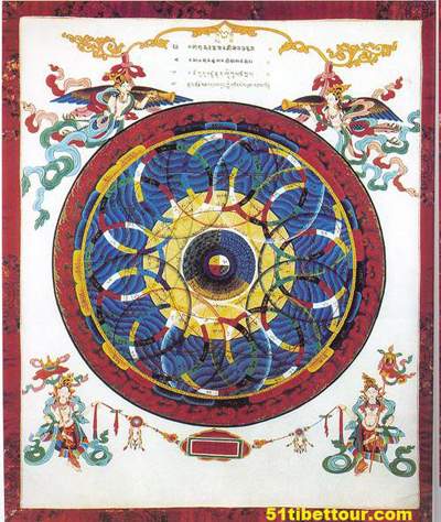
8. Classifying graphic images for humanistic projects.
Formal languages that we have adopted. Western calendar vs Tibetian circular calendars.
CalendarTibetan Calendar
I enjoyed the last 'Window Slide' which discussed the Books of the Future, where we make up our own maps, schedules, repositories – of our world of experiences and the way we want to live our lives. But the question still remains – look at politics, religion, law and order - we still want an 'order' to this information. This epistemologic breakdown of visual coding – follows exactly the same rules as those societal norms that we’ve already created –grids, frameworks and rules for the way we run our lives.
Tokyo subway map
Review: 'Semiotics of Visual Language' by Fernande Saint-Martin
For basic time constraints – I’m going to review Chapter 4 about Kandinsky’s theories about – “The Pictorial Basic Plane’.
It seems that there are 3 other defining ways (besides Coloreme discussed in the 1st chapter) to define the Pictorial Plane (in this case – analyzing painting, drawing, photography or video – or just the limited frontal plane), nothing in 3 dimension, although this analysis could be used in sculpture or installations.
First, the visual representation is defined as a ‘space of life’ or a space of ‘free movement’ that demands perceptual attention – the truth that the visual representation presents itself in a SPECIFIC way into its surrounding space.
The first is ‘TENSION’, or how a visual in inserted into that basic plane and how other visual elements are then inserted with its relationship to the first. He mentions that we primarily ‘center’ the first images, and the second and subsequent case creates the interaction, or ‘TENSION’.
The second is ‘WEIGHT’ of the elements in the pictorial plane. How much space is covered and that relationship to each other.
The third is ‘Periphery’ – where its located on its basic visual plane.
Kandinsky coined the phrase ‘Plastic Representation’, which Saint-Martin writes that is adverse to the theory of Gestalt, or the ‘whole’. However by analyzing each shape to each other usually does result in a ‘gestalt’ of some sort, even as Kandinsky tried to created a basic visual language. You could argue this case by looking at cave paintings or perhaps in Egyptian hieroglyphics, although there is evidence that this is a pictorial ‘language’ and not form.
I found these chapters fascinating, but difficult to sift through. I appreciate that there is a need to create a sense of order in our need to depict form and information, but don’t artists create their own visual language with each piece? This book only affirmed the Graphesis reading, which questioned my notion of is it art, or is it data being conveyed?
Today was the first I actually saw a printed copy of Johanna Drucker’s Graphesis. I was suprised by it’s size. Being only familiar with the digital pdf version I imagined a work like this, impressive in it's curatorial and conceptual dimensions, would be bigger. This remark might seem anecdotal but my surprise might also mark a point of departure towards the book of the future which will still be designed and interpreted (maybe unconsciously) in the legacy of print conventions, but the awareness of the origin of these conventions might fade and certainly there are and will be even more new conventions for screen display, that might override those.
In her introduction Drucker unwraps the history of visual epistemology. A history that is not only a side track but one in its own right, of course entwined with, often influenced by or subject to advancementsin general epistemology, the systematization of our understanding of language, the success of capitalist abstraction and the machine paradigm gaining prevalence.
Instead of re-narrating Drucker’s timeline, I want to make some remarks or ask questions on specific sections and concepts.
What do you think about the historical attempts to think about the visual in terms of language? Maybe it’s just a borrowed concept, but I think there’s also the intention to borrow the connotation of authority that language has. Do you think these approaches might miss the chance to establish visual knowledge production independently and hence to explain the differences between the visual and language and their domains, dis- /advantages and opportunities of mutual completion? What do you think is Drucker’s position towards this question? It’s interesting to me that her vision of the book of the future looks very textual, images are only mentioned as material to be parsed and the only graphical elements described and shown are mind- /maps.
Drucker’s narration is remarkably pointed to critical paradigm shifts on the verge of epochs. I’m really interested in how she describes the coincidence of evolving abstract visual production and the needs of a growing industrial production for mass producible commodities, forms and patterns.
The “language of graphics” became a language for and of industry, even as analysis of abstract visual form became one of the distinctive features of late nineteenth century aesthetics and its legacy to twentieth century modernism. The rhetoric of supposedly universal formal principles is historically coincident with the need for an abstract graphical approach to design for industrial production.
Is this a small side blow to Modernism? I would have loved for the text to elaborate a bit on this coincident. Couldn’t you argue that the advancement of abstraction set the underlying foundations of this growing industrial production in the first place?Is visual knowledge production always just adapting to current needs of the industry and subjecting to the newest (machine, software) tools to mass produce (broadcast) most efficiently? – In comparison the line Drucker draws from Boole’s Laws of Thought to the Vienna Circle (Neurath) and the linguistic turn and George Spencer-Brown’s Law of Form and Kandinsky’s interest in formalism,seems less tainted to her.
My selection for further research
I guess I was interested to compare how books looked like that taught design or could be used as a reference. It was really interesting to see three completely different examples and approaches. Apart from the content, it was also revealing to compare the different formats and typesetting conventions. While Dondis is closest to textbook conventions, Jones is more like an encyclopedia and Crane is almost set like a novel, which tells you immediately a lot about their didactic approach.
I’m not sure how these examples directly relate to my data visualization practice, but it showed me how important it also is to set the context and even if that’s very specific, if I had to work with already visual material these examples are a great reference how to work and organize these.
My selected artifact 1: Donis A. Dondis, Primer of Visual Literacy (1973)
My selected artifact 2: Owen Jones, The Grammar of Ornament (1856)
My selected artifact 3: Walter Crane, Line and Form (1900)
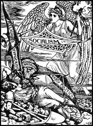
Somehow it seems like I’m always unconsciously picking a socialist. Walter Crane (1845 – 1915) joined the Social Democratic Federation (SDF) in 1884.
One of his most known drawings shows Capitalism pictured as a vampire sucking blood from a worker, while socialism depicted as an angel warns him of the danger:
I chose to write about Jesse James Garrett because, frankly, I do quite a bit of UI/UX work and I wasn't familiar with him or The Elements of User Experience. The graphic below was featured in our reading and I found it interesting for several reasons:
It's an informative breakdown on both the later of software interface and the pipeline for web development.
In doing the above, the image defies conventions by having the same illustration serve as a map for multiple processes.
This is a great primer and I think I'll use this image to facilitate conversation about the development of UI/UX in my own classes. Terms like user experience, interface design and interaction design are often used interchangeably and this is a good breakdown on their differences. I could see this being particularly useful in developing common language for a development team or when establishing a relationship with a new client.
I love that this doesn't start with a flowchart, progress to wireframes, prototypes and production. Rather, the project pipeline begins much earlier, in the concept development state. It reminds me of something our guest teacher in Data Structures said last night, that 80% of data management is cleaning and parsing. Similarly, product/web development requires an enormous amount of discussion just to set perimeters, define goals and values, understand the definition of success, etc.
While this graphic is great at describing parallel flows I wish it addressed the idea of feedback but perhaps that's too much to ask from a single image. And within the domain of web development feedback is largely constrained to button states and transitions.
I'd like to expand on this system to see how these 'steps' actually manifest in a production.
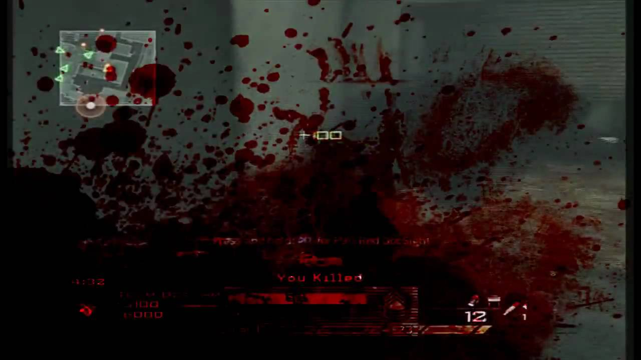
I have an particular interest in game development so I connected the above graphic to diegesis theory and would love to work through, with my students and clients, the exercise of determining when to plan for the UI representations below.
Diegetic Components
Diegetic components are typically featured within the game world as things the player’s avatar, and other characters, are aware of.
Non-Diegetic Components
The interface component is neither in the game story or a component in the game space. A heads up display (HUD) is the most common manifestation. It's efficient, doesn't interfere with the game space and can be skinned to support the aesthetic without appearing in-world. Often used for quick access to critical information but also used for embedded menu systems. Need to check your quests? You're usually navigating to this via a non-diegetic UI component.
Spatial Components
The interface component is NOT in the game world but DOES appear in the game space. Meaning, the characters in the game space are not aware of them but they communicate some state change within the environment.
Often used to communicate area of effect and what is within an NPC's field of vision.
Meta Components
Interface components that are in the game story but NOT in the game space. Often these are clues to a character state but lack the clarify of a HUD component. For example, a meta component of blood splatter on the screen might communicate that the player is hurt but not how close the player is to dying.
In the first chapter of Graphesis, Drucker discusses the idea of extracting information from a physical form, such as a person’s face, and analyzing it through graphic representation. This practice, referred to as physiognomy, essentially reads and predicts human personality traits based off of a person's facial features.
Giambattista Della Porta - De Humana physiognomonia
In 1585, Italian physiognomist, Giambattista della Porta, studied the connections between human and animal facial characteristics to ultimately make value judgements about people’s character and personality.
For example, if a human had a broad nose that resembled one of a chimpanzee, della Porta assumed that this person was intelligent, simply because chimpanzee’s were an intelligent species.
As a result, many of the facial features were over exaggerated in their graphic representations in order to exemplify and prove a specific characteristic.
Despite the fact that della Porta’s deduction is deeply flawed and highly based on interpretation, his work can be seen as the very first form of caricature art.
French forensic investigator, Alphonse Bertillon, built on the ideas of della Porta and used physiognology within the prison system to analyze the personalities and characteristics of criminals.
By gathering and analyzing hundreds of photos of criminals faces, Bertillon created a “system of criminal identification”.
These photos can be seen as early forms of mug shots and were later made obsolete by the introduction of fingerprints to track and identify prisoners.
Through closely measuring the faces of criminals, Bertillon used this information to identify specific people who had committed crimes in the past and who he believed were repeat offenders.
This process soon became extremely problematic and racist as demonstrated by Cesare Lombroso who believed that he could identify criminals in a crowd of people solely based on their facial features.
"What could be seen could be known". "every aspect of human knowledge could be communicated visually. "
Telling stories using graphics is an instinctive behavior, it's not learned or practiced, it's performed in all fields and ages, therefore it's important now to learn how to read and understand visual forms. I find the fact that using our vision and visualizing skills to tell stories is fascinating especially that we have been doing this for hundred of thousands of years, no one taught cavemen how to paint on rocks yet 20,000 years later we are here discussing it. Drucker presented few topics on graphical knowledge, she discussed the evolution of visual forms, for centuries poeple have been trying to standardize the "language of graphics", she also talked about if "these graphic languages serve humanistic fields where interpretation, ambiguity, inference, and qualitative judgment take priority over quantitative statements and presentations of “facts”".
_
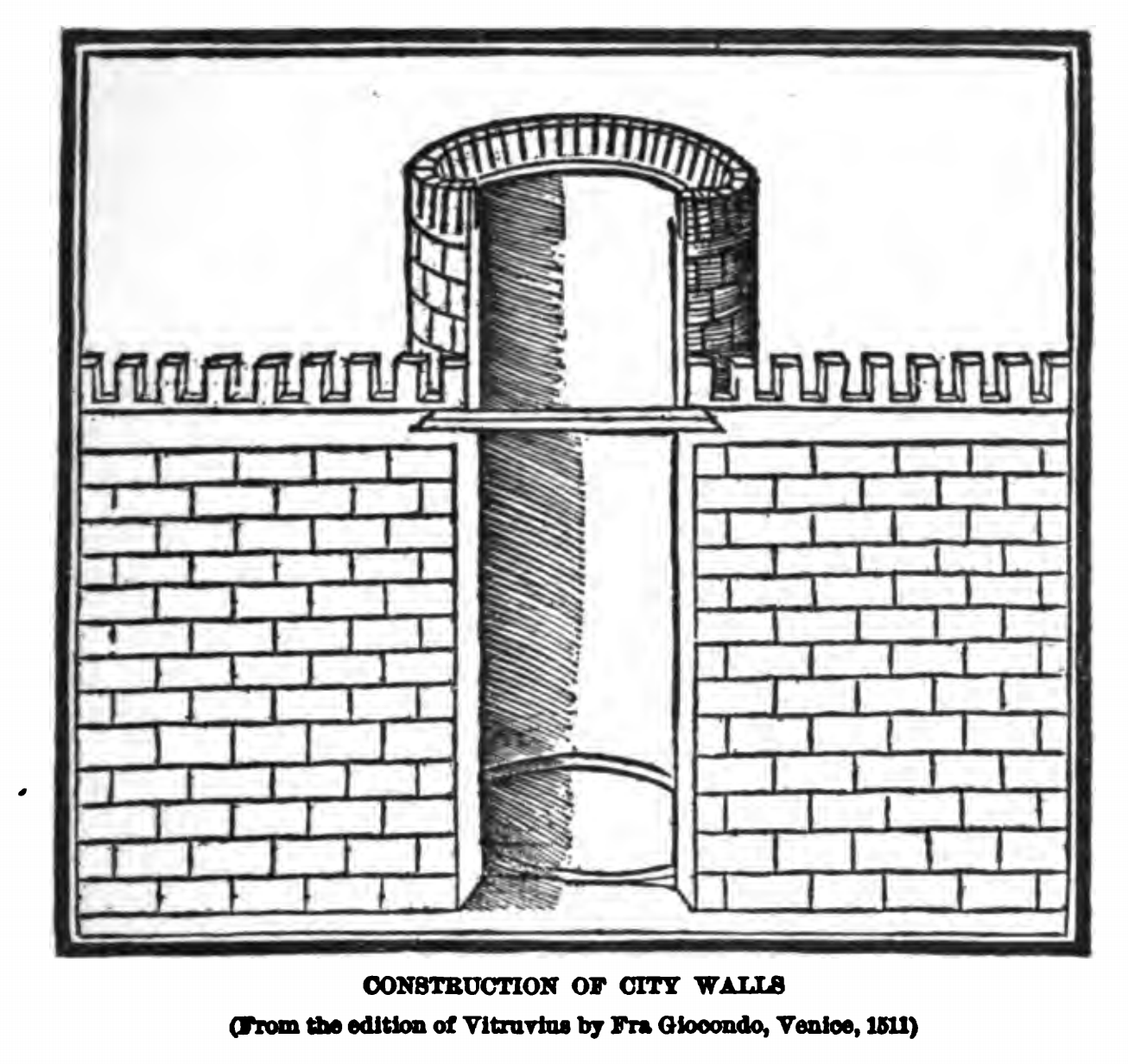
I was mostly drawn to this part of the chapter: Knowledge and/as vision, specifically the architecture part. Before switching gears to communication design in my undergraduate degree, I was in interior architecture program, I remember the how crazy it was following rules to draw a 2D plan, (e.g., "The distance between the top of your table and the chair seat should be 12″. So, if your table is 30″ high, aim for a chair that has an 18″ seat height"). All these measurements are unified universally, and some people had to come up with these ergonomics rules. Ducker mentioned Vitruvius the Roman architect, Vitruvius wrote De Architectura, " is the only Roman work inspired by Greek architecture that has come down to us." This book overall presents the principles of architecture, that includes the used materials in building, the interior design decorations.
The book is only $75,000 if you're interested
An example that I found extremely interesting in Vitruvius's the ten books on architecture is the City Walls, he illustrated his idea of how the tower should be built in order to protect the city from enemies at wars, he talked about the thickness of the walls, the materials (stones, rubble..), the shape of the tower should be polygonal or circular, squared towers are more likely to be shattered. The illustration served as a guide to explain how the tower should be built beyond the actual wall.
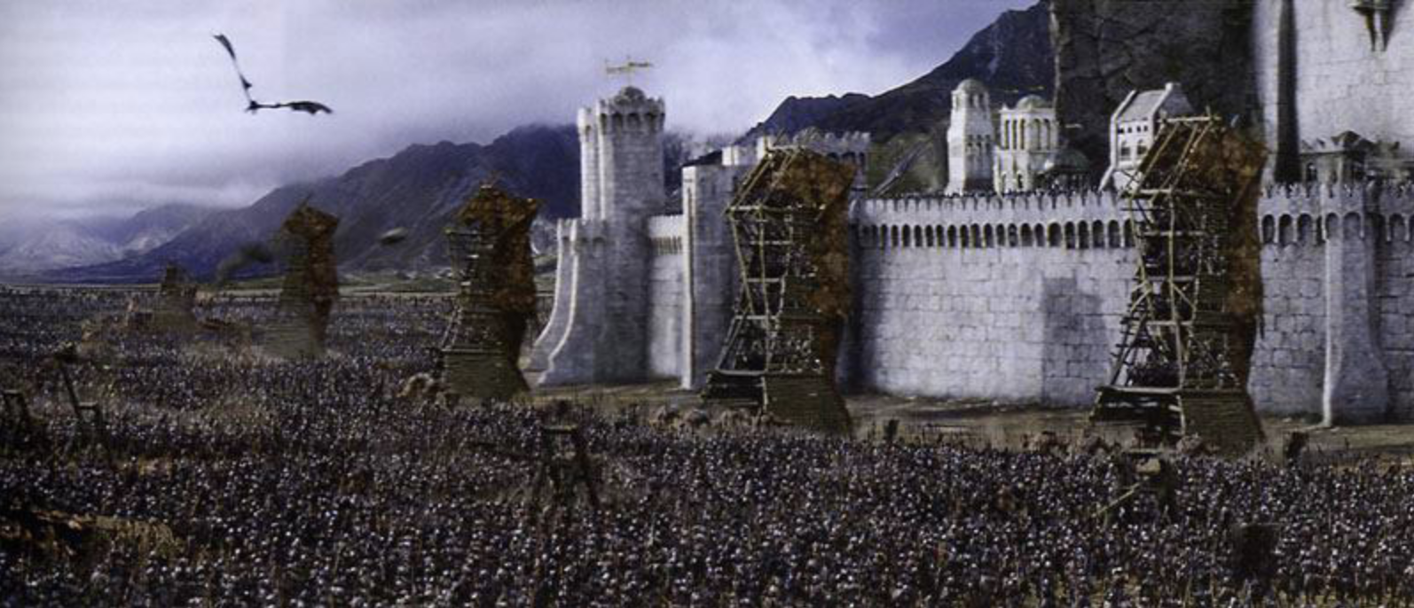
Although no country in this century wants to build a wall with towers for protection (you'd think), these details by Vitruvius are valuable, for example, in our contemporary lives, we see these towers in movies and video games. Film producers do not come up with these details, they look for real information in order to produce a realistic content.
"Alphonse Bertillon (French: [bɛʁtijɔ̃]; 24 April 1853 – 13 February 1914) was a French police officer and biometrics researcher who applied the anthropological technique of anthropometry to law enforcement creating an identification system based on physical measurements. "Alphonse Bertillon, “Summary Chart of Physical Traits for the Study or the ‘Portrait Parlé'” (1909), gelatin silver print (courtesy the Metropolitan Museum of Art)
It is interesting to think about the "grammar" of graphical languages. People have been using graphics and visual elements to convey messages and express meaning for thousands of years. While a lot of artists/cartographer/etc. have produced systems of reference to the grammar of graphical languages – how the graphics are formed or derived and what information they address, these patterns they found or built up updon are based on the essence of human visisions. We see the visual elements and automatically tend to perceive the image, in a way we have experienced/seen before.
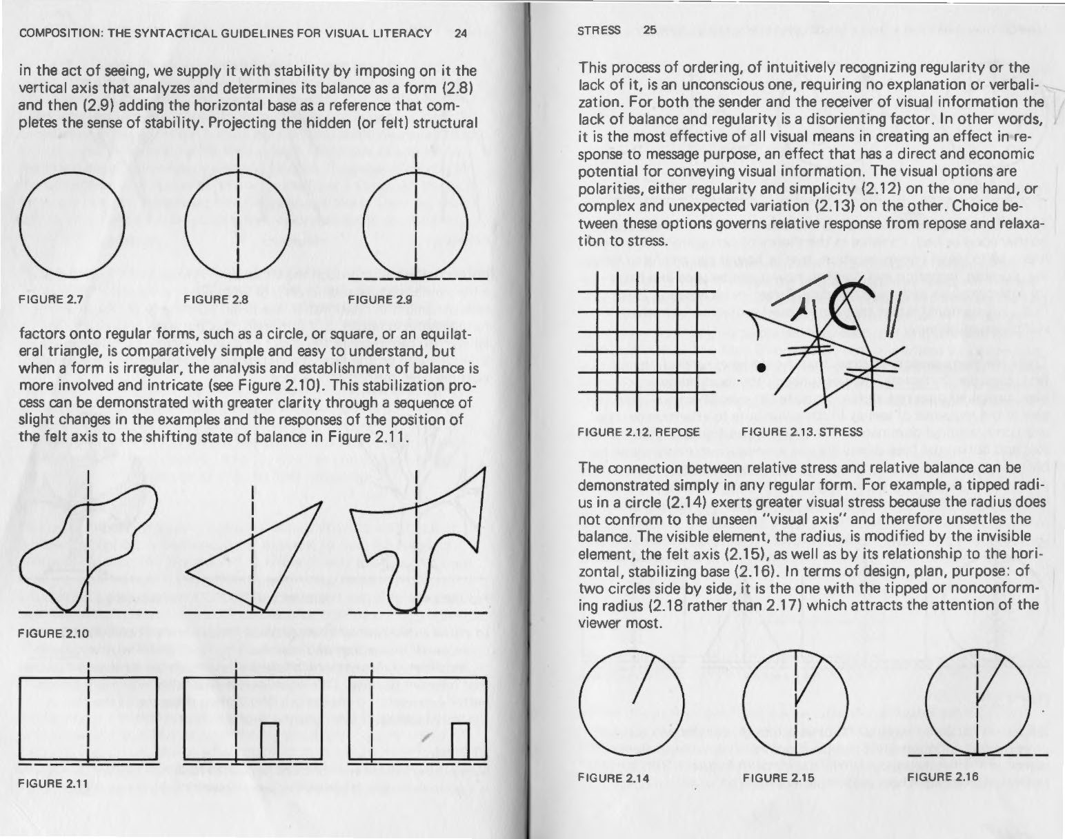
I am really into the part of the chapter on the gestalt diagrams. What we see what is made. It also cooresponds to the making connections plate. People tend to find a way to make sense of the graphics they see. This reminds of my childhood cloud watching experience when everyone in my class looked at the sky and describe what they saw. Everyone saw something other than just "a cloud."
When producing visua projects, I think it is significant to keep in mind this human nature of interpretation of visual elements and follow the "rules" of the graphical grammar, not to constrain the work but to pay attention to how the audience will perceive it.
Gestalt is a psychology term which means "unified whole". It refers to theories of visual perception developed by German psychologists in the 1920s. These theories attempt to describe how people tend to organize visual elements into groups or unified wholes when certain principles are applied.
These principles are:
Similarity
Similarity occurs when objects look similar to one another. People often perceive them as a group or pattern.
The example above (containing 11 distinct objects) appears as as single unit because all of the shapes have similarity.Unity occurs because the triangular shapes at the bottom of the eagle symbol look similar to the shapes that form the sunburst. When similarity occurs, an object can be emphasised if it isdissimilar to the others. This is called anomally.
The figure on the far right becomes a focal point because it is dissimilar to the other shapes.
Continuation
Continuation occurs when the eye is compelled to move through one object and continue to another object.
Continuation occurs in the example above, because the viewer's eye will naturally follow a line or curve. The smooth flowing crossbar of the "H" leads the eye directly to the maple leaf.
Closure
Closure occurs when an object is incomplete or a space is not completely enclosed. If enough of the shape is indicated, people percieve the whole by filling in the missing infomation.
Although the panda above is not complete, enough is present for the eye to complete the shape. When the viewer's perception completes a shape, closure occurs.
Examples
Proximity
Proximity occurs when elements are placed close together. They tend to be perceived as a group.
The nine squares above are placed without proximity. They are perceived as separate shapes.
When the squares are given close proximity, unity occurs. While they continue to be separate shapes, they are now perceived as one group.
The fifteen figures above form a unified whole (the shape of a tree) because of their proximity.
Figure and Ground
The eye differentiates an object form its surrounding area. a form, silhouette, or shape is naturrally perceived as figure (object), while the surrounding area is perceived as ground (background).Balancing figure and ground can make the perceived image more clear. Using unusual figure/ground relationships can add interest and sublety to an image.
Figure
The word above is clearly perceived as figure with the surrounding white space ground.
In this image, the figure and ground relationships change as the eye perceives the the form of a shade or the silhouette of a face.
This image uses complex figure/ground relationships which change upon perceiving leaves, water and tree trunk.
“The most complete graphic language systems appear in the twentieth century, as adjuncts to design curricula and professional training. Work at the Bauhaus, as well as in the technical academies and design schools founded in the 1920s and 1930s, such as Vkhutemas in Moscow, fostered a brief but generative dialogue between visual practices of design and those of fine art.”
- The Language of Graphics, pg 19
I chose to analyze the Bauhaus in the context of this text because I feel as if I always come across it referenced, but I wasn’t exactly sure what it encompassed. When I heard it mentioned in the chapter, I was curious about its connection to codifying graphics language, its role in graphic design history, and its merge between graphic design and fine art.
The Bauhaus was a German art school (1919–1933), famous for its approach to instruction and design thinking. It was a key player in the arts and crafts movement, which combines fine and applied art. It seems that most of this chapter was trying to identify the taxonomic foundation for graphics and information, without trying to be a history lesson on graphic design. With that said, it makes sense that the Bauhaus would be mentioned, and I wish it were mentioned in more detail. Through the research, it seems the school’s goal was to translate graphics and design in an intelligent manner, similar to what Gestalt theory does to visual perception and Walter Crane’s treet does to decorative motifs.
“The motivations behind the creation of the Bauhaus lay in the 19th century, in anxieties about the soullessness of manufacturing and its products, and in fears about art's loss of purpose in society.” – The Art Story
Instruction at the Bauhaus aimed to inject creativity back into manufactured goods and, in effect, daily life. The instruction separated itself from traditional fine art teaching, putting importance on the connection between intellectual and theoretical work and practical skills. In fact, the Bauhaus’ ethos was so influential to art education that many began to translate fine arts to visual arts, moving it from the sphere of humanities to research science. This style feels like it paved the way for data visualization and is significantly reminiscent of the field’s instruction today, which aims to channel the aesthetics of graphic design into visualizing data. In my eyes, there is a balance between understanding underlying theory, such as Jacques Bertin’s retinal and graphic variables, and understanding what makes data attractive to the layperson. The balance between these two goals shifts as the goal of the overall visualization shifts—i.e., if you’re working on an artistic visualization, aesthetics may take control.
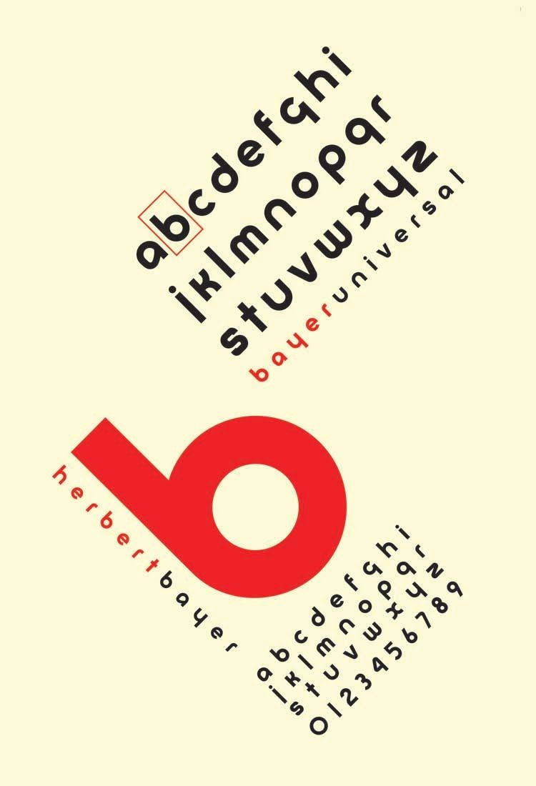
Typography Example: Universal Bayer by Herbert Bayer (1925)
Bayer converted the medieval-influenced German script that was popular at the time to a cleaner design with sans-serif style. Another interesting feature of this work is the fact that Bayer moved away from two different typecases (upper and lower) and moved only to lowercase.
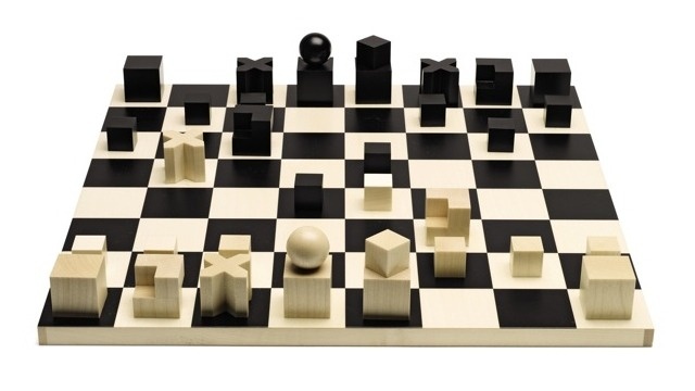
Bauhaus Chess Set by Josef Hartwig (1922)
While the game of chess is far away from the language of graphics and data visualization, I feature this example because of the unique game pieces, which have designs that match their possibility for movement in the game. I think this encoding in an interesting concept in terms of visualizing data, where the goal is often encoding utility in the imagery we’re producing.
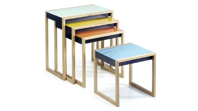
Bauhaus Nesting Tables by Josef Albers (1926–1927)
In line with the school’s interest to re-insert creativity into manufacturing, a lot of impactful furniture design came out of the Bauhaus, including these nesting tables. I feature these tables to connect to Jacques Bertin’s retinal variables, color-coding specifically, which match the size of each piece. In other words, the variable size is encoded in color.
Vision was prioritized above all other senses among the Ancients. The modern adages that one must "see it to believe it" or achieve understanding by "seeing the light" reinforce the triumph of vision as a means to knowledge, knowledge of our physical, digital, and imagined environments. Despite this, visual productions and visualizations, historically, have been eschewed as lacking the empiricism and objectivity of logo- and numero-centric approaches.
Human visual perception itself is not direct image transmission, but a mediated process, of computing a likely state of the world given retinal input. Our concept of what constitutes an unmediated image changes as tools for visual production change (in the present day, a photograph; in the 16th century, a copper plate).
From the development of novel tools and methods invariably arise novel outputs and outlooks on visual production. We work within the frameworks and limitations of our tools, and with new tools, expand into new capabilities of visualization.
Here, I think of British artist Harold Cohen, who under the tutelage of Stanford professor of programming and artificial intelligence Edward Feingenbaum, produced AARON, a computer tool that produces visual compositions autonomously. Programmed with primitives on visual entities in the environment, AARON became a visually epistemic machine that produced ceaselessly varied generative drawings.
AARON at work, at the Stedelijk Museum, 1977ink on paper, 57 × 76 cm, 1983pigment ink on canvas, 120 x 200 cm, 2014
I’d like to begin writing this essay by saying how much I love Graphesis by Joanna Drucker. I began reading this book over the summer and I have remained impressed by Drucker’s cinematic ability to describe this diverse (if not meandering) history of the development of data visualization as a field with depth, beauty, and impressively with brevity!
In the introductory chapter of “Image, Interpretation, and Interface”, Drucker outlines her plans to unveil the history of data visualization. She has a remarkable talent for connecting the dots to the variety of disciplines that have influenced the field we are studying today. We are introduced to the astronomers, economists, psychologists, policy makers, technologists and designers who were innovators in their own fields that inadvertently contributed to the development of this field. Drucker also smartly isolates data visualization as a specialty that exists outside of graphic design and the fine art canons in it’s own right. Drucker outlines the foundation of what she calls the eight visual approaches to knowledge production. They are:
Knowledge and/as vision
Language of form
Dynamics of form/universal principles of design
Gestalt principles and tendencies
Basic variables
Understanding graphics & editing
Processing images
Typology of graphic forms
I think it goes without saying that the introduction of ‘empathy’ to fields that study human beings and human behavior was really pivotal in terms of the ethical imperative to move towards diversity and inclusivity in fields like anthropology or psychology. Practitioners like Wilhem Worringer and Ernst Cassirer were finally in a place where they needed to take into account, all of the different ways human beings experience the world and therefore, interpret the world. In the reading, I found myself most drawn to the discussion of the theoretical study of graphic elements named the Gestalt Principles, because I explore the tension between reality, perception and the (meta)physical body in much of my own art work. I found my own curiosities to be aligned with the overall concern with how to make links between “visual knowledge, psychology, and the human experience.” I took an experimental film class several years ago where we were asked to create a piece that was a study on the ontology of the camera to test the limits of its ability to replicate the functions of the human eye. Human beings are often rendered temporarily blind until they readjust to suddenly lighted space, so I wanted to test the camera’s ability to recover from dark to instant light. I wound up making Double Darkness; a reflection of how I may personally be perceived based on my race and gender expression by using bright flashes of light in a dark space. The flashing patterns that roll along the screen add a layer of difficulty to detecting what you think you see.
The ideas behind the development of the Gestalt Principles emerged from the study of psychology in the 1930’s, and it is based on the observation that human beings seem hardwired to group things together or detect patterns in similar ways. This hardwiring is a survival tool whose use is impacted by the region where one lives, their beliefs about the world around them, and the affordances of life that may be available to them at any given time. While this realization had shown a light on the inherent problems of Western exceptionalism the fields of study in the 1930’s, the early works that are referenced in Chapter 1 also reflect the roots of Orientalism which continues to plague the social sciences.
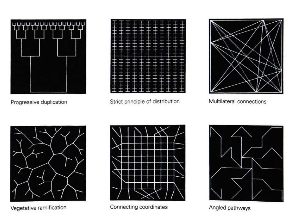
That being said, there were a couple images that stood out to me. Anton Stankowski’sVisual Presentation of Invisible Processes focuses on skeletons, canal systems, networks and grids, and the fine structure of matter which can only be seen under a microscope.
These images represent organizations in nature which can not be seen with the naked eye. These examples are linocuts which exemplify how a square surface can be divided into internal patterns, and these patterns can be compared to nature, used to create communication systems, and the function of a technological apparatus.
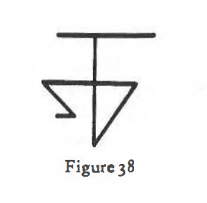
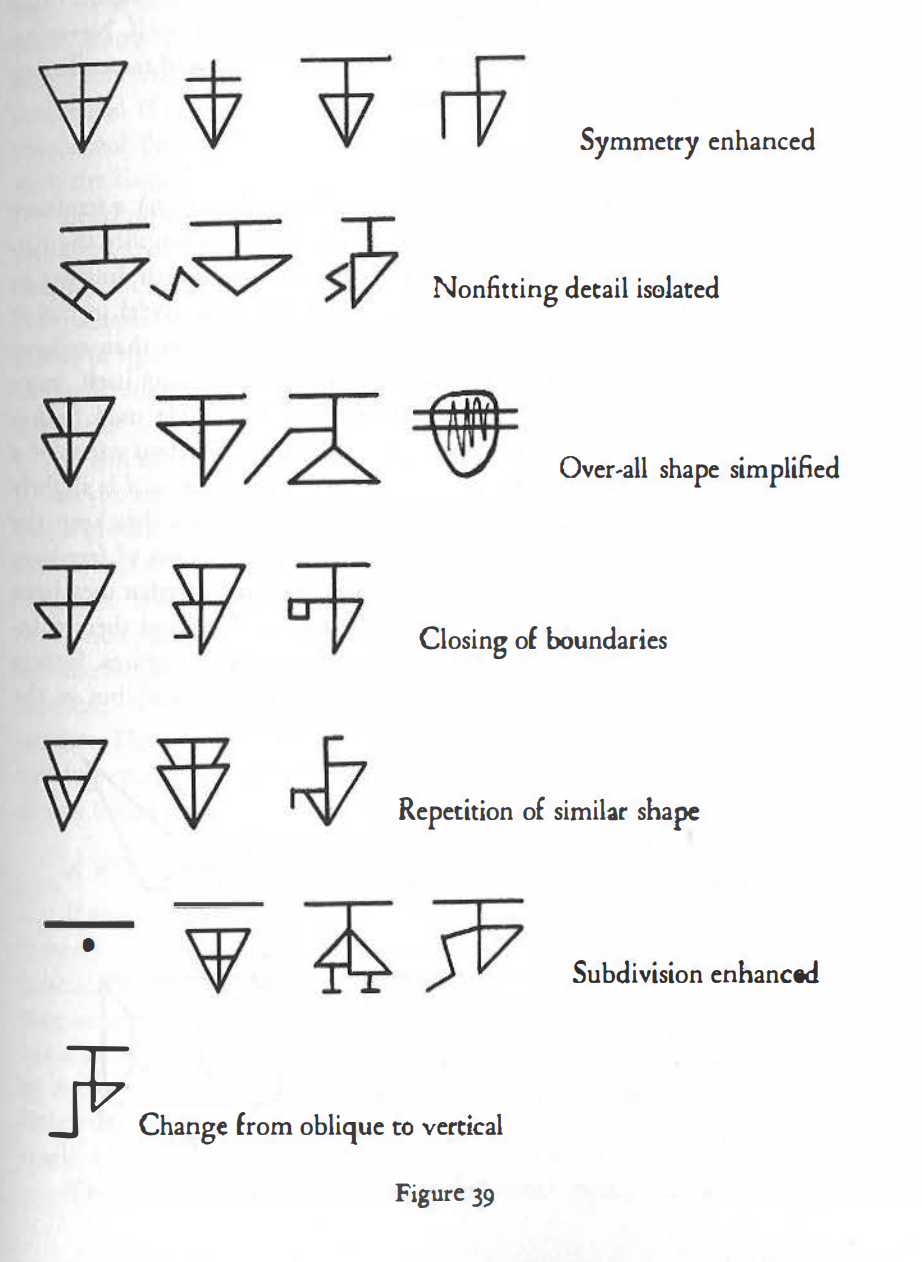
Rudolph Arnheim published Art and Visual Perception in 1954, and in it he wrote extensive chapters on Balance, Shape, Form, Growth, Space, Light, Color, Movement, Dynamics, and Expression. In the chapter on “Shape”, Arnheim discussed that magic that can happen when there is what he calls ‘the discrepancy of complex meaning and simple form’. For example, in the images below, in the discussion on memory traces, Arnheim displays the results of a study where a group of participants are exposed to the drawing (Fig. 38).
for “a split second”, and are asked to “draw with much reflection but as accurately as possible what they have seen.” The variety of the reactions on display are considered typical results, due to individual differences, and distance from the image. There are all simplifications of the image that lead to a large diversity of solutions and alternate patterns.
This small subsection of the introductory chapter is a great example of why it’s so important to take individual and cultural experiences into consideration when we interpret data visually for large audiences. The assumption that there is a “universal experience” is false, because what people see, remember, and believe is always relative.