Look at Data: What Makes Bad Figures Bad - Kieran Healy, Carl Bergstrom and Jevin West
In the essay, Look at Data: What Makes Figures Bad, the authors analyze the various types of “bad” data visualizations in order to both understand there downfalls and remedy them in the future. The authors describe the three most common problems with bad figures as being, aesthetic, substantive and perceptual. While all three of these elements can be present on their own, the authors note that often the worst figures tend to incorporate a mix of all three. When discussing poor aesthetic choices or “bad taste”, the authors grapple with the idea that good design should be simplistic and should always maximize the data-to-ink ratio. Although aesthetic problems play a large role in the creation of bad figures, the authors assert that substantive problems are much more common. Finally, bad perception deals with how the viewer understands certain shapes and relationships making it arguably the most difficult to correct because it requires a deeper understanding than both aesthetic and substantive issues.
Within the essay, the authors reference Richard Tufte, to explore his views on good design when dealing with data. I strongly agreed with Tufte’s argument that good design presents complex ideas in a simple and precise manner. I also resonated with the belief that if a figure or object is designed thoughtfully, it should be ageless and remain modern for future decades. The idea of simplicity and modernity in good design is demonstrated in many creative fields, such as architecture and furniture design. For example, the Charles and Ray Eames chair was created over 50 years ago, yet due to its simplicity, it is still considered modern and highly valued.
The authors emphasize the importance of the data-to-ink ratio however; I began to question whether there are exceptions to this principle in today’s post internet era. While I can appreciate minimalism and simplicity in design, there is also an argument to made for the beauty in design that incorporates humour and chaos. Through the rise of the internet, a lot of the art we see today is purposefully tacky, kitschy and ironic yet still highly regarded in the art world. However, when looking only at visualizing numbers, I believe it is important to weigh on the simpler side of design, ensuring the aesthetic does not overpower content. On the other hand, I also believe there is an important place for humour and playful design in data visualization as it can transform the way people think of numbers and statistics. This raises the question of whether it is even possible to incorporate a sense of playfulness into data visualizations without damaging the readability and clarity of the data itself? Must all good data visualizations adhere to a simplistic aesthetic?
Misleading Axes on Graphs - Carl Bergstrom and Jevin West
In the essay, Misleading Axes on Graphs, Bergstrom and West discuss how visualizations can be created to both exaggerate and conceal data, ultimately persuading the reader to think a certain way. The authors describe multiple ways in which a graphs axes can be manipulated, such as changing the scale or inverting the axes, to emphasize its effect on the overall story of the visualization. Furthermore, the authors draw a distinction specifically between bar charts and line graphs, as bar charts should always include zero on the y axis while line graphs should not. The main message of the article was to explore how subtle changes to the axes can drastically affect the way the information is presented to and interpreted by the viewer.
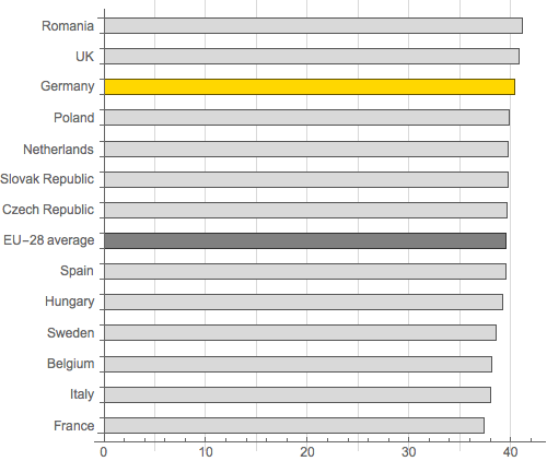
In the re-drawn bar chart of the German economic development agency titled, Average number of actual weekly hours of work in main job, full-time employees, the creator removed certain parts of the graph even though they were not misleading. I found this to be interesting because although the horizontal gridlines did not negatively influence the story of the chart, they were omitted simply for aesthetic choices. I believe this is important to emphasize because while it is easy to edit a visualization looking only for parts that are misleading, it is also critical to go one step further and also edit out features that are not necessary to the design.
In regards to the Powerline graph example and how graphs are used specifically to conceal or hide information about global warming, do you believe there should be laws or rules that prohibit this? Similarly, to what extent can we assume that people will be able to recognize that a graph is altered to conceal or exaggerated information? Does the onus lay on the person creating the graph to not mislead the reader? or should the reader assume the responsibility of critically analyzing the data presented to them?
The Principle of Proportional Ink - Carl Bergstrom and Jevin West
In Bergstrom and West’s essay titled, The Principle of Proportional Ink, the authors assert that the ratio of ink used to represent a value should be proportional to that same value in a figure. This principle can be seen as an extension to the argument about misleading axes and is actually based of a more general principle by Edward Tufte. Through analyzing various types of charts including bar charts, bubble graphs and donut bar charts, the authors seek to emphasize the importance of following the principle of proportional ink when designing visualizations. Although the authors make a strong case for the use of this principle, it is evident that many visualizations today do not incorporate it, resulting in countless bad visualizations.
In reference to 3D figures, I agree that 3D is often used only to impress the viewer and not because it enhances the clarity or interpretation of the data. I think in the past, 3D was used mainly because it was a relatively new technology and created more exciting figures. Similar to the points made in the previous essay by Bergstrom and West, I believe it is important to constantly edit and refine design elements when visualizing data. Thus, designers should always critically question the necessity of 3D elements and seek to rationalize all design choices. I also found it interesting that the authors pointed out a connection between the use of 3D and “professionalism”. In the past, there have been instances where I assume a graph is well created purely because of its professional aesthetic. I think it is important to recognize that a lot of bad data can be concealed, both on purpose or accidentally, using interesting and unique design.
Another aspect of the essay that I found intriguing was the idea that human looking patterns affect the way data is interpreted on a figure. For example, in three-dimensional pie charts, the eye often focuses more on the front of the disk ultimately placing more importance on that specific information. This is also present in bubble graphs, as the eye cannot detect subtle differences in the size of disks. When considering these patterns, it is important to incorporate human centered design principles. Instead of simply designing a figure to communicate information, data visualizers should be acutely aware of their audience and seek to understand the limitations of the viewer.
References:
http://socviz.co/lookatdata.html#what-makes-bad-figures-bad
https://callingbullshit.org/tools/tools_misleading_axes.html
https://callingbullshit.org/tools/tools_proportional_ink.html