Definition
The word histogram comes from the Greek 'histos', meaning "anything that stands upright", and 'gram', which means chart or graph (source: NCSS Statistical Software, Etymology online). The term was coined by Karl Peterson in 1895.
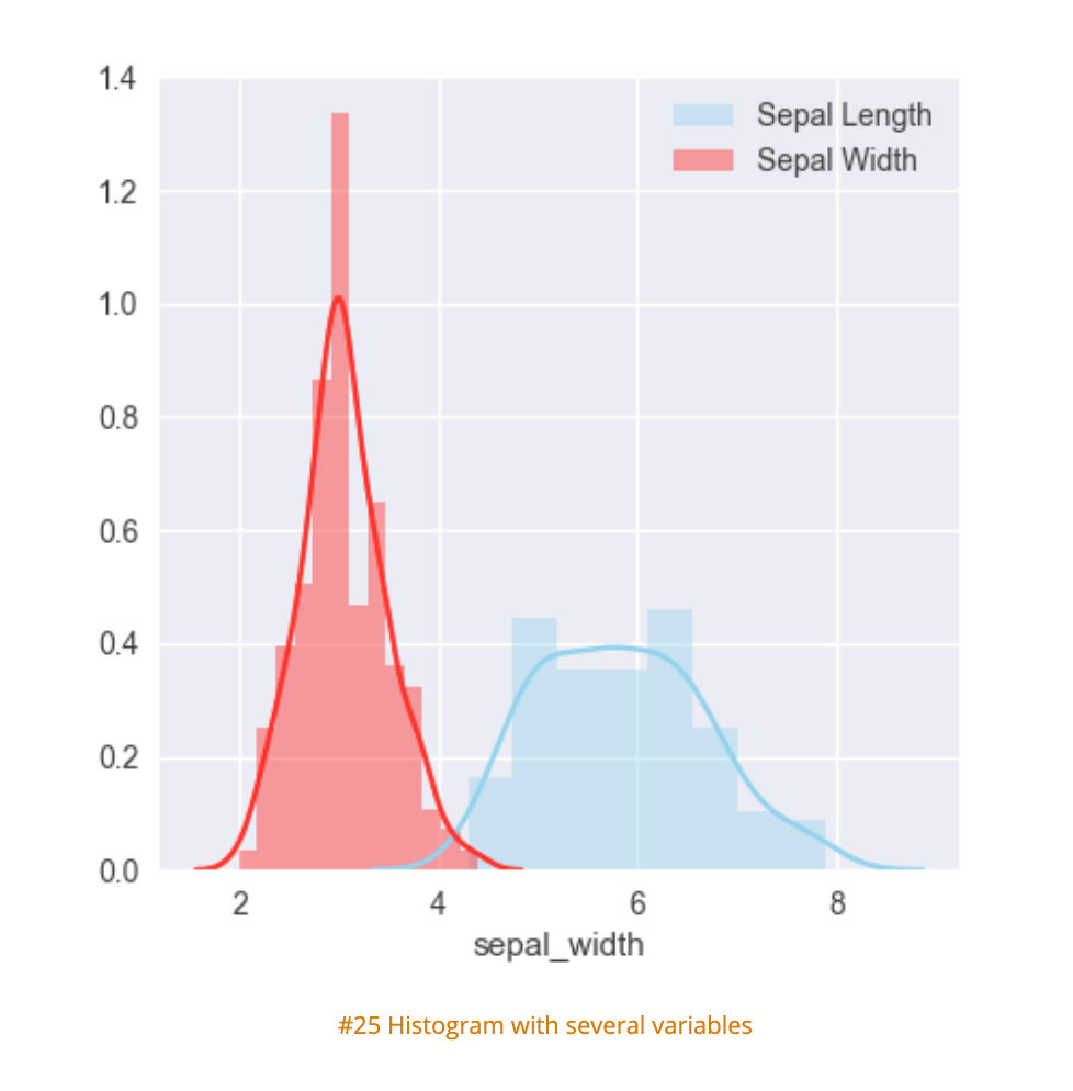
Histograms are accurate representations of continuous, numerical data on a singular axis. A histogram is a visualization of the frequency distribution in which the vertical axis represents the count (frequency) and the horizontal axis represents the possible range of the data values.
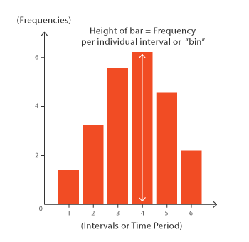
Each bar in a histogram represents the frequency of scores within the intervals (also known as bins). Histograms help estimate where values are concentrated, what the extremes are and whether there are any gaps or unusual values. The bins are the main differentiator from a bar chart: a histogram can only plot the frequency of score occurrences whereas a bar chart can plot many other kinds of data. Histograms can also be normalized to display relative frequencies, which will quickly show how often data occur in relation to other data. Histograms are useful for:
- Comparing data within intervals
- Showing data over time
- Displaying and analyzing distribution
- Finding patterns across ranges
Creation
The bars produced in histograms are used to represent the shape of the distribution of data and as such are used to perform communicate business and math analysis. Bar shapes can vary in height or width, as long as the groups are defined in a way that clearly communicates any relevant patterns. Creating a histogram can be straightforward if the data is grouped correctly. It is important to try filtering the data several times to explore relevant patterns.
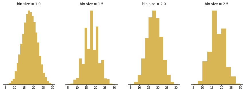
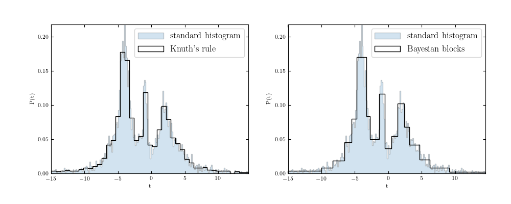
Several methods have been developed for optimizing data bins in creating histograms. Bayesian blocks, shown below, is a dynamic histogramming method utilizing probability density functions to program bin widths.
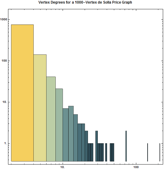
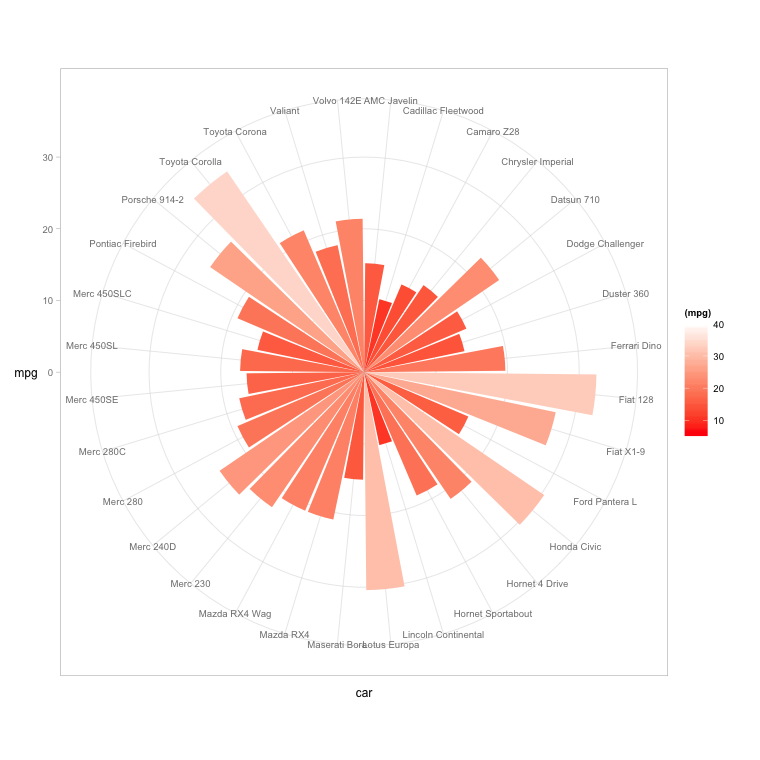
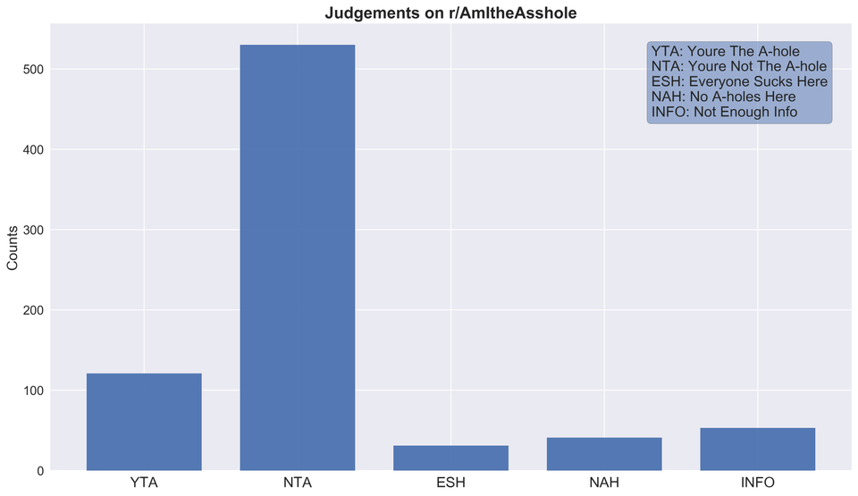
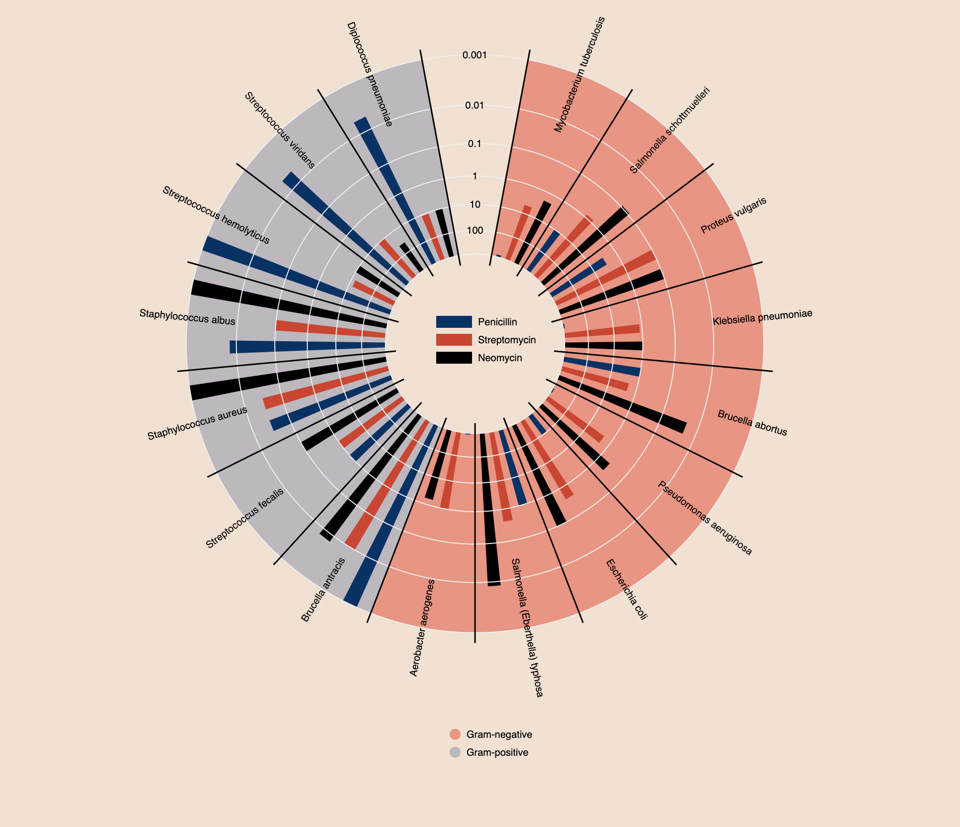
Histograms don't have to remain vertical; radial histograms, polar histogram and angle histograms are useful for examining peaks and identifying abnormalities in distribution from a similar starting point.
Analysis
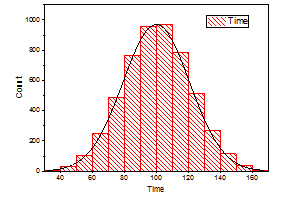
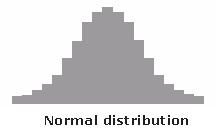
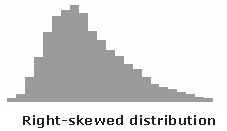
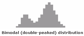
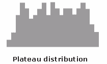
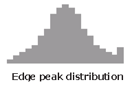
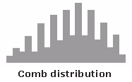
With the right bins, analyzing a histogram can be one of the quickest ways to communicate patterns across a data set. As histograms examine frequencies rather than other kinds of data, it is easier to tell if a distribution has any irregularities within it. Here are some examples of what different distributions might look like in a histogram and what they mean:
Creative Histograms
The following histograms expand on histogramming methodology to convey more data, as clearly as a classic histogram.
- Comprehensible bins
- Shows an obvious pattern
- Quickly identifies spikes in frequency
- Well labelled
- Clear differentiators
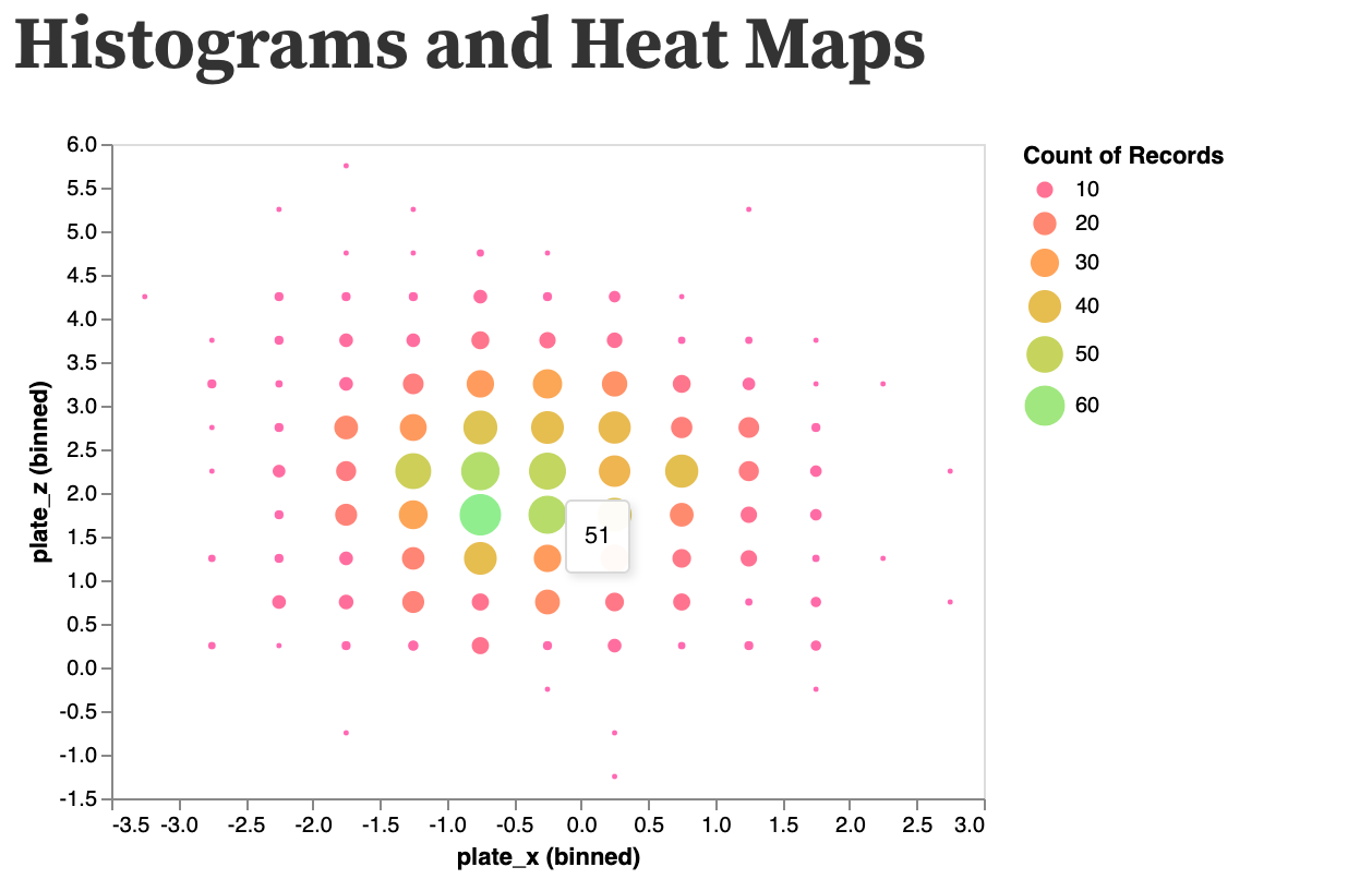
- Displays data within frequency
- Uses multiple retinal variables without confusing the reader (at least n sample data)
- Combines several data sets across frequency
- Clear labeling