The author's experience with color, coming from NASA, emphasizes the importance of color maintaining accuracy and scientific resonance. The examples that he used to communicate where lightness, saturation, and hue can be used and misused were easy to understand and reminded me how important it is to be strategic with color choice. Because of the different factors that make up what we perceive when we look at color, it becomes a multidimensional element and can be very rich in information when used properly.
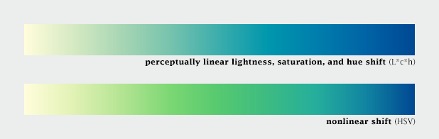
I am interested to look further into the Nasa Color Tool and to practice using L*C*h when selecting colors instead of defaulting to whatever program I'm using seems to prefer. The examples showing how differently spaced the rainbow hues are from each other made it much more clear on why "stepping" from one to the next is not actually accurate when communicating a proportionate change in data. This example below showing L*C*h vs. HSV helped me understand how there is more room for perceiving variation in color with L*C*h.
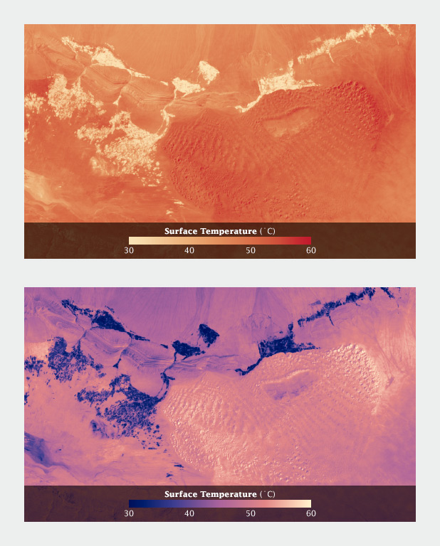
The pre-attentive processing and intuitive notions on color are aspects that are essential for those working with data visualization to be cognizant of. I am curious if there is a methodology or step-by-step process to walk through when beginning to consider color. For example, first determining what is and what isn't data, then considering what variables may or may not have an intuitive or cultural association with color (for example, water), and finally, what relationships do all the variables have to each other and how should the colors differ. There also needs to be a time to check your work to make sure that the colors you're using are accurately representing the data and can be perceived by people with color blindness. The example Simmon used with the surface temperature heat map was a helpful demonstration of the necessity to check-in, by showing that palettes that may work at a large scale, may not work when zoomed in to a more detailed scale.
Overall, this article and video are a great reminder of how specific and strategic a data visualization designer must be when selecting colors to represent data. Not only must color be representative of the data, accurate in its changes, perceptible, and aligned with preconceived notions, it should also be all around aesthetically pleasing. Color should never be an after thought.