Reading #1

Responses: 25

Zui Chen

Data visualization relies substantively on authors' choices of axes arrangement, such as truncation and scaling, as well as the shapes, including figure types and relative sizes.  

Apparently, if the obtained data has significant biases, fake information, or simply a large number of missing data, then the visualization would not be as clear and perceptive as those developed from comprehensive datasets. Leaving aside the influence the data quality and looking at the visualization methods only, how to choose the appropriate axis scaling and truncation, as well as the displaying shape is critical to the quality of any data visualization.

First, the importance of not truncating bars and scaling in line charts is emphasized in the articles. Changes in these aspects can lead to misunderstanding of the original information intended to show, and of course, sometimes are used deliberately to "deceive" the readers for promotional or other purposes. Second, the concept of "proportional ink" is another substantive guiding rule that data visualizers should always keep in mind. The perception of data visualization requires integration with the psychological interpretability of humans on visual figures. Accuracy should not give way to aesthetics. It is essential to find out the most interpretable form of presenting the data, not just simply altering the inept choice and give away accuracy to gain more awareness from the audience.

Felix Buchholz

I really enjoyed this week’s readings, especially the first Chapter of Kieran Healy’s book Data Visualization. I don’t want to be too humanistic about it, but I found it remarkable, that the visual honesty, clarity and mindfulness he is advocating for is also represented in her text, for example when he explains the limits of the scope of her text as well as ongoing research in the introductory paragraphs of Chapter 1.3 & 1.3.1.

Overall I think the text is a good addition and contextualization of our discussion in class and is well structured to consult for later reference.

It hasn’t been the first time I was introduced to the Gestalt principles, but Healy’s explanation and visualization was by far the most concise and still fine grained I’ve seen so far and it stuck with me, because I realized how subtle differences not only affect communication effectiveness and aesthetics but also the integrity of the whole act of communication. Even though I was aware that the category of “honesty” would be a new dimension to design for me, I am surprised how fragile and vulnerable it seems to be and therefore demands a great deal of attention. I think it’s largely the influence of  Bergstrom & West's passionate Calling Bullshit essays that most of my thoughts and questions circle around the theme of integrity.

I think when visualizing data we should be mindful of the fact, that the result will never be neutral and regarding the topic of our dataset, our audience and our client’s or our own intentions we could take responsibility and try and communicate design decisions (more) openly. We could even discuss if that can be a reaction to the post-empirical condition we’re confronted with at the moment. To give a bit of context to my following and maybe odd thoughts I wanted to give a short preview to the discussion of Laura Kurgan’s text in the Major Studio 1 course. Here’s a quote from Bruno Latour that she references regarding the crisis of representation:

But it might also be the case that half of such a crisis is due to what has been sold to the general public under the name of a faithful, transparent and accurate representation. We are asking from representation something it cannot possibly give, namely representation without any re-presentation, without any provisional assertions, without any imperfect proof, without any opaque layers of translations, transmissions, betrayals, without any complicated machinery of assembly, delegation, proof, argumentation, negotiation and conclusion. (Latour, 2005, p. 26)

Kurgan advocates for a new understanding of truth, that might be helpful when thinking of new ways to communicate the limits of data visualizations. Referring to her previous juxtaposition of a photograph of earth taken from space and a rendering of it from collected satellite data she suggests that this example

helps us understand what has become of truth in the era of the digital data stream: it is intimately related to resolution, to measurability, to the construction of a reliable algorithm for translating between representation and reality. (Kurgan, 2013, p. 12f)

tl;dr

Even if this is might be a bit stretched and Kurgan’s suggestion does not directly apply to human designed visualizations, it leads me to the following questions (sorry for the long introduction):

  1. Kieran Healy mentions several times that we cannot take for granted that everybody understands how to read a scatterplot or the less common types of charts. Would it help to include something like a manual, in cases when we are not completely sure whether the audience is used to interpret the kind of visualization we use?
  2. Many of the good visualization examples include the source reference to the original data set. But to prevent the misleadings like in the New York line chart suggesting declining support of democracy could we communicate in one way or another how the data was treated to create the graph?
  3. Regarding the inclusion of the “zero” and the importance of the aspect ratio of a graph, would it be an option to allow the user, where applicable and the conditions, to choose whether he wants to see a version with the “zero” or even alter the aspect ratio? – Of course it is still an option to set boundaries for this user interaction.
  4. When talking about persuasive methods in information aesthetics, how would you describe a fairly neutral “style”? Can we avoid that these “style” conventions can also be tempered with, in a sense that the design suggests integrity but is actually deceptive?
References

Bergstrom, C., & West, J. (n.d.-a). Tools - Misleading axes on graphs. Retrieved September 8, 2018, from https://callingbullshit.org/tools/tools_misleading_axes.html

Bergstrom, C., & West, J. (n.d.-b). Tools - Proportional Ink. Retrieved September 8, 2018, from https://callingbullshit.org/tools/tools_proportional_ink.html

Healey, K. (2018). Data Visualization. Retrieved from September 8, 2018, http://socviz.co/lookatdata.html

Kurgan, L. (2013). Close Up at a Distance. New York: Zone Books.

Latour, B. (2005). From Realpolitik to Dingpolitik, or How to Make Things Public. In B. Latour & P. Weibel (Eds.), R. Bryce & et al. (Trans.), Making Things Public: Atmospheres of Democracy. Cambridge: MIT Press.

Mio Akasako

Graphs and plots are "visual representation(s) of data, not way to magically transmit pure understanding"--though there is an implicit understanding of this fact within me, I was newly struck by the truth of this statement while reading Healy's introductory chapter in Profiles of Badness and Bergstrom and West's essays.

Many of the variables mentioned in her chapter are understandable intuitively. In other words, it makes sense that ordered and unordered data have different optimal channels of for mapping them; it makes sense that including or excluding a zero point on the x-axis will affect the perceived amplitude of change in the y-axis data points. Coming from a neuroscience background, I am fully aware of the ways in which visual perception alters the reality of what we are presented in the visual field. But to be faced with a comprehensive explanation of all of the ways in which perception plays into interpretation of data magnified the sheer multitude of factors that actually contribute to (or take away from) good visualization.

Whenever I had to make plots for scientific data, I mainly worked with my intuition--what looks and feels right? What communicates the data most clearly, and gives the most amount of information? I realize now that so much more goes into the creation of a good visualization; every detail in it must have a reason for why it has been placed there, why it has been formatted in that way. It is not enough that the visualization looks aesthetically pleasing, or the data is being presented "accurately". It relies both on good aesthetics and good data presentation, but ultimately culminates in the interpretation the viewer makes of it. We must think carefully about what can influence this interpretation, and make sure that our presentation of data does not create bias or misinformation.

Questions:

  1. As data visualization becomes more complex as technology advances, there is more freedom in the way data can be visualized and interacted with. Is there any work/research being done on best practices when making visualizations that are interactive (i.e. How much of interactivity is "fluff"? How much contributes to deeper understanding of the data being presented? How is it impeding understanding by presenting too much information?)
  2. Healy states that we cannot rely on viewers to know how to accurately read a scatterplot (or that the percentage of people who can accurately read one is lower than we think). How do we make sure that viewers have a uniform baseline understanding of the visualization types that we choose to use? How do we do that without imposing our own biases/interpretations of data?

Suzanna Schmeelk

This work examines the importance of visualizing data.  A visualizing exercise by Jan Vanhove (2016) shows 16 graphs of data.  

The graphs quickly show the viewer details about the data such as skew, outliers, trends, residuals, and categories.  The same data represented in a table may not as easily tell the same story.  One note to remember is to study the graph scale, tho, to ensure proper understanding.  The author argues that what makes a visualization bad is “tacky, tasteless, or a hodgepodge of ugly or inconsistent design choices.”  They present Figure 1.4 as evidence of their argument stating, “the bars are hard to read and compare. It needlessly duplicates labels and makes pointless use of three-dimensional effects, drop shadows, and other unnecessary design features.”  The author then introduces Edward R. Tufte as an example of tasteful visualization.  The author notes Tufte’s book The Visual Display of Quantitative Information (1983) as a classic with sequels (Tufte, 1990, 1997).  Tufte cites Charles Joseph Minard’s famous visualization of Napoleon’s march on Moscow as that it “may well be the best statistical graphic ever drawn.”  The author then discusses what makes a graphic memorable.  He elaborates that it’s not the pen-to-ink ratio, the simplify-simplify paradigm, etc.  He argues that visualizations need to be distinctive to be memorable.  

Some other categories discussed by the author of bad visualizations include bad data and bad perception.  The first property, “bad data” speaks for itself.  Bad perception, however, is in the way the data is encoded into the graph—scales, ratios, etc.---both Tufte (1983) and Wainer (1984) give examples.  

The work discusses perception and data visualization along with the visual tasks and decoding graphs.  The author notes the following relationships that can be inferred within a visualization: Proximity: Things that are spatially near to one another seem to be related; Similarity: Things that look alike seem to be related; Connection: Things that are visually tied to one another seem to be related; Continuity: Partially hidden objects are completed into familiar shapes.; Closure: Incomplete shapes are perceived as complete; Figure and Ground: Visual elements are taken to be either in the foreground or the background; Common Fate: Elements sharing a direction of movement are perceived as a unit.  

The author discusses channels for representing data and problems with good judgement.  These include different “sorts of variables attributes can be represented more or less well by different kinds of visual marks or representations, such as points, lines, shapes, colors.”  Both the channels and the perceptual details that we use to implement it inform the effectiveness of the visualization.

I agree with the author mainly from experience with visualizations in media, books, etc.  I like the discussion about what makes a visualization memorable? I think that the author has a point with a graphic being distinctive.  In fact, it is hard to remember one of many.  I’m curious as to what the class thinks about what makes a visualization memorable.

Figure 1.6 from reading Nigel Holmes 

Mikaela Ergas Lenett

Look at Data: What Makes Bad Figures Bad - Kieran Healy, Carl Bergstrom and Jevin West

In the essay, Look at Data: What Makes Figures Bad, the authors analyze the various types of “bad” data visualizations in order to both understand there downfalls and remedy them in the future. The authors describe the three most common problems with bad figures as being, aesthetic, substantive and perceptual. While all three of these elements can be present on their own, the authors note that often the worst figures tend to incorporate a mix of all three. When discussing poor aesthetic choices or “bad taste”, the authors grapple with the idea that good design should be simplistic and should always maximize the data-to-ink ratio. Although aesthetic problems play a large role in the creation of bad figures, the authors assert that substantive problems are much more common. Finally, bad perception deals with how the viewer understands certain shapes and relationships making it arguably the most difficult to correct because it requires a deeper understanding than both aesthetic and substantive issues.

Within the essay, the authors reference Richard Tufte, to explore his views on good design when dealing with data. I strongly agreed with Tufte’s argument that good design presents complex ideas in a simple and precise manner. I also resonated with the belief that if a figure or object is designed thoughtfully, it should be ageless and remain modern for future decades. The idea of simplicity and modernity in good design is demonstrated in many creative fields, such as architecture and furniture design. For example, the Charles and Ray Eames chair was created over 50 years ago, yet due to its simplicity, it is still considered modern and highly valued.  

The authors emphasize the importance of the data-to-ink ratio however; I began to question whether there are exceptions to this principle in today’s post internet era. While I can appreciate minimalism and simplicity in design, there is also an argument to made for the beauty in design that incorporates humour and chaos. Through the rise of the internet, a lot of the art we see today is purposefully tacky, kitschy and ironic yet still highly regarded in the art world. However, when looking only at visualizing numbers, I believe it is important to weigh on the simpler side of design, ensuring the aesthetic does not overpower content. On the other hand, I also believe there is an important place for humour and playful design in data visualization as it can transform the way people think of numbers and statistics. This raises the question of whether it is even possible to incorporate a sense of playfulness into data visualizations without damaging the readability and clarity of the data itself? Must all good data visualizations adhere to a simplistic aesthetic?

Misleading Axes on Graphs - Carl Bergstrom and Jevin West

In the essay, Misleading Axes on Graphs, Bergstrom and West discuss how visualizations can be created to both exaggerate and conceal data, ultimately persuading the reader to think a certain way. The authors describe multiple ways in which a graphs axes can be manipulated, such as changing the scale or inverting the axes, to emphasize its effect on the overall story of the visualization. Furthermore, the authors draw a distinction specifically between bar charts and line graphs, as bar charts should always include zero on the y axis while line graphs should not.  The main message of the article was to explore how subtle changes to the axes can drastically affect the way the information is presented to and interpreted by the viewer.

In the re-drawn bar chart of the German economic development agency titled, Average number of actual weekly hours of work in main job, full-time employees, the creator removed certain parts of the graph even though they were not misleading. I found this to be interesting because although the horizontal gridlines did not negatively influence the story of the chart, they were omitted simply for aesthetic choices. I believe this is important to emphasize because while it is easy to edit a visualization looking only for parts that are misleading, it is also critical to go one step further and also edit out features that are not necessary to the design.

Re-drawn graph with horizontal gridlines omitted (https://callingbullshit.org/tools/tools_misleading_axes.html) 

In regards to the Powerline graph example and how graphs are used specifically to conceal or hide information about global warming, do you believe there should be laws or rules that prohibit this? Similarly, to what extent can we assume that people will be able to recognize that a graph is altered to conceal or exaggerated information? Does the onus lay on the person creating the graph to not mislead the reader? or should the reader assume the responsibility of critically analyzing the data presented to them?

The Principle of Proportional Ink - Carl Bergstrom and Jevin West

In Bergstrom and West’s essay titled, The Principle of Proportional Ink, the authors assert that the ratio of ink used to represent a value should be proportional to that same value in a figure. This principle can be seen as an extension to the argument about misleading axes and is actually based of a more general principle by Edward Tufte. Through analyzing various types of charts including bar charts, bubble graphs and donut bar charts, the authors seek to emphasize the importance of following the principle of proportional ink when designing visualizations. Although the authors make a strong case for the use of this principle, it is evident that many visualizations today do not incorporate it, resulting in countless bad visualizations.

In reference to 3D figures, I agree that 3D is often used only to impress the viewer and not because it enhances the clarity or interpretation of the data. I think in the past, 3D was used mainly because it was a relatively new technology and created more exciting figures. Similar to the points made in the previous essay by Bergstrom and West, I believe it is important to constantly edit and refine design elements when visualizing data. Thus, designers should always critically question the necessity of 3D elements and seek to rationalize all design choices. I also found it interesting that the authors pointed out a connection between the use of 3D and “professionalism”. In the past, there have been instances where I assume a graph is well created purely because of its professional aesthetic. I think it is important to recognize that a lot of bad data can be concealed, both on purpose or accidentally, using interesting and unique design.

Another aspect of the essay that I found intriguing was the idea that human looking patterns affect the way data is interpreted on a figure. For example, in three-dimensional pie charts, the eye often focuses more on the front of the disk ultimately placing more importance on that specific information. This is also present in bubble graphs, as the eye cannot detect subtle differences in the size of disks. When considering these patterns, it is important to incorporate human centered design principles. Instead of simply designing a figure to communicate information, data visualizers should be acutely aware of their audience and seek to understand the limitations of the viewer.

References:

http://socviz.co/lookatdata.html#what-makes-bad-figures-bad

https://callingbullshit.org/tools/tools_misleading_axes.html

https://callingbullshit.org/tools/tools_proportional_ink.html

Candice Chan

1. Misleading Axes on Graphs
This essay focuses on the message that data visualizations can not only bring out important aspects of data but also conceal or mislead. I agree that subtle choices, such as the range of the axes in a bar chart or line graph can have massive impact on the story that the graph tells. For instance, drawing bar charts with a dependent variable axis that does not go to zero can be misleading, whereas line graphs with dependent variable axis that reaches 0 can obscure important patterns and make it harder to see relevant changes in a range. By looking at some of the examples laid out, it is important to understand the difference between a graph designed to tell a story that accurately reflects the data or a graph designed to tell a story more aligned with what the author believes.

The importance between determining the proper use of the x and y axis can be seen in the following example. It is interesting to see how one small change can completely alter the message behind climate change: the first graph depicts a steady increase in temperature, while the second graph shows no increase over many years.  

Questions:
In a time when stories form so rapidly and so many parties are involved (people, social networks, publishers, content distributors, etc.), who gets to decide what is real? How do we identify information that is tinted, incomplete, or manipulative that may support someone else’s agenda?

2. The Principle of Proportional Ink:
The principle of proportional ink discusses how many forms of data visualization use shaded areas to represent data values. To avoid misleading viewers, it is important that the size of the shaded areas in graphs are directly proportional to the value itself. Although the principle of proportional ink rule applies to bar charts, it does not apply to line graphs as the amount of ink is not used to indicate the magnitude of a variable. Instead, a line chart should be scaled so as to make the position of each point maximally informative. The article highlights several instances where this principle is violated, especially with the use of 3D.

By looking at multiple examples of poorly used 3D graphs, I agree that many 3D graphs are more difficult to interpret than 2D graphs because the angle that the graph is shown can make it difficult to correctly see the length or size of each bar. The sizes of some bars are fully visible, whereas the sizes of other bars are partially obscured. The 3D characteristics serve no additional purpose other than to impress the viewer.

Questions:
The article mentions 3D graphs serving a purpose when they are used to display values associated with a pair of independent variables, when are other instances that 3D graphs would be useful?

3. What Makes Bad Data Bad:
This article examines the “badness” of data, broken down into three main topics: substantive, aesthetics, and perception. The author provides both good and bad examples of visualizations in order to develop good taste-based judgements on how to represent graphics.

I agree with Tufte’s message that “complex ideas communicated with clarity, precision, and efficiency is that which gives to the viewer the greatest number of ideas in the shortest time.” Simple graphics that speak for themselves are most powerful, but most difficult to portray because of the careful balance between the data and the aesthetics. Perception, which lives in the gap between data and aesthetics, is one of the most difficult forms of “badness” to solve by the application of good taste or following the general rule to maximize data-to-ink ratio because we have to take into consideration colour, edges, contrast, relationships between data and how to represent them in a way that stays true to the fact we want to show.

Questions:
How do we make our data visualization distinct and memorable from one another?
How do we stay neutral in our style of representing data so as to not impose our own biases?

Brad MacDonald

Having just researched and written about Edward Tufte's Beautiful Evidence I have an immediate sense of relief reading the opening paragraph of this essay. This statement, particularly, resonated with me - "The graphs you make are meant to be looked at by someone. The effectiveness of any particular graph is not just a matter of how it looks in the abstract, but also a question of who is looking at it, and why." This is a concept Tufte largely ignores in the reading I've done. There seems to be resistance from Tufte and Healy about creating illustrative, or high ink to data, visualizations. Even when those images are more easily recalled by readers than more spare visualizations.

I appreciate the author's emphasis on critical thinking over pre-scripted design patterns.

I'm reminded by the potential, intentional or inadvertent, of data visualizations to distort reality or express a bias. This could be related to data or the presentation layer of a visualization.

I find the 'bad taste' argument to be problematic. Who are the taste-makers? The creators of data visualizations. Why isn't the consumer's needs and taste taken into account? There are plenty of designs that exist in the world that don't match my personal taste but that doesn't invalidate their appeal for others.

Legibility, accuracy and comprehension seem to be the core underpinnings of successful data visualizations. My concern about the bad-taste criteria isn't an argument for misleading fluff but rather a hesitation to accept a narrow concept of what tools should be considered. There is something to be said for designer to the audience expectations. If a client loves to see 3D bar charts, why not give them what they desire to facilitate a positive outcome for a meeting? NFL and NBA graphics come to mind. I find them overly done but they appeal to the audience and seem to convey information effectively enough.

The section on the relationship between color and shape is fascinating. similarly the section on Poisson and Matérn models. The comparison section referencing William S. Cleveland and Robert McGill study struck a chord. Particularly the aspect that the further one got from comparison the less accurate was the comprehension of the data. With this in mind it matches the association I have with more complex data visualizations with a degree of elitism. Yes, they may be clearer on some level but perhaps as a cost of legibility. It's the humanist in me. Not all designs are meant for all audiences but design should take into account the audience, their level of patience and aptitudes for understanding the language laid before them.

The following principles are also used in UX/UX design:

  • Proximity: Things that are spatially near to one another seem to be related.
  • Similarity: Things that look alike seem to be related.
  • Connection: Things that are visually tied to one another seem to be related.
  • Continuity: Partially hidden objects are completed into familiar shapes.
  • Closure: Incomplete shapes are perceived as complete.
  • Figure and Ground: Visual elements are taken to be either in the foreground or the background.
  • Common Fate: Elements sharing a direction of movement are perceived as a unit.

I was confused by the statement, "Remember, often the main audience for your visualizations is yourself." Is he really suggested that most data visualizations are serving the needs of the maker as opposed to a client or project?

Misleading axes on graphs

Fantastic. Now how to educate everyone who is treating misleading data visualizations as gospel?  I think most average viewers of the Bloomberg Business Week's critique would be been equally confounded by their response. Maybe I'm a cynic.

Regarding whether to include 0 in a line graph: is seems like this might depend on how far back the designer can track relevant data. If 0 has relevance than it should be included. If 0 isn't directly relevant, say the visualization is very clear about plotting a specific subset of years within the lifespan its subject, than 0 becomes less important.

The Principle of Proportional Ink

The concept of proportional ink makes sense yet has my head spinning as I'm sure most data visualizations I've seen in the mainstream violate this rule. I appreciate the redundancy of the message: be critical of how data are represented. I've taken many of these principles for granted over the years and imagine it will take some trial and error to try different designs and methodologies to internalize these rules.

Simone Betito

Look At Data: What Makes Bad Figures Bad

Takeaways: The author argues that there are three varieties of bad graphs: Aesthetics, Substantive and Perceptual. On aesthetics, annoyingly there is evidence that highly embellished charts - like the Monstrous Costs example in the text - are often more easily recalled than their plainer alternatives (Bateman et al., 2010). Viewers do not find them more easily interpretable but they do seem to recall them more easily. As well, cues like labels and gridlines may often be an aid rather than an impediment to interpretation if it isn't strictly superfluous.  

Bad graphs of the substantive variety refers to cherry-picking data so that it presents in a misleading way. A good example of cherry-picking data is the New York Times democracy graph that was also displayed in class. The designer of that graph specifically cherry picked the most extreme case of the results, making the insights seem more urgent and drastic than reality.

A bad graph of the substantive variety via the NYT

Bad graphs of the perceptual variety refer to perceiving graphs in a misconstrued way. Humans are bad at judging slopes on graphs, proximity (things that are spatially near to one another seem to be related), similarity (things that look alike seem to be related), connection (things that are tied to one another seem to be related), continuity (partially hidden objects are completed into familiar shapes), closure (incomplete shapes are perceived as complete), figure and ground (visual elements are taken to be either in the foreground or the background), common fate (elements sharing a direction of movement are perceived as a unit).

The Good: The author was quite humorous in this analysis.

The Bad: The entire text seemed dragged out and longer than it needed to be.

Misleading Axes On Graphs

Takeaways: Amongst other things, the author suggests bar charts should include zero but line graphs do not need to start at zero. However, a line graph should have something numerical on each axis. Categorical variables are not appropriate for display using a line graph. The author also argues that using logarithmic scales offer some challenges but one should never switch between a regular axis and a logarithmic one. This approach is very misleading.

The Good: The author's thesis was succinct and easy to grasp.

The Bad: There was nothing particularly bad about this piece. It seems like quite an obvious takeaway.

The Principle of Proportional Ink

Takeaways: According to the author, Proportional Ink is when the area of a shaded region should be directly proportional to the corresponding value.

On 3D charts: the author suggests that 3D charts violate the principle of proportional ink because the end-caps extend the effective visual length of each bar. Every bar has the same amount of ink used for its end-cap, irrespective of its size.

On pie charts: The author says that the message from pie charts comes at a considerable cost. Comparing values is more difficult with a pie chart than with a bar chart. Even when represented in two dimensions, pie charts are problematic because relative areas are difficult to assess visually in angular form.

For more on the pie chart debate, see Robert Kosara's research here.

On line charts: The author suggests that the principle of proportional ink does not apply because line charts don't use shaded volumes to indicate quantities; rather they use positions that indicate quantities. The amount of ink is not used to indicate the magnitude of a variable.

The Good: His thesis was succinct and easy to grasp.

The Bad: I found that the author did not provide enough visuals of good use cases. It would have been nice to visually compare and contrast good vs bad examples of proportional ink.

Questions for discussion:

  • How do we remain as objective as possible while visualizing a topic that requires a narrowing of focus?

Sources:

http://socviz.co/lookatdata.html

https://callingbullshit.org/tools/tools_misleading_axes.html

https://callingbullshit.org/tools/tools_proportional_ink.html

Hankyeol Na

  1. Look at Data: What Makes Bad Figures Bad

From my point of view (based on the fact that I do not really have any knowledge or experience of the data), one reason that penetrates this text is that “good data visualization methods” should be 1) as complex as necessary, and 2) at the same time, maximize data readability.

This text helps us understand the basics behind “what is data visualization” by visually providing both good and bad examples of data visualization.

As an MPS student, I thought that the bad example of data visualization presented by the images was not a satisfactory design when viewed only from a “design viewpoint” without prior knowledge of data. This made me feel that the standards of visualization are not much different. What I found especially impressive was that it gives a warning about trying unnecessary visual effects.

But what I disagree with is that the junk-free plot in (1.11) makes it difficult to see the detailed trend of the category. The colors are clearly displayed for each category which allows the graph to be understood sufficiently in each detailed category.

A junk-free plot that remains hard to interpret. While a stacked bar chart makes the overall trend clear, it can make it harder to see the trends for the categories within the bar. This is partly due to the nature of the trends. But if the additional data is hard to understand, perhaps it should not be included to begin with.


I thought that perhaps there might be individual differences in readability when viewing data charts depending on the viewer (for example, a graphic designer may read the charts differently than someone without graphic knowledge).

This text also places an important focus on the relativity of visual perception.
I have found that the visualization of data is the best purpose for conveying
information. This should be considered more importantly and applied appropriately when choosing colors or shapes. In that context, I strongly agree with the text. When using the pop-out method to visualize the data, it is necessary to use modal forms and colors.

 The question is whether there are instances where additional dimension (3D) is used as a good way to visualize data, and what principles should be followed if 3D is to be used correctly in a data bar chart.

2.  Misleading axes on graphs

This text deals with more segmented content than the first text. Subtle choices, such as the range of axes in a bar chart or line graph, can have a major impact on data delivery. The text also says that it is necessary to remove elements that cause visual disturbances when they are added without any purpose.

What impressed me the most was that it is also the case that the line graph should not contain zeros. I realized that there are reasons why a line graph should and should not contain 0, but there are more reasons on why 0 should not be contained.

After looking at the table below, I agree that all line graphs must have numerical values ​​on each axis.


And moreover, the point of feeling is that there should be no unnecessary logos or drawings on the graph, as there is no need for anything other than text. As mentioned above, elements added simply for a visual appeal without any purpose end up causing visual confusion. The choice of font and insertion of drawings seem to have a crayon-like vibe which feels like an ambitious attempt at design. As a designer, I can fully understand the intent of the producer, but I think the difference between design and data visualization comes from here. More important than design is the transfer of information. Therefore, the graph seems to have a problem on the graphing board as well as on the axis.

What I disagree with is that the person who produced the graph on the Florida Gunshot case is not deceiving those who see it. I think that graphs that have a primary purpose of delivering objective data should not reflect the individual's values, even if it was done under good intentions. I think that maybe it is getting closer to social artwork.

Question. I would like to know if there is a way to project the intent of the producer while conveying the data objectively and accurately through the graph. If the data is being conveyed correctly without any exaggeration and illusion, it may not be a bad idea to project the producer's good intentions.

3.  The Principle of Proportional Ink

This text introduces the principle of proportional ink. This principle is the basic rule for designing data graphs, but can be easily violated in graphs that represent data.

This text also describes the line graphs discussed in the previous article. Unlike bar graphs, line graphs indicate that there is no need to include zeros in the dependent variable axis. The “filled” line chart uses area to represent the data values ​​and states that there must be an axis with zeros.

What I was interested in was the part on bubble charts. I first came across this graph in the form of a bubble chart through this article. But here and in recent years, the bubble chart has been introduced by Hans. The feature of the bubble chart is that only the vertical and horizontal positions where the bubble is placed on the chart enable accurate comparison. The size and color of the bubble are nothing more than recognizing its approximate properties.

This text also introduces a donut graph that is rarely used, as well as a common data design method, and shows a bad example of data visualization. The donut graph can exaggerate or shrink the differences between categories depending on the design method, which therefore makes it easy to break the principle of proportional ink.

What confused me about the graph below is how much information can be visualized and displayed graphically on a limited page at a time. I learned about this type of graph through this article. I thought it was rather complicated and had too many elements to represent. So my curiosity lead me to another question.

Question. Is there a reasonable number of items that can be used to efficiently display information in a graphically designed graph?

And I had a question about an interesting point in the first article as to whether the 3D effect could be used for data graphics in the right way, and I found the answer in this text. 3D bar graphs actually violate the principle of proportionality in many ways, making it difficult to actually interpret the graph. The author of this text also mentions that he cannot understand why it is still in use when the trend of 3D technology has passed. It sounds like the author is saying that “When you visualize the data, do not use 3D effects anymore.” I agree with this view.

Suzanna Schmeelk

This is a tale of two visualizations --- one honest and one dishonest.  According to the article, the bar chart was created by the German economic development agency GTAI.  The article claims that bar charts should start at zero; however, line graphs do not need to do so.   These graphs tell different stories: “By its design bar graph emphasizes the absolute magnitude of values associated with each category, whereas a line graph emphasizes the change in the dependent variable (usually the y value) as the independent variable (usually the x value) changes.”  The article then describes some examples.  Specifically, the article cites a Bloomberg Business Week satire graph which plotted year A.D. on the y-axis against very same quantity on the x-axis, and by suitable choice of scales revealing a flat line.”  

The article then claims that multiple axes on a single graph can also be deceptive.  The example cited in the article has faults including: (1) bar chart does not start at zero, and (2) lack of distinction between correlation and causation.  The author also notes that an axis should not change scales “midstream.”  The example the author references shows a 10 unit scale being changed to a logarithmic scale to represent income growth.  The author also argues that graph axises must represent numerical data.  The author references a graph of the “Top 10 Most In Demand Developer Skills of 2013.”  The article ends with the “Worst” graph highlighting an inverted graph which gives the optical illusion that the numbers are decreasing simply because the axis is inverted----(LOL).

Agree/disagree/Curious

I agree that graphs can be [unintentionally] deceptive.  One interesting piece is cross-cultural graphic interpretation.  For example, some languages read right-to-left rather than left-to-right.  I am sure subtle cultural distinctions can affect the human interpretation.  I open this question about data visualization across cultures.  Can visualization help interpretation?  Can visualization harm interpretation?  Does one graph fit all cultures?

Daniel Grunebaum

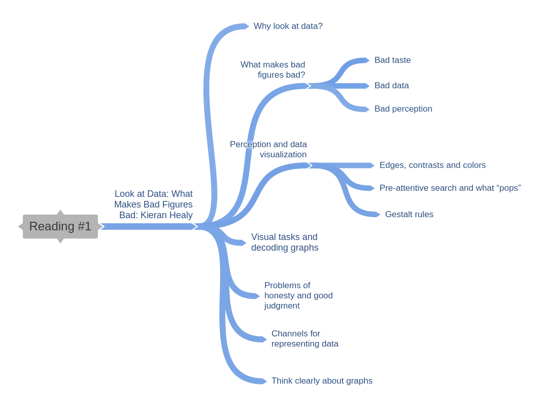
Healy, Look at Data: What Makes Bad Figures Bad

Healy in his introductory chapter from Data Visualization for Social Science seeks to outline organizing principles for effective data visualizations. He first states that he believes the relationship between data and the perceptual features of graphics are more important than esthetics, and then goes on to discuss a number of examples of misleading visualizations.

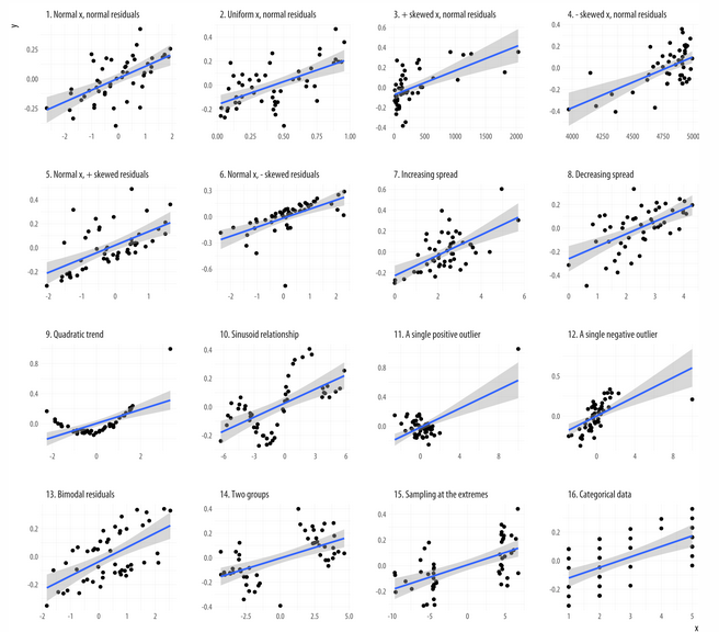
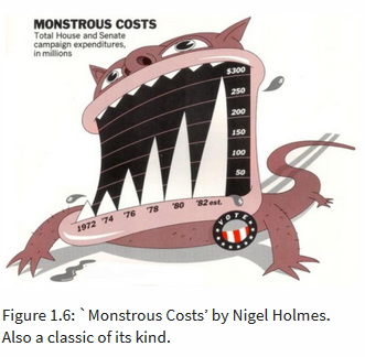
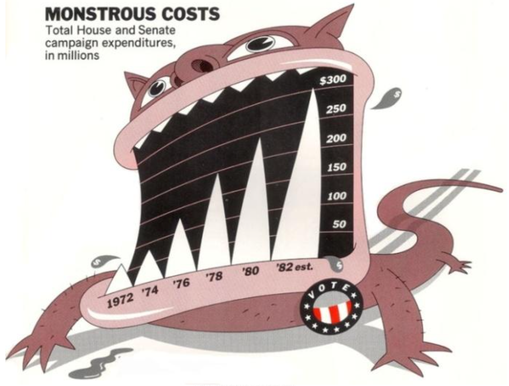
Healy says problems arise mainly in three ways: esthetic, perceptual and substantive. Esthetically good visualizations often maximize the ‘data to ink’ ratio with simple, clearly defined graphics, though he notes novel visualizations such as the illustrated ‘Monstrous Costs’ by Nigel Holmes can be memorable. A second problem can be found in the nature of human vision perception, which can produce illusions, meaning visual channels must be chosen carefully. Finally, substantive problems with the visual interpretation of data, such as badly designed aspect ratios and the lack of a zero point can be misleading, meaning good judgment and honesty are also vital.

In general, lacking sufficient contextual knowledge with which to agree or disagree with Healy’s points, I tended to naturally agree with him as an expert who effectively organized his arguments and buttressed them with evidence.

Regarding the two views of the rapid decline in law school enrollments, I would be curious to hear my classmates’ opinions on whether they agree with Healy’s acceptance of the first chart and, if so, how they think it might be improved to reflect the criticism to which it has been subject.

Bergstrom & West, Misleading axes on graphs

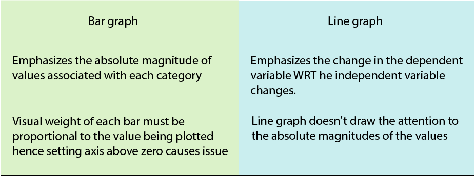
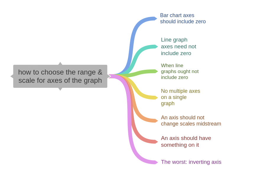
Bergstrom & West's in their Misleading axes on graphs essay look at ways in which bar charts and line graphs can be manipulated to change perceptions of the data being presented. They stress that data visualizations are created to tell stories, and that subtle choices by the author can change people’s perceptions dramatically. Bergrstrom & West believe that bar charts which depict absolute magnitude of values should be zeroed, but line graphs show change in the dependent variable, and need not include zero.

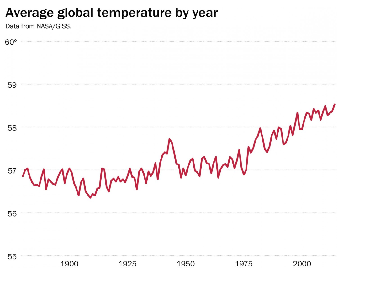
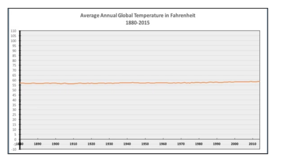
They cite several examples to buttress their argument. Among them is a controversial chart made by Powerline and tweeted by the National Review chart showing global temperature changes that goes to zero on the y axis. The visual impression is that there has been little change, whereas a revised Washington Post chart without the zero creates a much steeper line and the impression of rapid temperature increase. The disingenuous aspect of the Powerline graph is that they made graphical display choices that are inconsistent with the story they are telling.

Other problems with line graphs arise in changing scale midway, or inverting the scale. Misleading graphs are represented on controversial topics such as income inequality and gun deaths. The authors also stress a line graph in order to make sense should have something numerical on each axis.The authors conclude by stressing that subtle design choices can have a big impact on the story that a figure tells, and readers should be aware of possible bias.

Here again I tended to agree with Bergstrom & West due to the convincing nature of their arguments and my lack of domain knowledge. However, I felt questions were raised by their preference for a revised global temperature graph that emphasizes the change. As I accept their arguments based on their expertise, they seem to be favoring the revised chart based on the global climate science consensus on the reality of climate change.

I would like our class to discuss to what extent it’s acceptable to rely on experts in ‘biasing’ the design of a graph to make one or another point. For example, two centuries ago there was a global scientific consensus that linked skull dimensions to intelligence, creativity, morality and other human faculties in the later debunked field of phrenology.  

Bergstrom & West, The Principle of Proportional Ink

Here the authors explore a basic rule for the design of data graphics, the principle of proportional ink. The rule is  simple: when a shaded region is used to represent a numerical value, the area of that  region should be proportional to the value. This rule derives from a more general principle that Edward Tufte described in his classic The Visual Display of Quantitative Information.

Initially, two examples of bar charts are presented: the first exaggerates the growth of non-farm employment in Tennessee by failing to include the zero on the y axis, while another showing book sales downplays differences by reaching into negative territory.

The authors then refer back to their argument that line charts needn’t be zeroed when not “filled,” but when shaded as, in the example of a tax rate graph, they must as the coloring exaggerates differences.

Next they discuss bubble charts, whose power is that by using color and size as well as vertical and horizontal position, one can simultaneously encode four different attributes. The authors present an example by Hans Rosling, who popularized bubble charts. However they warn that while data-rich, they offer easy comparisons only between the x and y axes. They can also be misleading due to the nature of size perception with circles, or even misused as in another example cited.

Another type of graph that easily violates the principle of proportional ink is the donut graph, which either emphasizes or downplays differences depending on a band’s distance from the center.

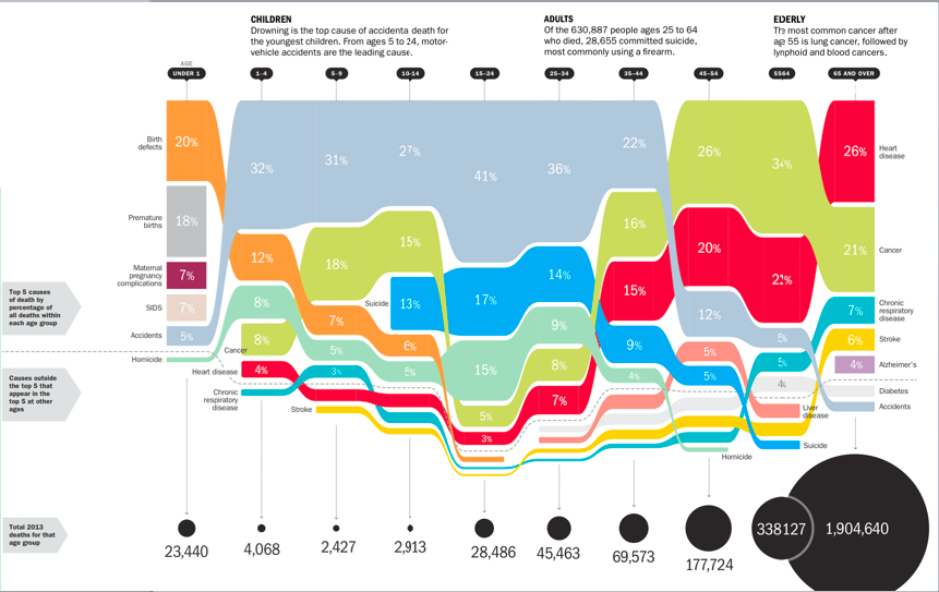
Another complex graph “filled” graph that poses problems is one showing cause of death relative to age in a Time magazine article. This graph confuses by not taking into account total deaths for each age group. But the authors suggest in cases like this it may be incumbent on the reader not to make mistakes of interpretation.

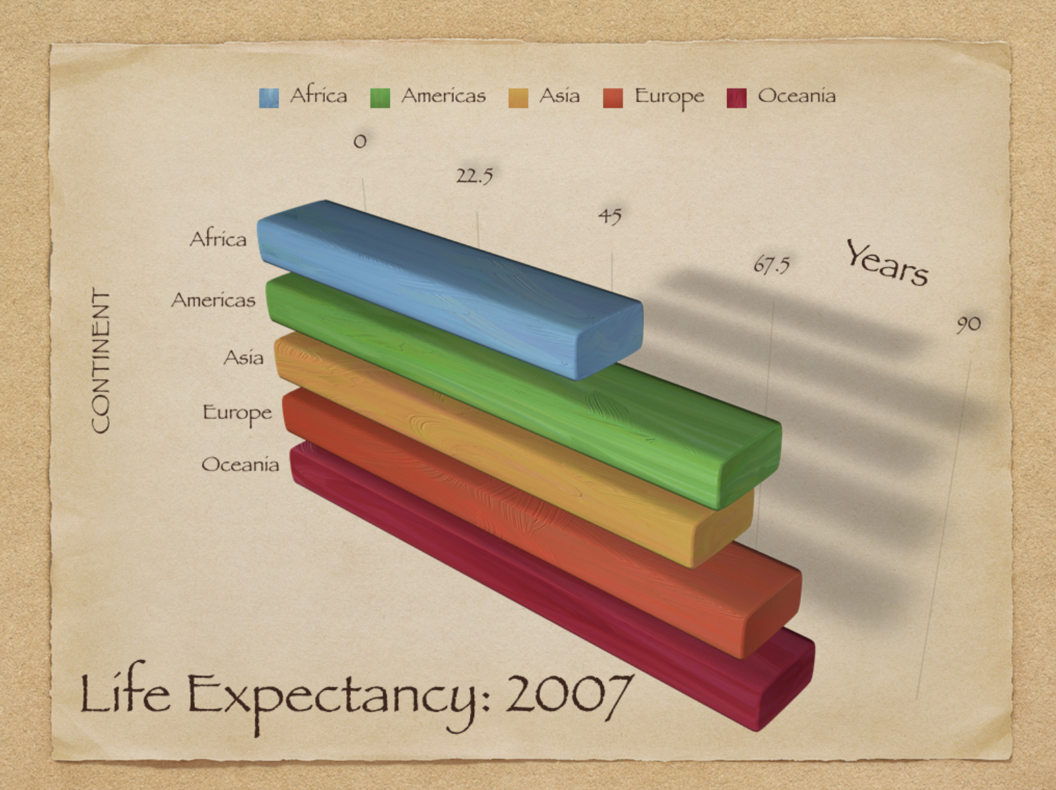
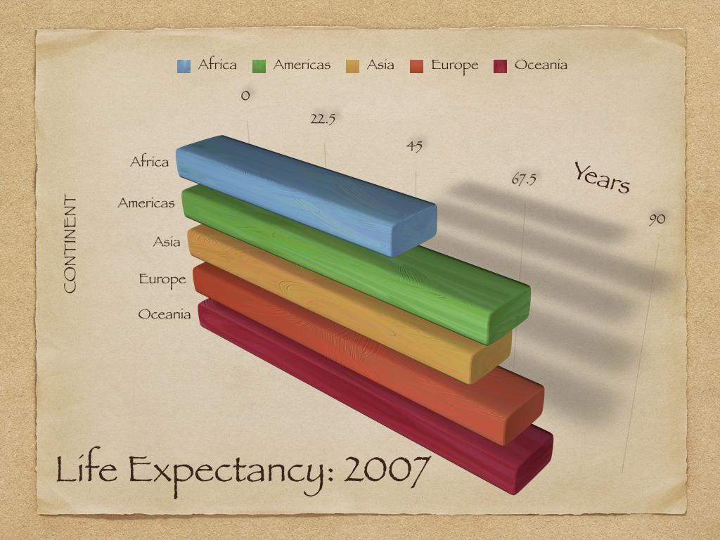
Three-dimensional charts can also not to make mistakes of interpretation, and 2D charts should be used when there is only one dependent variable. The trendiness of newfangled 3D charts is cited as one reason for their popularity.

The use of perspective in 3D charts also makes it substantially harder for a viewer to assess the relative sizes of the chart elements, and often violates the principle of proportional ink.

Pie charts are also problematic because relative areas are difficult to assess visually in angular form, with the authors arguing that 3D pie charts are pure visual bullshit. The use of perspective in 3D charts and the phenomenon of foreshortening makes misperception even worse.

I tended to agree with the authors as the examples they presented were convincing in the sense that when the ink is clearly out of proportion to the data, the effect is misleading. But some of these cases seemed more egregious than others. I’m curious what others made of this and, thought it would be interesting to see comparisons of 3D charts with 2D charts of the same data, to sense to what extent viewers are being deceived.

Andrew Levinson

Healy's Look at Data: What Makes Bad Figures Bad

Sometimes we look at an infographic and we know it's bad right away. But why? Healy calls out the importance of distinguishing the badness of a figure into three separate but useful categories:

Aesthetic

Simplicity and the removal of superfluous aesthetic junk is generally the overall theme here (unsurprisingly, proper execution of general design principles yields better data figures), however it's worth pointing out that the art vs. design debate manifests itself in this section as well. Specifically, in regards to Holmes’s “Monstrous Costs” being more easily recalled than their "plainer alternatives"

Nigel Holmes

Q: Is it better to be memorable or to be practical? Art can be interpreted but design solves a problem – how does that paradigm relate to data visualization?

Substantive

The example of "bad data" here, centers around the infamous NYT graphic of respondents that think it's essential to live in a democracy. At first glance, the graphic is well-produced and aesthetically pleasing (I liked the acknowledgement that a graphic with good visual taste but bad data can often be more misleading since the professionalism of the aesthetic conveys a false sense of trustworthiness), however a deeper look reveals the misleading title and subsequent data points. It was not a decline in a yes/no question, but a slightly lower ranking on a 1-10 scale. The decline in "essentialness" is not nearly as severe as the graph is purposely trying to communicate.

Q: how far is too far for a publication when it comes to substance and impact? Is this wrong across the board for the NYT to do? Could you still make the argument that the perceived decline in "essentialness" of a democracy still represents a significant shift in our society worthy of being reported as the NYT did?

Perception

How easy is a chart to interpret? This topic lies between aesthetics and data as it's closely related to both. Basically, don't use 3-d charts when unnecessary.

Overall, I'm a fan of this structured way to breakdown visualizations. By categorizing and analyzing a chart according to its aesthetics, substance, and perception we can more effectively communicate just why a chart is effective or not.

Note: the rest of the article focuses on our perception of graphics as it relates to design principles. I chose not to focus on these standards as they aren't anything unique, and more of a lesson on general design best practices like Gestalt, color theory, perception, etc.

Bergstrom & West's Misleading axes on graphs

The last sentence in this piece captures the message of this article perfectly:

When you look at data graphics, you want to ask yourself whether the graph has been designed to tell a story that accurately reflects the underlying data, or whether it has been designed to tell a story more closely aligned with what the designer would like you to believe.

Unsurprisingly, I completely agree with this. Everytime I look at a chart I have this in mind – especially, when reading an article in a publication which often attempts to persuade the reader.

Throughout this piece, the authors call out examples of misleading graphs, most often related to the axis and their intervals. They argue that bar graphs should never start at zero since they are displaying categorical data of "absolute magnitude", whereas a line graph "emphasizes the change in the dependent variable as the independent variable changes" and may start at zero, except when it shouldn't...

I generally agree with this; however, I'm struggling with something here. The two examples given are the Average Number of Hours Worked bar chart and the Climate Change line chart. The bar chart is criticized for not starting at zero, and therefore overemphasizing the differences between countries' avg. hours worked. The line chart is criticized for starting at zero and therefore underemphasizing the differences in rising temperatures. However, it seems the changes are both significant, the only difference is the type of chart. Just like the difference in a few degrees in temperature is significant, the difference in 37 and 41 hours worked per week is more significant than it appears when the bar chart is corrected to start at zero.

Q: is it really always wrong for a bar chart to start at zero? What's an alternative to a bar chart for displaying significant change between categorical data when a small range needs to be emphasized?

Bergstrom & West's The Principle of Proportional Ink

Proportional Ink is a really interesting concept fairly specific to data visualization – one that I haven't heard much about in my studies so far (aside from Tufte's series of books, although not mentioned in his popular class).

The amount of ink used to indicate a value should be proportional to the value itself

This makes sense. If we perceive a larger area, we immediately think larger/more impactful absolute value regardless of is relation to other elements in the figure. Only if we evaluate and analyze after our initial perception does it become clear when proportional ink isn't used. And if it's not, we have to force ourselves to reconsider the graphic. As a data visualization student, that may not be too hard, but as a reader of a publication, it's deceiving.

The biggest impact of proportional ink, is the initial moment when the reader first sees your graphic. Difference in size is the easiest way for us to compare related items and judge value - more so than space, color, angle, etc. so the amount of ink must be proportional to the value.

Additionally, we read about 3d charts again in this article. My favorite quote regarding pie charts:

We cannot think of a situation in which the addition of a third dimension offers anything other than visual bullshit

As if we needed another reason to not use pie charts, it's clear how it does not follow the proportional ink principle.

This proportional ink concept is definitely logical, but one of the hardest to executive flawlessly once you break away from bar charts and line graphs. If I had to guess, it would be one of the most often broken rules of data visualization.

Q: Aside from only using bar charts that start at zero, and line charts without shaded areas (unless they also start at zero), what other chart types are acceptable that don't break the proportional ink principle?

Batool Akbar

Data visualization is a way to help the viewer understands a complex or simple data by representing it in a visual context. In order to deliver the right information, it is important to know what makes it successful. First, graphs can be misleading by using the wrong scale, for example, bar graph is mostly used for comparison by representing the groups on one axis and the scale on the other axis. Moreover, the scale plays a huge role on showing the differences between the groups, according to Read Bergstrom & West's Calling Bullshit essay, bar charts should include zeros to show the true value of the group. (e.g., figure 1) it's visually noticeable that Romania's value is three times greater than France, when in fact it's only 3.8 hours.

figure 1

Second, graphs are a creative tool to communicate the data with the viewer, thus it is important to take the aesthetic aspect seriously. Design elements such as colors, shapes and layout are essential tools to make a good graph, however, they can be used in a "tasteless" way. (e.g., figure 2).

figure 2 

As mentioned in Healy's book about What Makes Bad Figure Bad: "The bars are hard to read and compare. It needlessly duplicates labels and makes pointless use of three-dimensional effects, drop shadows, and other unnecessary design features." Not every design element can be useful in creating graphs, in the example above, the data is very simple, a flat bar graph or a pie chart would have been a better choice. The 3D projection of the chart makes it difficult for the viewer to see the gap between the bars, which makes the bar graph unsuccessful because it did not deliver the right information.

As a designer, before collecting data and sketching graphs, it is important to ask myself: What kind of impact I want to have on the viewer?
What is the most appropriate visualization that I can use to show the data?
What design elements I need to use to have a creative and legible data visualization?

I'm curious to learn other people's opinion about the aesthetic side of the process.
For example, I hate Papyrus font - used in (figure 2) - and the wooden texture bars, but my personal preferences do not define if the graph is successful or not.

Dan Ran

The articles from the reading #1 give a general sense of how the data visualization can be used as a tool to tell different stories, and what are some typical mistakes that we should avoid when we are trying to visualize data, as indicated in "Bar chart axes should include zero. Line graph axes need not include zero. An axis should have something on it." When we are processing the data, it is crucial that we understand the consequence of our design choices. These articles give a lot of bad examples of how people try to fool their audience by changing the subtle elements on their charts. They may do a great job on what they try to convey, but I think we should insist on using data for revealing or understanding the truth and always try making this world a better place. In the article "What makes bad figures bad", it summarizes there are three major things that cloud cause problems, which are "aesthetic", "substantive", and "perceptual", which I think it is really helpful when we are trying to design our own chart. I do agree that we should keep the visualization clear and easy to read. The extra design component may make the visualization seem more interesting in how it appears but always make the data harder for the audience to understand.
However, after the reading, even though there is a lot of conclusions on how to use those old charts, it is still worth experimenting ways of visualizing data. It is always worth trying something new and viewing things from different perspectives.

Suzanna Schmeelk

The essay examines the guideline of the "principle of proportional ink" (closely tied to misleading axes) and defined as “when a shaded region is used to represent a numerical value, the area of that shaded region should be directly proportional to the corresponding value.”  This idea was derived in Edward Tufte’s book The Visual Display of Quantitative Information (1983, p.56).    

The article defends the guidelines mentioned in the “Misleading axes on graphs” essay where it was emphasized that bar charts must start at zero on the vertical-axes; however, line charts are not required to do so.  

The article first examines bar charts with respect to the principal of proportional ink.   They reference a misleading graph of the top most read books---which misleads viewers into not realizing that some volumes had higher sales (e.g. Anne Frank vs. The Da Vinci Code).  (On a side-note, the graphs does not even explain how the data was collected for the graph.)  

The article then examines line charts with respect to the principal of proportional ink.  They emphasize that line charts do not use shaded volumes to indicate quantities so therefore they are not required to start at zero.  This point leads to a discussion about shaded line-charts---which should therefore have a scale that goes to zero.  

The article then examines bubble charts with respect to the principal of proportional ink.  The authors take the position that, “the power of the bubble chart is that by using color and size as well as vertical and horizontal position, one can simultaneously encode four different attributes for each item in the dataset.”  The authors references a visualization by Hans Rosling.

The article then examines donut bar charts with respect to the principal of proportional ink.   The authors express that, “the problem with this type of visualization is that the geometry of the circle assigns a disproportionate amount of ink to bars further on the outside.”

The authors then discuss topics where the a changing denominator can effect the guideline of proportional ink.  As far as three dimensional graphs go, the authors note that they should have more than one independent variable and that the use of perspective makes the relative size of the chart elements hard to interpret.

Finally, the authors review pie charts.  One point they note highlight is that, “the main problem with 3D pie charts that in these graphics, the front-most wedges of the pie chart to appear to be larger than the rear wedges.”  Therefore, this breaks their proportional ink guideline.

I really liked reading the critiques in the article.  One good point to review here is that graphs in the authors’ opinions are to improve the data messages conveyed to viewers.  I will suggest that the questions be put to a vote or included into a study?  I am curious to learn if it would be an interesting study measuring view beliefs from the different representations and wonder what the class thinks.

Anh Mai

  1. Look at Data: What makes bad figures bad

By giving a variety of examples, author explained what make a figure bad. According to the author, good and bad are not subjective but can be explained based on how human's visual perception works. Also, when design a figure, we need to think about who we are designing for. There are three problems that we can see in bad figures:  strictlyaesthetic - figures have bad design aesthetic, substantive - the data is incorrect or badly designed, areperceptual - figures mislead human's perception. The author explained the correlation between data visualization and human's perception by listing rules of how human perceives a figure. This includes Edge, Contrast and Color, Pre-attentive Search, Gestalt Rules, Proximity, Similarity, Connection, Continuity, Closure, Figure and Ground, Common Fate.

My thought after reading this chapter is that I can see some of the rule of human's perception of data visualization is similar to Graphic Design Principles. It is very fascinating that human perceive something as good or bad subconsciously. Therefore, this emphasizes a fact that design is not subjective. There are certain rules and principles for designers to create good design. I also like the examples that the author demonstrated. Some examples I could not have thought of as bad designs but when the author explained, it makes sense.

I would love to ask my classmates about how they define a "bad taste" in term of designing a figure. What makes them "tacky"?

2. Misleading axes on graphs

The Misleading axes on graphs discussed when data visualizations are misleading and sometimes used to conceal the real data by using the wrong axes set up. By giving detailed examples of common misleading graphs and how to correct it, the authors explained rules of how to set up axes. Some of the rules were Bar chart axes should include zero, Line graph axes need not include zero, When line graphs ought not include zero, Multiple axes on a single graph, An axis should not change scales midstream, and An axis should have something on it.

My thought after reading this article is I love how detailed the rule is. The examples are interesting because they are actually graphs that appeared in articles of big and well-known companies, online newspapers and magazines. This places a question of are those misleading charts were just badly designed or intentional to manipulate the information. This also makes me think of the influence that data visualization have on people and the importance of integrity in designing data visualization.

I would love to hear what my classmates think about this article and this question: Is it always necessary to be completely honest with the data or sometimes manipulating the graphs is for a good cause?

3. The Principle of Proportional Ink

This article explained a  rule for data visualization design, the principle of proportional ink. According to the authors, "The rule is very simple: when a shaded region is used to represent a numerical value, the area of that shaded region should be directly proportional to the corresponding value. In other words, the amount of ink used to indicate a value should be proportional to the value itself." In this article, authors led us through different type of charts and graphs to explain when the principle of proportional ink was violated.

My thought after reading this article is that I can see the connection between the principle of proportional ink and the previous article "Misleading axes on graphs". These rule goes together and makes sense of the whole theme. Again, this article used examples of misleading charts taken from well-known companies websites and magazines. This shows that it is really easy to create a misleading chart. Therefore, designers always have to keep in mind how to visualize true data.

I would love to see more examples of misleading charts that my classmates encountered in their everyday life/work.

D'hana Perry

Upon reading the chapter “What makes bad figures bad?” by Kieran Healy there were three key takeaways that he asserts are the primary categories where visualizations can get into the weeds when presenting data narratives: aesthetics - which he describes as “ugly or inconsistent design choices”, substantive - problems that arise due to the way the data is being presented, and perceptual - visualizations that are confusing or misleading due to how people perceive and process what they see.

Healy suggests that there are certain design principles that should be utilized to mitigate these flaws, which include choosing the visualizations that are most appropriate for the data to be presented, maximizing the “data to ink” ratio, and centering simplicity over creating eye-catching visuals that can detract from the data itself.  Healy also warns us how easy it is to unintentionally  (and intentionally) place value judgements on the presented data by the visual choices we make and cherry picking information that we want to present. I certainly can’t argue with this.

I do however, have one point of contention: I agree with Healy that bad taste is in fact bad, but what one may consider “ugly” is entirely subjective and should be considered separately from the aesthetics that mislead the consumers of the data. I certainly hate the Comic Sans font as much as the next design snob, but that shouldn’t give me license to write off the legitimacy of the content. Unfortunately this is a human trait - to diminish the quality of the content in favor of what is simply easy on the eyes. It may not be fair, but in this regard it is a responsibility of data visualizers to make good data, look good too.

D'hana Perry

In the essay “Misleading Axes on Graphs” by Carl Bergstrom and Jevin West, they describe the various ways people will misuse the axes of graphs when presenting data that in some cases, benefits the agenda of the visualization’s creator.  For instance, they cite the now infamous line graph created by the National Review that purposely obscures information they found inconvenient to their priorities regarding climate change.  In order to successfully convince people to see what you want them to see in the data available, there are methods that can be employed to discreetly hide the statistics  you want by making adjustments to the range and scale for the axes of the graph.

The other examples in this post seem nonsensical, so for those of us with a conscious there are some tried and true methods that are suggested to avoid the trappings of creating misleading graphics.

  1. “Bar chart axes should include zero”: Graphs that measure dependent variables should always begin their count at zero to avoid overselling your productivity. Bar charts are designed to show the value totals in each category. The whole number.

2.   “Line graph axes need not include zero” (unless the data requires it): Line graphs  are designed to emphasize the change in the dependent variables - commonly measured over a specific period of time. This means that a variable can have any starting value that is inherent to the nature of what is being measured.

3.   “Multiple axes on a single graph": This is not a useful technique to convince anyone of anything - the example in the essay is illegible. But it certainly would be convenient to do this if your goal is to sew confusion.

4.  “An axis should not change scales midstream”: In this example, the changes in the scales were significant and it is unclear why this would seem necessary in this data presentation.

5.   “An axis should have something on it”: Seems fair.

6.   “Don’t invert the axes”: There is no room for artistic liberty when it comes to creating a proper graph.

D'hana Perry

The Principle of Proportional Ink was originally captured in Edward Tufte’s seminal book The Visual Display of Quantitative Information. In this book, he states that the vast majority of the ink used to create a graphic should be designated to the presentation of the data itself. In other words, there are benefits to limiting the number of tick marks, color filler, grid squares, and other extraneous design that will ultimately detract from the presentation of the data.

Not only can graphs divert attention away from the data, but the addition of unnecessary fillers can lead to the misrepresentation of data as well. The use of 3-D graphics, for instance, almost always skews the viewer’s interpretation of the data and it does not add any value to the image - particularly when it’s set up against markers that should display perfectly straight lines. More often than not, the Y axis become distorted, making it difficult to get accurate information. The same is true of fillers used in line graphs, which runs the risk of overdramatizing your data.

The use of color is also cited in this essay as a big distraction from the presentation of data. Regarding the construction of graphs, they state that “…only the vertical and horizontal positions allow easy and precise comparisons. Color and size are useful to set context for each item.” Human beings cannot derive quantity or even meaning through the use of color on it’s own.  And even in cases where a legend does exist with color coded variables, requiring the data consumer to bounce between an interpreter (legend) and the primary material can lead to fatigue on the part of the consumer. Ultimately, limiting the our inclination as human beings (and artists, perhaps) to over-embellish is necessary when the integrity of the data is at stake.

Caitlyn Ralph

Assessment

I enjoyed how Kieran Healy discussed the successfulness of a visualization in terms of visual perception. In the past, I’ve done some reading on how to determine if a visualization is “satisfactory.” However, in those conversations that I’ve come across, the deciding factor centered on if the reader acquired information and knowledge from the piece. I found it interesting to read about the connection between principles of visual perception and visualization adequacy. While valid and important, I always felt the former was quite hand-wave-y—a way to give an answer to something without actually giving an answer. This felt like it dove deeper into the mechanics of how the visualization process works.

In those previous readings, there was reference to developing a form of criticism for visualization, similar to art criticism*. The four outlined rules to this still-hypothetical criticism didn’t include mention of these visual perception techniques.

Additionally, I liked how this discussion of visualization adequacy was framed early in the chapter by addressing audience differences. I think this is a critically important (and seemingly overlooked) aspect of visualization, a consideration that should occur early in the process as it shapes later steps.

Bringing in the pieces by Carl Bergstrom and Jevin West, I liked how this collection of readings attempted to integrate definitional taxonomies with visualization conversation. I feel the field—the journalism corner, in particular—is growing rapidly, I think it’s important to include precise language in these foundational discussions as it allows for concrete discourse and critique, which is all in hopes to push the evolving field forward.

Questions Raised

As visualization discussions progress alongside visualization education, I’m curious how we address this seemingly slippery slope of creating misleading and deceptive output? There are so many intricate details to consider when designing a visualization while so many tools are so openly available: how do we help ensure solid visualizations are published in the community while also being critical of what’s already there? Do we teach it earlier in the classroom?

I felt as if a lot of the bad examples were testaments to why packaged software isn’t particularly apt for data storytelling, appearing in support of more flexible programs such as D3 that allow a designer to have control over more aspects of a visualization (and I may be biased because I’ve wrote papers on this, haha). Do others feel differently? Does it matter on the audience? On the stage in the visualization process? What the visualization is meant for?

*R. Kosura, “Visualization criticism: The missing link between information visualization and art,” 11th Int. Conf. on Information Visualization, July, 2007.

Sherley Soraya Wijaya

This reading teaches me how to determine data graph that is effective and which one is not. Especially this graph with heavy shadow, this graph is what I usually see often in school and universities; Furthermore, it is not only that, even the graph from Microsoft Excel is what we usually work with is actually hard to read and it is finally explained that it is a ‘bad perception’ (1.2.3 Bad perception) which leads to misleading data.

When it comes to data visualization, it needs a good visual for audience to perceive informations. I noticed that there is a lot of similarity of making a good data graphic with graphic design formula that I have learned, such as contrasts, grids and colors. It makes your graph easier to understand since it has a lot of information in it.

However, theres a possibility of bad data happening as well. It is written on the article,

‘In your everyday work you will be in little danger of producing either a “Monstrous Costs” or a “Napoleon’s Retreat”. You are much more likely to make a good-looking, well-designed figure that misleads people because you have used it to display some bad data. Well-designed figures with little or no junk in their component parts are not by themselves a defence against cherry-picking your data, or presenting information in a misleading way. Indeed, it is even possible that, in a world where people are on guard against junky infographics, the “halo effect” accompanying a well-produced figure might make it easier to mislead some audiences. Or, perhaps more common, good aesthetics does not make it much harder for you to mislead yourself as you look at your data.’ - 1.2.2 Bad Data

It is aesthetically pleasing to the eye but however, it causes data misleading as well.In conclusion, data visualization needs to be presented very clear with brief information indicated as well

Christian Theodore

DVIA WEEK 2 READING 1 (R1)

Healy’s Look at What makes Data Bad:

“Good taste might make things look better, but what we really need is to make better use of the data we have, or get new information and plot that instead. In these cases, even with good aesthetic qualities and good data, the graph will be confusing or misleading because of how people perceive and process what they are looking at. It is important to understand that these elements, while often found together, are distinct from one another.”

In this reading, I found that this quote resonated most deeply with me. The thesis here is that apart from canonical principles, “good” data visualization is rooted in a deep empathy for the audience, and more specifically, producing clarity where there is complexity or illumination where information is shrouded.

The Power of Perception:

Because this is a visual medium, we must take great care to understand how optics, qualia and and "chart junk" can impact how the final result is received. I appreciated using the example of the “3d chart” here to highlight the practice of adding “visual candy” in the face of a dearth of information. Less is really more (to use another hackneyed saying).

Bad Design, Ugly Results:

To use another cliche- good data design is about  applying Lex Parsimonae as generously as possible- a paradox captured well in Edward Tuft’s quote:

“ Graphical excellence is the well-designed presentation of interesting data—a matter of substance, of statistics, and of design … [It] consists of complex ideas communicated with clarity, precision, and efficiency. … [It] is that which gives to the viewer the greatest number of ideas in the shortest time with the least ink in the smallest space … [It] is nearly always multivariate … And graphical excellence requires telling the truth about the data. (Tufte, 1983, p. 51).”

Handsome Design, bad data visualization:

But bad design is even more deceptive. In the example of the NYT's article on the decline of democracy, the reader is guided to towards the (erroneous) conclusion that democracy was in precipitous decline in the western world. Several errors were made (with the ranges of the x-axis). An interesting point for me here is that the influence of authoritative sources can maximize the effect of accepting incorrect conclusions. He points out that the story gained outsized virality and its was accuracy taken for granted (it being published in the "Paper of Record" and also, in turn, sourced from an academic study). I imagine that this would not have had the same positive/ uncritical reception coming from less respected source(s).

Misleading Axes on Graphs:

Janice Yamanaka


Misleading Axis on Graphs

Good data visualization seems to be utilitarian in a way, perhaps devoid of taste and style.  But after reading the intro to this essay, and after our discussion today, I feel that we all come equipped with a ‘point of view’ – as a designer and a viewer. We can't help it.

I can think of a handful of friends who are artists who don’t ‘get’ conceptual art, don’t enjoy it, and don’t seek it out.  I also have a handful of artist friends who are conceptual art snobs.  How we create and ‘look’ at art or life, or visualizations depends on your point of reference.  

Like everything else in life, visuals are sometimes a shell game.  You can dress up, or dupe the viewer into believing that the graphic is meaningful, as we discussed with the ‘Monstrous’ visualization.

I think that we all as part of our human conditioning, seek order to mine specific meaning.  But in order to have your data read, do we sacrifice order for viewability?  Do we worry about the form in which the data will take, at the risk of not selling the message to be compelling?   Or is the viewability a way to get more views, therefore more data or thought is provocative?

Another part of this essay that was thought-provoking was the meaning of ‘outlier’ data skewing results.  I’ve always believed (and read the Malcolm Gladwell book ‘Outliers’) that outliers create and can tease out innovation.  The use of outliers in data seems to be a throwaway.  But doesn’t that go against a value that may mean creativity, trend or innovation?


Misleading Axis on Graphs

This essay seems to be a discussion of how the ‘x’ and ‘y’ axis can be manipulated to a satisfying result.  But this is the function, and responsibility of the designer.  There is a moral obligation to show the data, no matter how far away it may go from your hypothesis.  This essay is self explanatory, but I’m not so sure that again, we all come into a design with a point of view, a skew, and an aesthetic.  

It may be impossible, although not entirely truthful to be swayed by either the data, or creating the visualization.  An example I can give is the genre of Documentary films. There is editing, camera view, light, as well as dialogue and visuals that can skew the information.

The Principle of Proportional Ink

The essence of this essay is that the amount of information being shown, should be proportional to the amount of ink being used.  But in the above essay (Misleading Axis on Graphs), line graphs use ‘hierachy’ of height to show data.  This argues, to me, the logic of this principle.

Bar graphs, line graphs, bubble charts, donut bar graphs , changing denominator (the Time magazine example),  the use of 3 dimensional graphics (in bar and piecharts) are discussed in depth.

It’s a compelling case to be made in order for the data to be important it needs the most ink, but I’m unclear if the goal is to show the value of 0 (crime, rapes, deaths), our eyes do not necessary associate ‘less’ as more.  

Aaditi Rokade

  1. Look at Data: What Makes Bad Figures Bad: Kieran Healy

    Healy discusses the importance of considering 'how human visual perception works' while visualizing data. He describes why it is necessary to get into a habit of thinking about the relationship between the structure of data and the perceptual features of graphics. Although, the ggplot software can help us make the right decisions but it cannot really force us to be honest with ourselves, data and the audience.
    - how even tasteful, well-constructed graphics can mislead us
    - the perception of shapes, colors, and relationships between objects
    - cognitive aspects of data visualization: we are quite literally able to see some things much more easily than others

Why look at data: Anscombe’s quartet provides an argument about looking at data visually. It's demonstrates why it's worth looking at data but it's not all. Real datasets could be messier. Representing such datasets visually could mislead researchers and audience of the data.

What makes bad figures bad?: When the visualization is tacky, tasteless, or a hodgepodge of ugly or inconsistent design choices, we might never get passed the bad visual. In rest of the cases, even if the visual is aesthetically pleasing, it is not enough. We need to figure a way to make best use of the data. The graphs can be confusing or misleading even with good aesthetics which is of course needs to be taken care of. I feel if there's an alternate way to represent the appropriate data in a simplistic and a more comprehensible manner, an effort should be made to chose it. As Tufte states it using Minard's visualization of the Napoleon's march, there are no stated rules, we need to figure a set that works best for the representation of given content and avoid designing something that's a content free decoration.

The discussion about "data-to-ink" ratio reminds me of usage of 3D visuals where in-fact one can actually efficiently represent data with 2D visuals. Our understanding of data is largely dependent on how we perceive geometrical shapes and relations in general.  Overly-elaborate presentation of simple trends may result into information overload instead of providing a simpler representation of the data. To grasp these issues we as data designers need to have an understanding of how perception works.

Perception and data visualization: As design can be used to help the audience is can also be used to trick them to the similar extent. The concept of cognitive bias has been explored and put to use in creating cognitive illusions such as:
-  the snake illusion,
- the design of pattens and usage of colors in the carpets and wallpapers used in casinos that make you stay awake and play more
- The design of IKEA stores- like a maze- that makes you spend more time inside store and you end up buying more than what you anticipated.

Same is the case with using colors, contrast, light, shapes and positioning of these elements in relation to each-other. If shapes and colors bring in similar value to the visualization, it would be pointless to use both together and make the visual more complicated necessarily. If we look at the basics, Gestalt principles- Proximity, Similarity, Connection, Continuity, Closure, Figure and Ground, Common Fate - need to be considered while designing visuals. The mix and match can introduce more complexity in terms of additional patterns where there aren't any.

Visual tasks and decoding graphs:
- There are better and worse ways of visually representing data when the task the user must perform involves estimating and comparing values within the graph
- We misjudge areas poorly. Area-based comparisons of quantities are easily misinterpreted or exaggerated. Comparing the areas of circles is prone to more error
- we find it hard to judge changes in slope

Channels for representing data:
1. The channel or mapping that we choose needs to be capable of representing the kind of data that we have.
2. Given that the data can be comprehensibly represented by the visual element we choose, we will want to know how effective that representation is.
3. our graphics will depend not just on the channel that we choose, but on the perceptual details of how the implementation is.
4. The decision to encode a variable in a certain way of representation is not the same as deciding what type of plot it will be.


2. Misleading axes on graphs

Every visualization tells a story. Any subtle choice by visualizer has a major impact on this story. Authors discuss some of these choices surrounding around how to choose the range & scale for axes of the graph. Authors talk about how the axes passing through 0 or not affects bar graphs and does not affect line graphs due to the difference in their visual density.

Following points to be considered while designing graphs in order to practice honest representations :

3. The principle of proportional ink
when a shaded region is used to represent a numerical value, the area of that shaded region should be directly proportional to the corresponding value.
  • applies to bar charts while does not apply to line graphs
  • The problem with bubble charts: only the vertical and horizontal positions allow easy and precise comparisons. Area based precise comparisons is not very intuitive to the human mind.