- Assessment of student skills, levels, and interests
- What do you want to learn in this class?
- What sorts of data/information graphics work have you done previously?
- Any coding experience?
- Stats?
- Introduction to course goals and expectations
- Intro talk
- Select Presentation topics
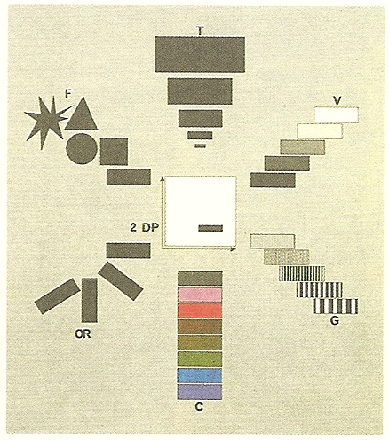
- Exercise: Catalog & Classify
- Create and publish a new post with your visualization type as its title. Assign it the tag “Catalog & Classify” in the gear menu.
- Describe your chosen visualization type in terms of the kinds of values it represents (e.g., fractions, integers, percentages, etc.) and the sorts of comparisons it enables or discourages.
- Explain what forms of ‘pre-processing’ need to occur between the raw data and the ink/pixels in the resultant chart.
- Explain the ‘mapping’ by which numerical/categorical/etc values are converted into positions, sizes, colors, textures, etc.
- Include 3 images apiece to demonstrate ‘good’ and ‘bad’ uses of this visualization type.
- Consult the Ghost Editor Overview to help you format your text & images.
Assignment
- Refine your Catalog entry based on the class discussion and see if you can find additional examples (with an emphasis on the ‘good’ uses of the form). If you didn't get a chance to talk today, we'll return to your visualization type next week.
- Next week we'll have an in-class programming workshop. In preparation for that, please make sure you've got the following installed/set-up:
- a text editor (consider SublimeText, VS Code, or Atom)
- the P5.js environment
- an account at GitHub and a copy of the GitHub Desktop client
- Read the P5.js introductory materials: Getting Started, the Overview, and Color (and take a peek at the Examples section while you're at it).