Heat maps are a type of visualization to show data density. They are particularly helpful when you have a lot of (e.g., tens of thousands of) data points and are mainly interested in their overall distribution. Technically, in a heat map, data points are aggregated locally and mapped to colors (either gradient or quantile), so that we can make better sense of the density of the data from the colors while still being able to see and use the map.
Values it Represents
Essentially, a Heat Map counts the amount of variables in a scale of an area. So it can represent various values including fractions, integers, percentages.
Sorts of Comparisons
Enables:
The benefit of Heat Maps is that visually encoding quantitative data with color using small area marks is very compact, so they are good for providing overviews with high information density.
A Heat Map represents the density discrepancies of dots based on maps, matrix or even just an interface, such as clicks on a webpage. It enables audience to perceive density of points independently of the zoom factor.
Discourages:
The limit of Heat Maps is area marks of a single pixel, for a dense heat map showing one million items. Only a small number of different levels of the quantitative attribute can be distinguishable, because of the limits on color perception in small noncontiguous regions.
How to Make a Heat Map
- Scale the data
- Cluster the data
Mapping
Encode a single quantitative value attribute with color.
Examples
Good Examples
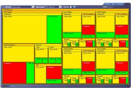
- It uses carefully designed color schemes and visualization strategies. The color schemes were designed so that one color does not visually dominate the others. Bright reds and yellows are nowhere to be found. Fully saturated colors are avoided in favor of slightly muted colors. It enables you to see variations in the data without being biased by visual artifacts that can result from poor color choices.
- Peak crashes during the after- school pickup hours through the drive home commute hours M-F, with highest crash volumes on Friday during such periods.
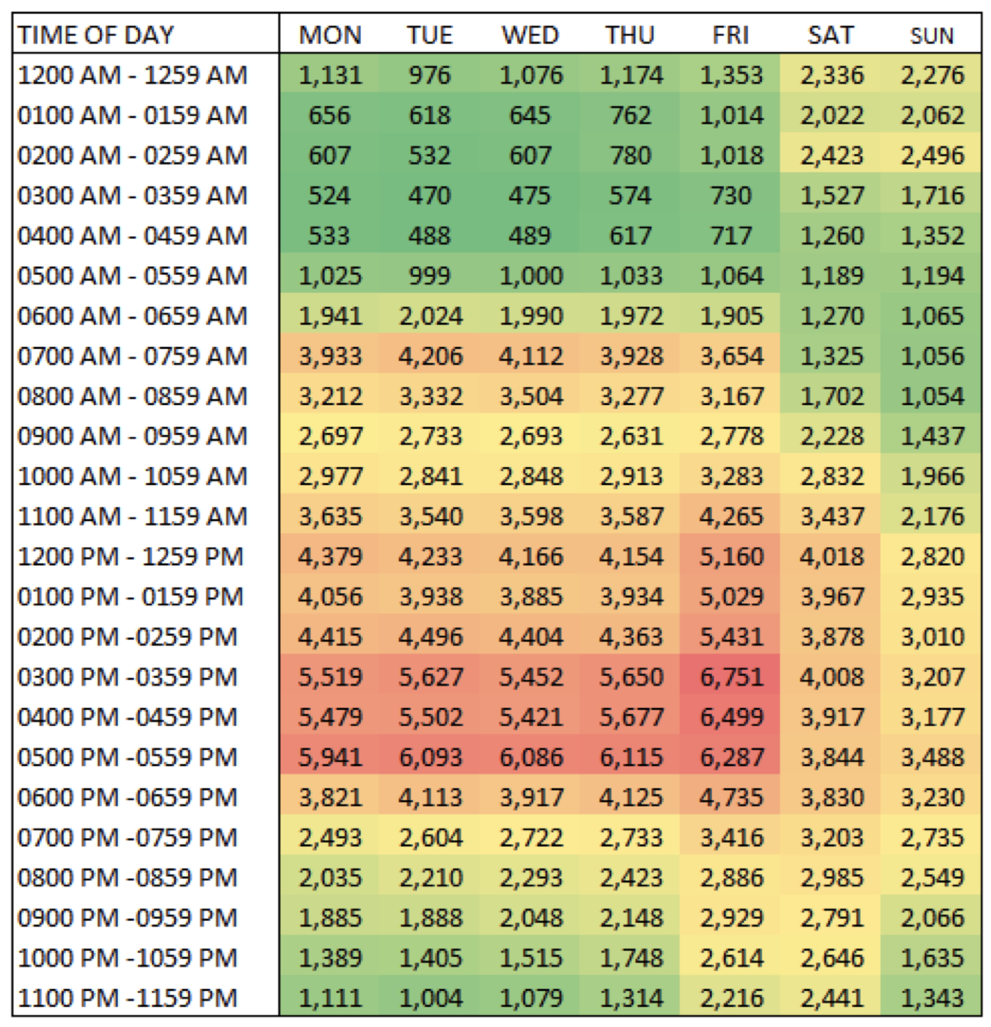
Some heat maps use mini-bars in the crosstab cells to convey magnitude.
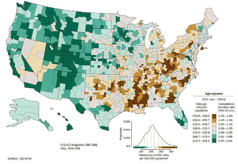
- A Heat Map provides a compact summary of a quantitative value attribute with 2D matrix alignment by two key attributes and small area marks colored with a diverging colormap.
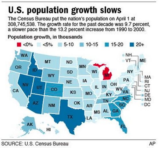
Bad Examples
- The legend is confusing for many reasons.
There are three different kinds of ranges here: two “less than” signs, three numerical ranges like 5-10, and then one “plus” sign. That variety of how the numbers are displayed can make it hard to understand.
And there's overlap, too: is 10 percent in the 5-10 range or 10-15? More useful ranges would be something like 0-4.9, 5-9.9, and so on. Less than 5 percent would technically include less than 0 percent, too.
And finally, the note says the data is in thousands, but then lists percent.
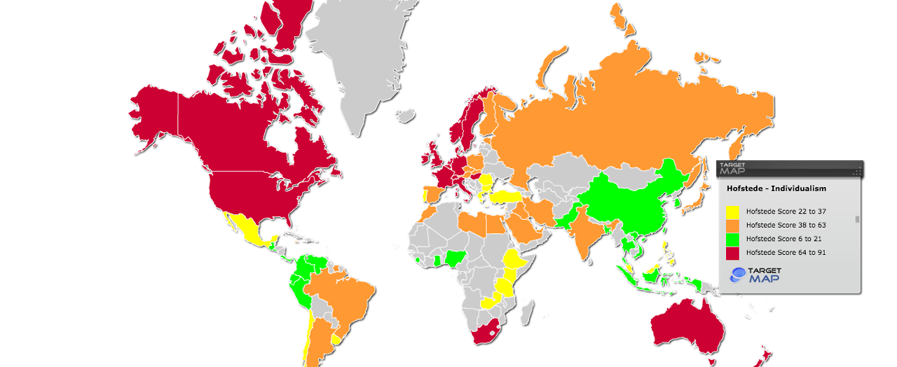
- Poor color scale. Values do not encompass entire range. Inconsistent data range. Order of legend is a mess.
- The choice of colors is plain ugly and very tough on eyes. A softer shades of the same colors could deliver the same information with better aesthetics.
References:
- Tamara Munzner. Visualization Analysis and Design. A K Peters Visualization Series, CRC Press, 2014.
- https://en.wikipedia.org/wiki/Heat_map
- Effective Use of Heat Maps - MSKTC
- When Maps Lie
- Drawing and Interpreting Heatmaps
- https://appsource.microsoft.com/en-us/product/power-bi-visuals/WA104381072?tab=Overview