In this chapter, Drucker traces the history of data visualizations, noting that “the roots of tables, and charts, calendars and timelines, maps and diagrammatic forms are as old as writing and record-keeping.”
She begins by offering rubrics for which to study this history. Drucker states that information graphics can be organized into two types: static representations like calendars and knowledge generators such as train timetables. Another way of breaking down visualizations she presents is by graphic format, intellectual purpose, type of content and the way meaning is structured. Finally, she structures her exploration into nine types of visualization, leading from timekeeping and space-making through administration and record-keeping, on to trees of knowledge, knowledge generators, dynamic systems and visualizing uncertainty.
Visualizations have their deepest roots in timelines, calendars and maps, beginning in Mesopotamia with solar and lunar timekeeping, and in maps that were used for navigation and delineation of property.
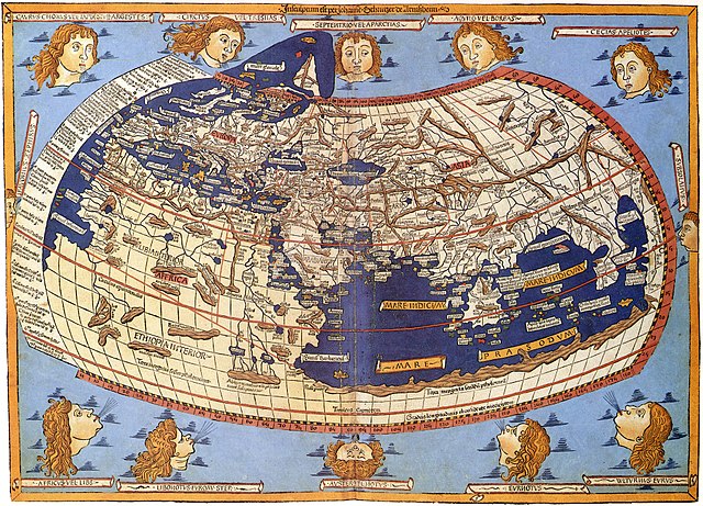
Calendars developed further in Roman culture, while Greco-Roman polymath Ptolemy was the first to offer a gridded map spanning the known world. Drucker stresses the process of abstraction behind both calendars and mapmaking: the use of spatial reasoning abstracted from specific observations and the construction of analogies from three to two dimensional space.
She notes similarities in visualization methods that have carried through since ancient times: rationalization of a surface; distinction of figure and ground; and delimitation of visual elements so they function as a relational system.
Visualizations were often restricted to Judeo-Christian mythology in the Middle Ages, but the printing press and development of scientific instruments led to an explosion from the 16th century onward. The first examples of bar charts and scatterplots appear with Priestley and Mayfair in the 18th century.
Drucker roots statistical graphs in Cuneiform tables from the fourth millennium BC, and establishes modern data visualizations in the growth of administrative states in the 17th and 18th centuries and their need to manage large populations. Descartes, for example, established the mathematical basis (planes, points etc.) for graphs in the 17th century. New scientific instruments for measuring weather such as thermometers and barometers also provided numerous data points that could be charted.
After tracing the evolution of information visualizations into the 20th century and the complexities of visualizing uncertainty such as dynamic weather systems, Drucker focuses on their interpretative aspect. This is the most polemical section of the chapter. Drucker notes that decisions about how statistics are translated into graphics are crucial, warning that this process is reductive and can lead to pseudo social sciences like eugenics, which gained authority by abstracting supposedly empirical methods and using visualizations to make reductive arguments visible.
Drucker calls on us not to adopt natural science models in the humanities unquestioningly, or “suspend critical judgement in a rush to visualization.” Instead, she proposes a humanistic approach that acknowledges the interpretive character of data, noting that “all data is capta.” For example, edges could be permeable and lines curved in a “constructedness” that displays the codependent nature of observer and phenomena.
I found Drucker’s presentation of the history of data visualization encyclopedic, in that it offers not just a chronology but also a framework for understanding its development over millennia, as well as guidelines for an ethical future.
But this reading left me with two principal questions. First, as a student of Asian history, I found the lack of an examination of the sophisticated visual and analytic traditions of South and East Asian civilizations to be a weakness. Where do these traditions fit into the overall picture of data visualization, and what does the growing influence of Asian nations portend for the development of the field? Second, Drucker's exhortation for a humanistic approach to data visualization seems warranted, but her examples of how to resolve the tension between what is an inherently reductive process with a visual "fuzzy logic" seemed a bit thin.