I had a lot of fun reading Robert Simmon's Subtleties of Color, especially through the perspective of a scientist. I used to work in a retina neuroscience lab, and although our specialty was not in phototransduction or visual components of the circuit, I appreciated seeing the field of visual neuroscience having an impact on other areas of life. It was eye-opening to observe just how much visual perception has a role in our interpretation of color, and how much color theory is rooted in it.
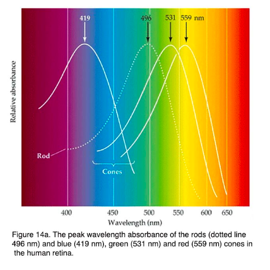
First, the concept that computers do not process colors in the same way that humans do: our retina uses three types of cone photoreceptors (L, M, and S types), which process broad wavelengths of light, corresponding to long, medium and short wavelengths (peak absorbance - 560nm, 530nm, and 420nm respectively). We perceive light exponentially rather than linearly, as a computer does, and our ability to perceive different colors is not equal. This gives rise to the necessity for translation of colors on a screen, because it is one of our main methods of looking at visual information.
It was entertaining to read his remark on how scientific visualizations are often difficult to understand:
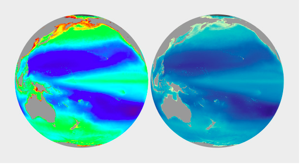
Some conventional color schemes, especially those used in scientific visualization, are difficult for non-experts to understand. In fact, one study found “satellite visualizations used by many scientists are not intelligible to novice users” (emphasis mine). Visualizations should be as easy as possible to interpret, so try to find a color scheme that matches the audience’s preconceptions and cultural associations.
This statement was significant to me because more often than not, when presenting scientific data, we (as scientists and researchers) get so caught up in the accuracy of the data that we do not take into consideration how readily it can be interpreted by people who are not specialized in that particular field. It is even a problem within a single company (i.e. my workplace), where people in differing programs (more pharmacology based vs neuroscience based) have trouble interpreting data of other teams, simply because the presentation is not intuitive (even though it is the standard for that particular field). If it is a problem for people who are specialized in science, it is obvious it will be a problem for non-experts. If we cannot communicate scientific data effectively to the public, we cannot use our findings to induce change and advancements in society--and ultimately, that is the goal of the scientific pursuit.
Generally speaking, I thought the series gave very practical tips on how to go about picking the right colors for our visualizations, and what questions to consider when doing so. It will be a good resource to comb through again when creating our own visualizations.