I'm starting writing having completed the video and before reading through the blog posts. I loved the video. Robert Simmon manages to disrupt so much of what I though I knew about color. Like him, I'm not a color expert but his approach to the use of color - the specificity of color - is at a whole other level. I'm not yet sure how I'll use the information from this series but I'm curious enough to begin my own line of research. The emphasis on even, gradation of color is fascinating. Like everything else in the world of Data Visualization it seems nothing is left to chance and every detail is considered.
I'd never realized the gaps or uneven color of the RGB or the rainbow palette. Nor have I given much consideration to the way we perceive natural vs computer color. While much of the video is about the practical function of color and how it might be used to best represent data I appreciated that he also spoke about using colors that 'make sense' based on the data being represented. Ex. using green to represent grass or trees.
He doesn't address this directly but this approach to color could easily be applied to the UX/UI development. Many of the issues he discusses, establishing hierarchy, clear boundaries, planning for color blindness, etc aren't specific to the world of data visualization.
The insight that lightness is the strongest of the three components of color (hue, saturation, and lightness) reinforces a practice that I've often applied when working on digital painting and illustrations - which is to view a piece in grayscale to better understand the clarity of form. It's tempting to use saturation and hue to compensate for indefinite shape and previewing work in grayscale exposes where and how color is being manipulated in a compensatory fashion.
Rather than rephrase the takeaway below I chose to copy and paste because the whole paragraph is useful:
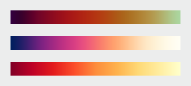
"How to take advantage of the strengths of both the grayscale palette (preservation of form) and rainbow palette (preservation of quantity), while minimizing their weaknesses? Combine a linear, proportional change in lightness with a simultaneous change in hue and saturation. Colin Ware describes this type of palette as “a kind of spiral in color space that cycles through a variety of hues while continuously increasing in lightness” (Information Visualization: Perception for Design, Second Edition). The continuous, smooth increase in lightness preserves patterns, the shift in hue aids reading of exact quantities, and the change in saturation enhances contrast."
Types of Data
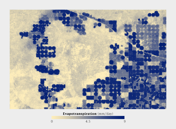
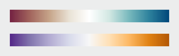
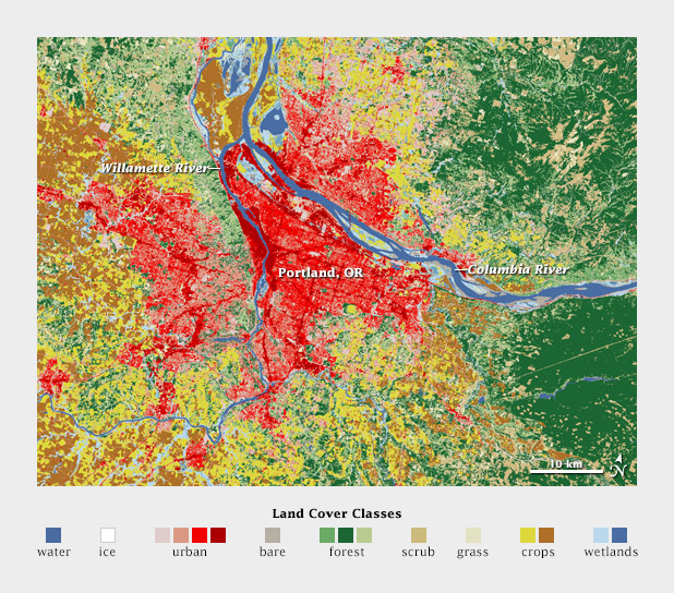
There are several types of data, each suited to different types of display. Continuously varying data, called , is the most familiar. In addition to sequential, Cynthia Brewer defines two additional types of data: divergent and qualitative. Divergent data has a “break point” in the center, often signifying a difference. For example, departure from average temperature, population change, or electric charge. Qualitative data is broken up into discrete classes or categories, as in land cover or political affiliation.
Sequential Data
Vary evenly from light to dark, or dark to light, often with a simultaneous shift in hue and/or saturation.
Divergent Data
Has a breakpoint in the middle. The merging of two sequential palettes with equal variation in lightness and saturation.
Qualitative Data
Broken into classes or categories.
Questions
How does one use the CIE L*c*h (lightness, chroma/saturation), hue) color space in Photoshop (or other industry standard design tools)?
Tools
Gregor Aisch’s L*C*h color gradient picker and chroma.js
Color Brewer. The Color Brewer Palettes are also implemented in visualization applications and languages like D3, Processing, R, ArcMap, etc.